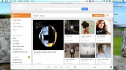
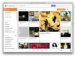
Google Music is not very efficient running as a tab in Safari. It gets lost.  So I decided to put something together in Fluid and tweak the CSS a bit to make it less Google and more about the music.
So first off this is your desired result. It lets you enjoy the nice full moving artwork eye candy too :
:


To start, you want a copy of Fluid, which you can buy here: http://fluidapp.com You're going to need the Userstyles, so yes, you will have to shell out $5, but it's totally worth it.
Next you want an icon for your new app, I'm just using the one from the Android app itself which you can right click and save from here: https://play.google.com/store/apps/details?id=com.google.android.music&hl=en

Afterwards, you'll want to open up Fluid and actually create the app with these settings:
Then click Create.
Now open your new app, and maybe keep it in the dock you want.
Click on the Window menu and then on Userstyles.
Next you want to create a new style by clicking the + on the bottom right (the solid blue box). Name it something like "Hide Google Bar". Then go to the blue/off white box (Patterns) and click on the + there and call it "*play.google.com/music*" or similar depending on your country.
Then copy and paste this on the bottom box:
And refresh to see the changes. It's not perfect, I know, but it's much nicer than what it was before! The Playlist + is sorta weird and doesn't show up properly until you click it, but that happens in Safari too.
Afterwards, go to View and then Hide Status Bar.
Then resize to your liking (or as least until before the scrollbar shows up).
Enjoy!
So first off this is your desired result. It lets you enjoy the nice full moving artwork eye candy too
To start, you want a copy of Fluid, which you can buy here: http://fluidapp.com You're going to need the Userstyles, so yes, you will have to shell out $5, but it's totally worth it.
Next you want an icon for your new app, I'm just using the one from the Android app itself which you can right click and save from here: https://play.google.com/store/apps/details?id=com.google.android.music&hl=en
Afterwards, you'll want to open up Fluid and actually create the app with these settings:
URL: https://play.google.com/music/listen (Change as needed depending on your country)
Name: Google Play Music
Location: Don't change this, just keep it as Applications, unless you really want to.
Icon: Click and select Other... and browse to the icon you saved earlier.
Then click Create.
Now open your new app, and maybe keep it in the dock you want.
Click on the Window menu and then on Userstyles.
Next you want to create a new style by clicking the + on the bottom right (the solid blue box). Name it something like "Hide Google Bar". Then go to the blue/off white box (Patterns) and click on the + there and call it "*play.google.com/music*" or similar depending on your country.
Then copy and paste this on the bottom box:
Code:
#gb.header-wrapper{margin-top:30px;margin-bottom:0}
#gb{margin-bottom:-30px; margin-top:30px}
#gbq1 {margin-top:-30px}
#gbq2{margin-top:-10px}
#gbq{margin-top:0}
#gbvg{display:none}
#gbx1{margin-top:0}
#gbx1 {margin-top:-30px}
#gbx3 {display:none}
#gbx3{margin-top:0}
#gbx4{display:none}
#gbz{margin-top:-30px}
#gbzw{margin-top:-30px}
#gbq1.gbt {display:none}
.gbqlca{display:none}
a.gbqla2{display:none}
And refresh to see the changes. It's not perfect, I know, but it's much nicer than what it was before!
Afterwards, go to View and then Hide Status Bar.
Then resize to your liking (or as least until before the scrollbar shows up).
Enjoy!


