I am in need of a more trained eye than mine to help me kern the words GRAPHIC ARTS for this article I am working on for a school project. I have included a picture of where I have it kerned, but I'm not so sure it looks that great. What would you all do different?
Got a tip for us?
Let us know
Become a MacRumors Supporter for $50/year with no ads, ability to filter front page stories, and private forums.
How would you kern this? UPDATE: Please critique my final layout
- Thread starter klymr
- Start date
- Sort by reaction score
You are using an out of date browser. It may not display this or other websites correctly.
You should upgrade or use an alternative browser.
You should upgrade or use an alternative browser.
can you post the un-kerned version? as a comparison?
my first thought that this has been kerned too much.. some of the characters are one step away from touching.
Edit: In cases of ALL CAPS I would increase the kerning.
similar to what was posted by creator (below), but be careful of the GR HI pair, too much space now.
my first thought that this has been kerned too much.. some of the characters are one step away from touching.
Edit: In cases of ALL CAPS I would increase the kerning.
similar to what was posted by creator (below), but be careful of the GR HI pair, too much space now.
You have closed the letterforms up way too much. You need to match the white of the RA since it is your largest invariable space - meaning the white space can't get any smaller because the text would interfere with each other if it did.
Squint your eyes and think of the text as a gradient. It should be as close to a single shade of gray with no dark or bright spots.
Here is a quick kerning from me.
*edit*
Looking at mine I can see I opened the G & HI up just a tad too much...maybe only 5/1000em but it's too much for the feel of the rest. I could either close those up or see if opening a couple other spacings up would help. Point is, yours is too tight and needs to breathe.
Attachments
Here it is without any kerning. The computer set the R and A way close, I actually moved them apart a bit. I know my professor likes things a little on the tight side, and I'm afraid these (my original) are probably even too far apart for him. I don't like them extremely tight like he does. His rule of thumb is, imagine you are pouring sand between the letters and filling the gaps up evenly. I guess with that he also wants something to hold the sand in the bottom of each gap. 
Anyway, I'll keep playing with this. I wish I had a printer here at my apartment so I could print it and see. It'd make this a lot easier.
Anyway, I'll keep playing with this. I wish I had a printer here at my apartment so I could print it and see. It'd make this a lot easier.
Attachments
Here it is without any kerning. The computer set the R and A way close, I actually moved them apart a bit. I know my professor likes things a little on the tight side, and I'm afraid these (my original) are probably even too far apart for him. I don't like them extremely tight like he does. His rule of thumb is, imagine you are pouring sand between the letters and filling the gaps up evenly. I guess with that he also wants something to hold the sand in the bottom of each gap.
Anyway, I'll keep playing with this. I wish I had a printer here at my apartment so I could print it and see. It'd make this a lot easier.
I actually like it as-is (the default) and wouldn't worry about making it any tighter.

Here is an example...very, very crude one at that...of what my type professor had us do when we were having trouble with spacing.
Just create blocks of color where the negative space is and you will see your problem areas.
And so what is the end goal in doing this? to get each block of color relatively the same size or what?
And so what is the end goal in doing this? to get each block of color relatively the same size or what?
More or less. You also have to take into consideration the letters too since the have different negative space as well. It's most useful to find areas where you are way too close/far apart.
More or less. You also have to take into consideration the letters too since the have different negative space as well. It's most useful to find areas where you are way too close/far apart.
Ok, thanks. I'll play with this a bit more.
I have an question. How come when I kern words in Ai the kerning is not always even. Whats the deal with this.
Kerning is adjusting the space between individual letters. Tracking is adjusting the spaces between all the letters. Are you using the kerning tool or the tracking tool? Kerning is more up to the designers eye than what the computer defaults to. No machine can kern perfectly. That's up to you.
So, in short, I'd say it's because you need to adjust the kern manually for each letter. I hope I didn't just sound rude. I don't mean it at all if that's the case.
The R and the A in Graphic is the thing that hits me in the face right away. Only solution I see to that is using a different font. Thats just my thoughts.
I might try the type in a lowercase as well. That should help I think.
Also, I can only use these 5 classic typefaces: Garamond, Baskerville, Bondoni, Century Expanded, and Helvetica. I'm using Garamond Permier Pro. I hope it's close enough to Garamond, because I don't have that. I only have Baskerville, Garamond Premier Pro, Adobe Garamond Pro, and Helvetica. I don't like the looks of Helvetica for this assignment, so I don't want to go there. So, does anyone know which of the two Garamond fonts I have is closest to regular Garamond?
I have an question. How come when I kern words in Ai the kerning is not always even. Whats the deal with this.
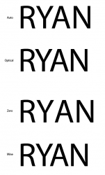
Are you using Auto, Optical, or 0, in the Character Palette. I would play with both the Kerning and Tracking of you letters. I generally like to use Optical Kerning, i think it looks the best most of the time [thats just me]. Here is a simple pic of what i am talking about, and the bottom one is about how close i would have the letters of my name:
*the 'R', 'Y', and 'A' are mostly what i moved.
Attachments
I'm using kerning and I know what tracking is also. I guess I should just eyeball it than huh.
Yeah, that's what I was told to do in my classes. Good luck!
I might try the type in a lowercase as well. That should help I think.
Also, I can only use these 5 classic typefaces: Garamond, Baskerville, Bondoni, Century Expanded, and Helvetica. I'm using Garamond Permier Pro. I hope it's close enough to Garamond, because I don't have that. I only have Baskerville, Garamond Premier Pro, Adobe Garamond Pro, and Helvetica. I don't like the looks of Helvetica for this assignment, so I don't want to go there. So, does anyone know which of the two Garamond fonts I have is closest to regular Garamond?
Lowercase will help, or if you did it all caps in Helvetica you wouldn't run across nearly as many issues. Especially between the R and A.
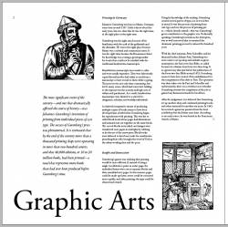
I went with the lowercase. The all caps was getting to me. I still need to work on it a bit. I think the At in Arts is a little tight at the bottom. I need to tweak it a bit and see. Anyway, here is page 1 of 2. How does it look?
I like the overall layout, however, the "p" in Graphic looks like it's floating a little too much on it's own. I would tighten that up if it were up to me.
I like the overall layout, however, the "p" in Graphic looks like it's floating a little too much on it's own. I would tighten that up if it were up to me.
Yeah, I haven't kerned any of that yet. I just changed it and moved on to the rest. I'm almost done with page two now. I'm tired too.
EDIT:
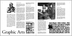
Ok, here is the final version (for tonight at least). I kerned everything in the title and finished the whole layout. I don't know if I'm too pleased with the second page, but I can't think of what to do differently. Any suggestions? The project is to help us focus on and use grids. I used a 7 column grid in my layout and tried to leave the thumb edge open and clean. Anyway, here it is. Enjoy!
Attachments

Yeah, I haven't kerned any of that yet. I just changed it and moved on to the rest. I'm almost done with page two now. I'm tired too.
EDIT:
Ok, here is the final version (for tonight at least). I kerned everything in the title and finished the whole layout. I don't know if I'm too pleased with the second page, but I can't think of what to do differently. Any suggestions? The project is to help us focus on and use grids. I used a 7 column grid in my layout and tried to leave the thumb edge open and clean. Anyway, here it is. Enjoy!
I think you need to justify the body text. It looks sloppy with the ragged right edge and type during the time period the paper is about would have been justified anyway, right? The title looks pretty solid, to me.
I think you need to justify the body text. It looks sloppy with the ragged right edge and type during the time period the paper is about would have been justified anyway, right? The title looks pretty solid, to me.
The flip side of that argument is that justifying the text can potentially lead to awkward spacing between words.
I tend to prefer ragged right text, but I usually go through and put some soft returns in to make each sentence roughly the same length.
And I kill hyphenation.
In a layout where white space is an integral part of the design, ragged right text generally helps to preserve the feel of a clean and open layout.
InDesign does a pretty good job of not having weird spacing issues, especially if you adjust the tracking when one does crop up.
Soft returns are usually a bad idea because they can cause all kinds of problems with longer documents if you have to go back and edit things.
I also think the subject matter should be taken into account when deciding on certain layout issues, and in this case justifying the text would fit the style of Middle Ages type better than ragged.
I agree with the no hyphenation thing unless there's a really good reason for it.
I'll give the justified text a shot. I had tried it earlier on a few paragraphs and didn't like the look of it. Anyway, I'll justify it and make it look decent and probably have both printed and then mount the one that everyone in class says looks better. How does that sound?
Ok, here we are. Now, another question. Do I need to em space the beginning of each paragraph (except the first one under each subhead)? Nevermind, I found my answer. "…use either extra space between the paragraphs or an indent. You don't need both!"
Ok, here we are. Now, another question. Do I need to em space the beginning of each paragraph (except the first one under each subhead)? Nevermind, I found my answer. "…use either extra space between the paragraphs or an indent. You don't need both!"
Attachments
I'll give the justified text a shot. I had tried it earlier on a few paragraphs and didn't like the look of it. Anyway, I'll justify it and make it look decent and probably have both printed and then mount the one that everyone in class says looks better. How does that sound?
Ok, here we are. Now, another question. Do I need to em space the beginning of each paragraph (except the first one under each subhead)? Nevermind, I found my answer. " use either extra space between the paragraphs or an indent. You don't need both!"
Okay.
sigh.
The justification actually looks pretty good.
And IgnatiusTheKing actually has a valid point about soft returns. They can indeed do very bad things to long documents.
There is something to be said for designing it in the style of the Middle Ages.
In the immortal words of Fletch:
"It takes a big man to admit when he's wrong. I am not a big man."
Seriously - design is often times subjective. Everyone is going to offer you his or her advice...and all of it will differ somehow. You'll get good advice. You'll get really crappy advice. Heck - you'll even get conflicting good advice. It comes down to this - make your own choices, but be able to explain and understand why you made the choice.
Good job on your layout, by the way.
Register on MacRumors! This sidebar will go away, and you'll see fewer ads.