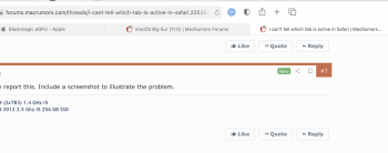
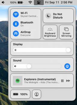
Not sure if the change happened in Beta 6 but whenever it's a white background, it's almost impossible to tell which tab is the active one
Got a tip for us?
Let us know
Become a MacRumors Supporter for $50/year with no ads, ability to filter front page stories, and private forums.
I can't tell which tab is active in Safari
- Thread starter Daniel L
- Start date
- Sort by reaction score


