Become a MacRumors Supporter for $50/year with no ads, ability to filter front page stories, and private forums.

Siderz

macrumors 6502a
Original poster
Nov 10, 2012
991
6
Something that bugs me in iOS7 is that Safari doesn't have a plus button like Safari that quickly adds a link to the Reading List, you have to click that share icon and then click reading list.

Well, now they've done the same with Yosemite, I really don't like that. It worked a lot better before; one click to quickly send to the Reading List, click and hold to choose a different location. You can customise the toolbar and I don't see that same button.

Really hope they bring back that button as an option, and maybe even add it to iOS8, but I really doubt that. No idea why they would remove it.

Edit: scaredpoet pointed out that there's still a button:
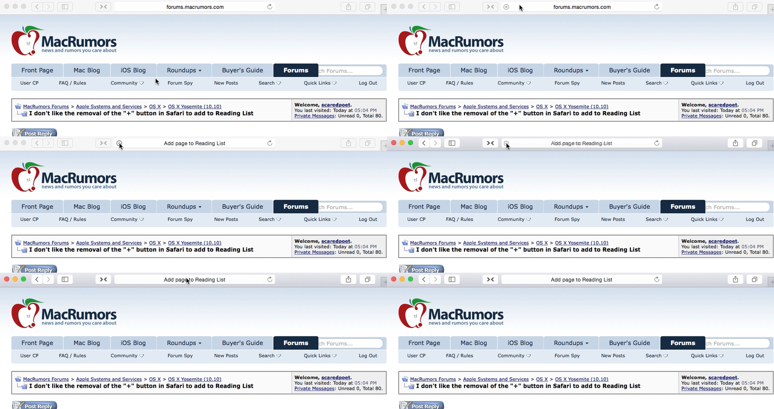
It shows up if you mouse over the address bar. Like this.

Yosemite_add_to_reading_list.gif
 
Last edited:

joedec

macrumors 6502
Jul 25, 2014
443
51
Cupertino
How can you not miss it, its invisible, its not the wisest design choice. More like an easter egg.

... Jeff
 

simon48

macrumors 65816
Sep 1, 2010
1,315
88
The hold for destination popup is new to me, that is awesome! I might use it over cmd + D from now.
 

zen

macrumors 68000
Jun 26, 2003
1,713
472
I posted about this the other day in a thread - I too had missed the hidden + that appears in the address bar. I know they're trying to keep Safari's new UI clean... but it does seem a little unnecessary.

Also, it looks like most people are going to miss it!
 

pickaxe

macrumors 6502a
Nov 29, 2012
760
284
Yes, I agree, it is a bit strange.... why couldn't they just leave the plus sign where it was?

because it's not minimal enough and it doesn't look good to the graphical designers with no experience in gui design
 

Siderz

macrumors 6502a
Original poster
Nov 10, 2012
991
6
Slightly related, I don't like where the iCloud tabs shows up. You have to click that annoying "Show all tabs" button and they show up at the bottom. I much prefer having a dedicated button.

Is the feedback assistant for just bug reports or can we also make feature reports?

Another thing, and I already reported this, the delete button for Reading List items is partially hidden behind the scroll bar, you can see it in the top right of my screenshot. Might not be a problem on Macs with higher resolution screens.
 

Attachments

  • Screen Shot 2014-07-29 at 20.01.22.png
    Screen Shot 2014-07-29 at 20.01.22.png
    13.4 KB · Views: 325

joedec

macrumors 6502
Jul 25, 2014
443
51
Cupertino
I've been using the Feedback Assistant included with the Beta. I assume they are reading these, I have been logging bugs as well as style issues.

Ditto on the Cloud Tabs, I would prefer a button too, I don't see why they're force feeding these things, let the user fill it up with buttons if they want, or not.

... Jeff
 

phrozend

macrumors member
May 14, 2014
60
1
because it's not minimal enough and it doesn't look good to the graphical designers with no experience in gui design

That's one ignorant comment you made there, mate, and I would love for you to list your credentials. Yes, we can all discuss the traps of minimalism, but hovering to show expanded options/actions is not a new thing, nor is it a bad thing.

Think about it this way:

Would you prefer having your option-click (right-click) list of actions visible next to your cursor at all times or only when you're in need of them? Do you really need to have a "create a new folder"-option visible at all times? Because something is invisible, does that mean its harder to reach?

The answer is yes, but only for an inexperienced/first-time user. This is the same for all of us the first time we use a new product, digital or not. Once you know how to access something, the problem has been solved. If it still irritates you, well, maybe you should think about using another product instead.

Understanding that hovering over an element will reveal new actions relative to the said element is smart design.

Now, maybe Apple should give the user more options in deciding what's visible on their screen. Maybe Apple should give the user more options period. I think so. If you really want plus-button, you should be able to add it to your toolbar in Safari.
 
Register on MacRumors! This sidebar will go away, and you'll see fewer ads.