Become a MacRumors Supporter for $50/year with no ads, ability to filter front page stories, and private forums.

Tozovac

macrumors 68040
Original poster
Jun 12, 2014
3,034
3,233
I miss thinking and hearing "it just works” in regards to using Apple products. There are too many increasing instances of their iOS & OSX software just not working as easy as they used to, coupled with this war on ports/jacks/buttons that makes connecting & using a device slower and more inconvenient.

Anyone else?

That's all. :)
 
Last edited:

Tozovac

macrumors 68040
Original poster
Jun 12, 2014
3,034
3,233
Works great for me. What's a dongle. Wires are so 1977

I mean more of the overall feel working Apple products, not just wireless headphones. Software doesn’t feel as crisp and intuitive as before 2013. Having to often google how to do things on the iPhone now versus never having to before, back when it seemed like you could just do what the app offered intuitively. “It Just Works” has been replaced with texts mid-day from relatives asking how to work the iOS 11 podcast app (and iTunes 12 when that abomination appeared). Every so often I forget how to enable list view in the base iOS calendar, things are so non-obvious any more. Nobody else feels similarly?
 
  • Like
Reactions: Moonjumper

dendowling

macrumors member
Aug 29, 2011
30
5
Early versions of iOS had minimal functionality so the interface and options were simpler and more direct. Software and OS get older and more mature, they have more features and capabilities so, the interface becomes more complex.

When features become more complex they outgrow the old interface and eventually a major shift is needed in the arrangement of the interface.

If you've been using an OS from the early days you have an ingrained familiarity with the system controls. So, when the big shifts come you have to unlearn some actions and learn new controls - which might be perceived as bad design or faltering. But, maybe it's just a system evolving.

Speaking of evolution. New ports are just another way devices evolve. Port connectors get smaller and faster. We no longer use SCSI ports and Parallel ports, they're not sufficient for current technology. Dongles are merely a temporary patch to ease the transition to new connectors. These transitions are not limited to Apple. Evolution of connectors has affected every computer company as well as all other types of electronic device decades before the computer era. Apple dropped USB-A in favor of USB-C. So will all the other companies.

Also, there are a lot of people complaining about using dongles when they don't really need dongles. Apple switched to USB-C. Do you need to buy a bunch of USB-A to USB-C dongles? No. Maybe buy one. But, it would be simpler to just buy new cables with the correct connectors on both ends. There's no reason to buy a $15 dongle for your printer when you can buy a USB-B to USB-C cable for $10 - skip the dongle. Also, the number of new accessories with USB-C connectors will continue to grow quickly so, the need for dongles dissipates.
 

Tozovac

macrumors 68040
Original poster
Jun 12, 2014
3,034
3,233
Early versions of iOS had minimal functionality so the interface and options were simpler and more direct. Software and OS get older and more mature, they have more features and capabilities so, the interface becomes more complex.

When features become more complex they outgrow the old interface and eventually a major shift is needed in the arrangement of the interface.

If you've been using an OS from the early days you have an ingrained familiarity with the system controls. So, when the big shifts come you have to unlearn some actions and learn new controls - which might be perceived as bad design or faltering. But, maybe it's just a system evolving.

Fair enough but would you not agree with two things which I feel is at the heart of my issues.

1) The early iOS/UI used intuitive cues to guide the user, certainly partly because touchscreen phones doing complex things were a new thing to the masses, but also because there are certain common sensical cues in life that make sense for a reason, namely differentiating "actionable" items from "informational" items. Typically an actionable item could be given a 3D look or a button look or an embossed look, etc, or placed within an area colored differently than "content" or "info only" areas, to differentiate "actionable" from "FYI." That type of UI strategy was not about fashion, nor was it a dated strategy but rather based on common sense / intuitiveness. However -- and it's even more poignant when offering more and more functions as you acknowledged -- the current Apple UI's went to a more flat, mono-chromatic look that clearly allows actionable items to blend in together often too well with the content areas. On top of that, there's more hiding of functions behind ellipses, hamburgers, and 3-dot icons that often require hunting and guessing to figure out. I disagree with your statement about complex features needing a major shift when the shift is toward something much less intuitive. Should it be acceptable that increased complexity be coupled with decreased obviousness/intuitiveness of UI?

2) Too many apps (especially iOS) seem to go thru changes that were completely unnecessary. Best example is the iOS 11 podcast app. I know of no friend or relative who liked the change nor stuck around long enough to figure it out. Most have moved on (I use a 3rd party app, Overcast, for podcasts for the first time). Similar thoughts for iTunes 12 that left me frequently mis-tapping and confused how to do things that were just simple before, where the only added complexity was from Apple's unnecessarily reworking the interface into disarray, and not because of a radical amount of new features.


Speaking of evolution. New ports are just another way devices evolve. Port connectors get smaller and faster. We no longer use SCSI ports and Parallel ports, they're not sufficient for current technology. Dongles are merely a temporary patch to ease the transition to new connectors. These transitions are not limited to Apple. Evolution of connectors has affected every computer company as well as all other types of electronic device decades before the computer era. Apple dropped USB-A in favor of USB-C. So will all the other companies.

Also, there are a lot of people complaining about using dongles when they don't really need dongles. Apple switched to USB-C. Do you need to buy a bunch of USB-A to USB-C dongles? No. Maybe buy one. But, it would be simpler to just buy new cables with the correct connectors on both ends. There's no reason to buy a $15 dongle for your printer when you can buy a USB-B to USB-C cable for $10 - skip the dongle. Also, the number of new accessories with USB-C connectors will continue to grow quickly so, the need for dongles dissipates.

Sure, I don't disagree with most of that. But regardless of whether you agree if the current port set (usb-c, no headphones, no magsafe) makes 100% sense for your usage style, would you not agree that there's the chance of going too far too quickly, or just too far? I do think Apple's crossed the line a bit too aggressively with the headphone/magsafe/usb route for the common user, sort of like teaching your 10 year old child to drive your car. Would be nice to check back here in 5 years and see if what's shocking today on the MBPro is commonplace, but Apple's coupling a radical shift in UI/software toward the more-plain, less-user-helping-intuitiveness strategy with a rapid reduction of hardware-ease-of-use (iPhone home button, headphone jack, magsafe/usb-c/headphone-jack) seems to be an awfully overly aggressive strategy, especially the plaining-down-of-the-UI while asking the device to do more than ever each year.

The thing I keep coming back to is: consider the design exercise (that all good designers should consider) of extending your current path or idea or concept further in the same direction, for argument's sake. For removal of the iPhone home button, for the macbook usb-c strategy and offering less flexibility of physical ports...how much could be too much to remove before it's just noticeably clumsy to use a product without having to invest in more hardware (wireless headphones, usb-c hardware, magsafe/usb-c adapter) and/or having to tote around extra cables/dongles/hardware just to stay flexible within today's (and likely the next 5-years) world? I often need to charge my iPhone while wanting to port out music to speakers in my garage, work desk, friend's house, or any of the dozen headphones I have out & about while not wanting to tote wireless headphones or cables or a splitter for charging/headphones.

iPhone's fragile design and the macbook designs are all about looking good without a case and standing alone, yet every port removal results in costing the consumer not only extra $ but extra hassle to carry something around to add back the flexibility that makes a device so fun to have.

Just feels like we're dangerously in the stage of gilding the lilly...lots of unnecessary plastic surgery. A parting thought for the moment: Computers/internet saw radical change in the past 20 years, then even radical change within the past 10 years for mobile devices. There's an ongoing assumption, maybe even expectation that radical change must continue. Couple that with Apple/Jony Ive's obsession with minimalism/removing things (intuitive UI cues, headphone jack, magsafe, usb/ports, home button, touch ID, physically-hinging trackpad that I find to be much more satisfying with better feedback) that may not be as low-hanging fruit as were things like optical drive, ethernet port, scsi ports, etc), and it begs the question of: when will be too much? What happens when there are no ports left, even for wired-charging....what will Jony focus on? How much as the violin improved in 100+ years? What new musical instrument has appeared in the last 50 years that will stand the test of time? Sometimes, you run out of "new" opportunities...things to remove from an Apple device... I think we're right in that period while I think Apple thinks that time will never arrive. Thus, I feel much of my Apple hardware & software feels less so easy, so less "it just works" than 5 years ago.

Am I alone?
 
Last edited:

Juicy Box

macrumors 604
Sep 23, 2014
7,579
8,919
I think the "it just works" doesn't apply to Apple products anymore.

One of the reasons is how user friendliness has been lacking Apple software.

Example, one thing I hated about using Windows in years past was that many simple tasks required very unintuitive ways to complete them. I had to fumble around with the UI for a while, or look up how to do many tasks.

One reason I used Macs my whole life was that the UI of the OS was very intuitive and easy to use. I was like a pro on Macs.

I think this is, in part, why Apple products had the appearance of "it just works".


Fast forward to about 5-ish years ago, there seemed to be a change with Apple's priorities when it comes to software. No longer is it about user experience.

In the past few years I have had to do more Internet searches about seemingly simple tasks on Apple software , than the previous 20 years combined.

I am getting tired of having to look up how to do everything.
 

Tech198

Cancelled
Mar 21, 2011
15,915
2,151
Still works for me... but then again, I have bluetooth

lol..

..and that's the other side :)

It always "just works"

Early versions of iOS had minimal functionality so the interface and options were simpler and more direct. Software and OS get older and more mature, they have more features and capabilities so, the interface becomes more complex.

When features become more complex they outgrow the old interface and eventually a major shift is needed in the arrangement of the interface.

If you've been using an OS from the early days you have an ingrained familiarity with the system controls. So, when the big shifts come you have to unlearn some actions and learn new controls - which might be perceived as bad design or faltering. But, maybe it's just a system evolving.

Speaking of evolution. New ports are just another way devices evolve. Port connectors get smaller and faster. We no longer use SCSI ports and Parallel ports, they're not sufficient for current technology. Dongles are merely a temporary patch to ease the transition to new connectors. These transitions are not limited to Apple. Evolution of connectors has affected every computer company as well as all other types of electronic device decades before the computer era. Apple dropped USB-A in favor of USB-C. So will all the other companies.

All companies? So all PC's have USB-C? I don't think so..... Some do, like laptops (HP) and Chrome books, but i don't think you'll find USB-C on a every single new desktop PC out there just yet.

I like the way we still think that any new thing coming from Apple is going to be the next big thing without even looking in the bigger area... We must stay inside the circle of Apple and trust what they always say..

To me.... if I don't see USB-C adopted on *every new laptop from all companies* its not gonna happen..

Apple may have been the first, or second to adopt this on their laptops, and switch by default to SSD, and downside and use dongles for connectivity allot more than they did before, *but* i still say unless u see that on every other laptop out there by every other company on mass, its only and always stay as a 'nitch.'

Apple makes good progress, and the disadvantages they take off, they makes up for, (sometimes for the better), but unless its world wide for all other companies laptops its only a select few companies that do that, and that is not something that every one will use..

That's the way i go into it as well with FaceID, ARKIT on iOS, and 3D. Its unique to some companies only....
 
Last edited:
  • Like
Reactions: Tozovac

Tozovac

macrumors 68040
Original poster
Jun 12, 2014
3,034
3,233
I like the way we still think that any new thing coming from Apple is going to be the next big thing without even looking in the bigger area... We must stay inside the circle of Apple and trust what they always say..

Possibly without your even realizing it, you’ve stated one of the most aggravating aspects of today’s website/computer/mobile device world as it relates to Apple devices not “just working” as easily anymore.

Apple does something, then everybody adopts it almost blindly as if it’s the next best best way to do something. Flat design on a stark white background, light-colored low-contrast text, circles instead of squares, amateurish-beyond-belief icons, buttonless-looking buttons, more wasted space than should be considered acceptable, etc. I can’t tell you how many apps I use that are clumsy and inefficient with lots of wasted unused space but lots of flat design circles used as the interface, organize not in a way that helps function but “looks organized.” To add insult injury, often their previous app was extremely functional and used space wisely, not hiding things behind hamburgers and requiring two taps to do what used to take one. Examples of downright stupid apps that help to maintain an apple aesthetic but requiring multiple tabs to do what used to be showing on one screen:

537E153E-F89A-4246-B4B1-F99F1BE5D49D.jpeg

Compare it to the prior app. Also, in the above image, don’t even get me started on the awful UI and unhelpful info elements at the bottom of the app in each corner. But at least everything is flat, white, gray, and round with lots of wasted space that could have been used in a helpful way. Better to hide everything behind hamburgers and ellipses. It’d be easy to pin this on the individual developer, for sure. But there are so many repeating instances of 3rd party apps turning to a certain similar look within Apple’s new post-iOS 6 UI space with too many repeating instances of poor organization and presentation like above. Is it possible that 99% of 3rd party developers fired their previous talented designers and figured “let’s just have the intern make it look light blue and white a flat with lots of plain space and hidden functions under hamburgers?”

Here is the old app that worked fantastically, intuitively, and efficiently.

49C4E46A-4D03-44C7-B947-DDFC4AF6C1B9.jpeg

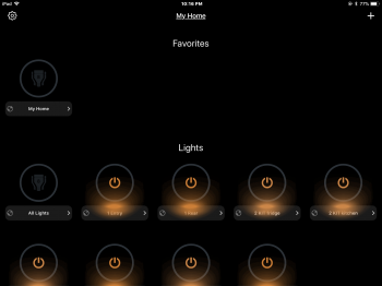
Here’s the LifeX app for controlling LifeX lights. I would venture to say, had this app been designed before 2013 before Apple made it embarrassing for developers to model a life-realistic looking app, I bet the developer would have logically arranged lights in a more space saving manner, if not allowed the user the ability to arrange lights as to model their actual room as looking from above, for quick, intuitive light control. Instead, we’re stuck with a circular icon flat app with no ability to logically arrange things for intuitive use. But at least we have Apple’s circles amongst a lot of wasted space that could be used more smartly and not require the user to constantly scroll up and down.

C17E976C-72B2-461F-B753-C7FEF087717D.png

Therein lies perhaps the root of why Apple’s devices no longer feel like they just work. Almost every aspect of their UI in iOS is unintuitive and requires more steps than before to do the same action. It’s almost as if Apple is scared to produce something that looks realistic and intuitive, closer to how things were with iOS 6 as if that would be an insult to the user, and it is just ludicrous and out of hand.

When using Safari, the address and upper controls hide away, having to tap once to access them before being able to use them, rather than showing them all the time. (which is downright silly as screens get bigger)

When using Apple’s newer macbooks, you have to first purchase, then tote, then use dongles repeatedly while Apple is trying to forceably accelerate their simplified way of doing things.

As mentioned earlier, it often takes guessing if not Google searches to figure out certain functions.

I could go on and on, but the extra steps required to use Apple’s items nowadays due to reduced hardware interfaces and hiding of controls within an already unintuitive app UI interface just to maintain lots of wasted open space on devices with less easy usability then the previous year are just too frustrating at times and feels like too much extra effort is expended too often to make things work.
 
Last edited:

maflynn

macrumors Haswell
May 3, 2009
73,682
43,740
I miss thinking and hearing "it just works” in regards to using Apple products.
You know that was just a marketing statement and the old apple was not nearly as perfect as people make it out to be. I'm not down on apple, but rather people look back in hindsight and see something that isn't there.

From 2004
Apple iOS 9.3.3 Has A Nasty Surprise

Form 2002
Defective Powerbook G4 Paint - Titanium

Apple like any other manufacturer has had issues in both hardware and software, and I recall people complaining back in 2000 when the G4 cube was rolled out that it cracks in the clear plastic, Steve Jobs called them mold lines, but they were cracks

We tend to look back at history and reminisce at how great it is, because its human nature to forget the issues and problems
 
  • Like
Reactions: s15119 and Tozovac

Tozovac

macrumors 68040
Original poster
Jun 12, 2014
3,034
3,233
You know that was just a marketing statement and the old apple was not nearly as perfect as people make it out to be. I'm not down on apple, but rather people look back in hindsight and see something that isn't there.

From 2004
Apple iOS 9.3.3 Has A Nasty Surprise

Form 2002
Defective Powerbook G4 Paint - Titanium

Apple like any other manufacturer has had issues in both hardware and software, and I recall people complaining back in 2000 when the G4 cube was rolled out that it cracks in the clear plastic, Steve Jobs called them mold lines, but they were cracks

We tend to look back at history and reminisce at how great it is, because its human nature to forget the issues and problems

Thanks for the reply!

Oh I so disagree! I wasn’t saying Apple made no mistakes before recently. Also, note your one link is from iOS 9, where the heart of my gripes is that using Apple products is generally much less fun and less easy and less intuitive (less “it just works”) starting with iOS 7 after Steve died and around the time Scott Forstall was fired and Jony Ive was elevated to stick his hands into software and started a war against physical interfaces/ports.

I’m quickly realizing that I should have added a qualification statement initially, regarding the time period and design elements I’m referring to, for when things suddenly felt like they “no longer just worked.”

To me, “It just works” was not just a marketing statement, it was a feeling that I and many had when first using OSX after coming from Windows, when using an iPod for the first time compared to the half dozen MP3 players I’d used before, when first using an iPhone after a Palm or Blackberry or other smart phone, when first using any of the many new apps I’d try on my iPhone or iPad before iOS 7. Using an Apple device was plain intuitive across the board and plain just worked for me and anyone I knew.

Contrast that with what we have today where the UI is significantly less clear, less “guiding” and less intuitive just to look a certain new, reinvented way, where many including myself need to google how to make something in iOS work too often now (which I think should be shockingly shocking to more users since we all should be getting better at navigating mobile apps than more confused), and where most all apps are set up in a flat design / lots-of-empty-space / buried-function / Apple-look (forced adherence to round white circles in configurations more about a clean, arranged appearance than a functional sense), where too often as I’ve shown above for the “new and improved” simplisafe app, things are generally much less convenient, easy, intuitive, and well-laid-out than before.

Heck, even when typing this reply on my phone in safari, the screen does not shift to where the cursor is in view when the keyboard appears, nor does the text entry box bounce/move up each time I type to the end of the available space in the window; I have to stop and manually scroll up the screen as I type every time I reach the bottom of the screen. I really do not recall that type of clumsiness and lack of attention to detail towards the user experience before.

Nor do I recall so many adjustments and reinventions between iOS updates (you know, MSWindows’ calling card) before 2013, where Apple iterates and re-re-invents pretty often nowadays trying to make things work better and fix obvious goofs while remaining self-constrained within the 4-year old UI that was redesigned to be more about a certain new, clean look than about robust, intuitive function.

More steps required to do what used to be automatic if not require just one step before.

Whether “it just works” was said by customers themselves as we moved from things like Windows or Palm phones or Blackberries or after hearing it said on Apple commercials or by friends, it was said often then and never nowadays. In fact I think (and hear from others) things more like: why is it like that now! How do you make this work??

I still have the screenshot of a text message from my mom exuding utter frustration and anger over the reinvented iOS 11 podcasts app that she couldn’t get to do what she needed it to do. It was sadly priceless but also a sad statement of where we’re at too often. She just threw her hands up and gave up, moving on to the Overcast app, following my lead since I too was unhappy wrestling with googling how to make it do what I wanted.

Whether some adjust to and/or prefer the new post-iOS 7 look and gradual removal of physical interfaces (home buttons, swipe to unlock, ports, MagSafe, headphone jacks, hinged trackpad, physical function keys) is a completely separate thing. And of course, that magical feeling of surprise and delight 5-10 years ago when first using iPods and iPhones can not be felt forever. However, if the iOS UI retained that intuitive form-over-function mode as before iOS 7, and if MacBooks weren’t on a path towards zero ports, and if I didn’t need to often google how to do something in iOS, and if nobody shouted “it just works” any more, that would be perfectly acceptable to me. What’s not acceptable is the feeling “it just doesn’t just work” anymore like it worked as cleanly, easily, and intuitively before 2013.

You don’t agree at least some? :)
 
Last edited:

tkermit

macrumors 68040
Feb 20, 2004
3,586
2,921
I miss thinking and hearing "it just works” in regards to using Apple products. There are too many increasing instances of things just not working as easy as they used to.

Anyone else?
Sure. I also agree with a lot of your iOS UI criticism. But there's nowhere else to go, is there?
 

Tozovac

macrumors 68040
Original poster
Jun 12, 2014
3,034
3,233
Sure. I also agree with a lot of your iOS UI criticism. But there's nowhere else to go, is there?

Sure there is - blow the dust of the Apple UI principles kit created after decades of learning that was in place prior to iOS 7. Just refine it with lessons learned and adjustments to accommodate increased complexities from asking a phone/tablet to do so much more than back before mid-2013. Feel free to keep the stitched leather in the vault; those of us who sorely miss iOS 6 didn’t need a compass to look like it was from 1492 (as nice as that looked) but we sure miss intuitive function-first UI’s designed for efficient and fun use.

But that’d be an obvious approach only if Apple magically returns to prioritizing function and user experience over Jony’s fashion whims and the "keeping up with the Androids" look.

But with Apple’s obvious shift towards minimalism and trendy changes first with so little regard to hits on function, I remain so morbidly curious to see how Apple pivots when Jony and the marketers feel a need to reinvent again; what was new in 2013 will obviously “feel old” eventually to those who fail to recognize that certain basic principles based on human nature can’t really be reinvented just because they want to see a change. If what we had before 2013 was arguably much more intuitive and pretty/detailed, while what we have now is arguably much more unintuitive and stark/plain (even as Apple slowly reverts some iOS UI elements back towards iOS 6-esque UI, righting certain lingering iOS 7 wrongs), what will Apple do next? Keep morphing back to good functional UI (since there’s no way in hell Jony will admit a lot of his decisions just weren’t good) until what we have is a far cry of iOS 7 to 11...or upchuck a third radical unnecessary change for the sake of change, bolstered by thoughts as some members here have carelessly said, “completely new features need completely new ways of doing things.”

I’m cautiously curious (and scared) to see if Jony pivots (and how) or if we’ll be stuck with the flat-design unintuitive iOS UI till he’s gone.
 
Last edited:

Mousse

macrumors 68040
Apr 7, 2008
3,648
7,082
Flea Bottom, King's Landing
Early versions of iOS had minimal functionality so the interface and options were simpler and more direct. Software and OS get older and more mature, they have more features and capabilities so, the interface becomes more complex.

When features become more complex they outgrow the old interface and eventually a major shift is needed in the arrangement of the interface.
In other words, BLOAT. It's the same with OSX after Snow Leopard. Apple just started adding more and more functionality (a lot of which most users never use) which gobbles up more resources. In turn you need a faster machine to run said OS. It's how they get you to buy the newest model with the go faster stripes.:rolleyes: This is why I'm content with sticking with older software.
 
  • Like
Reactions: InuNacho

iisdan

macrumors 6502
Feb 19, 2010
322
368
I think Apple is at the top of their game with "it just works"

Especially with Airpods. Dongles are just a transition element, going to wireless is a hard process for old tech but it's a much better "just working" experience once we get there.
 
  • Like
Reactions: Daekwan

Tozovac

macrumors 68040
Original poster
Jun 12, 2014
3,034
3,233
I think Apple is at the top of their game with "it just works"

Especially with Airpods. Dongles are just a transition element, going to wireless is a hard process for old tech but it's a much better "just working" experience once we get there.

But how do you like the current flat-design minimalism iOS and fisher-price-looking OSX? And the slow but steady eradication of physical buttons & ports on macbooks & iphones which used to provide user flexibility & convenience? This conversation was meant towards the UI & overall interaction with Apple products. I mistakenly added a reference to dongles and inadvertently suggested this is about headphones. :) As for the move to wireless and dongle-freedom, I don't see any near-term low-cost alternatives coming anytime soon for transitioning to wireless recharging for macbooks and/or fast wireless external disk drives, so once again, this war on buttons/ports is coming down the pike a bit too fast and furious for me at least. So is Apple really at an “it just works” Nirvana we all felt in 2007?

Now if each iPhone came with 4 airpods to keep at home, in the car, at work, and in the garage and with adapters for easy connection to all dozen radios I have with 1/8" headphone jacks and didn't risk costing me anther couple hundred $$ on top of an already over-priced phone that's likely to crack within 3 years or be painfully slowed down by Apple's annual "improved" iOS upgrades, I might be less unhappy about the whole headphone thing.
 
Last edited:

vkd

macrumors 6502a
Sep 10, 2012
981
377
Yeah, I feel trapped in time with this mid-2011 iMac, as since this model things have actually just degraded. You may say, oh but now they have 5K screens and SSD. Well, I too have an SSD because I can open up my iMac and modify things a little, which 2012 onwards cannot without tricky operations and so forth. I can swap out my processor, gpu, storage and memory all with little difficulty. I don't feel any pressing need to have 5K yet, though its good to know that it is out there. I have an infra-red sensor too behind the black Apple icon on the 'chin', so I can use a cute little white Apple Remote to control video and audio whilst I lay back at a distance to enjoy multimedia content, and for me these are all priority items that I am very hesitant to give up. OK you may say I can buy a USB infra-red sensor and stick it on top of the screen, but doesn't that defeat the minimalistic Apple design aesthetic? If I wanted bits and bobs hanging off everywhere I would just build a PC or a Hackintosh. Which reminds me of the other big degradation in present lineup of iMacs, fan noise.
 

jgdeschamps

macrumors 6502
Dec 18, 2012
317
372
Fair enough but would you not agree with two things which I feel is at the heart of my issues.

1) The early iOS/UI used intuitive cues to guide the user, certainly partly because touchscreen phones doing complex things were a new thing to the masses, but also because there are certain common sensical cues in life that make sense for a reason, namely differentiating "actionable" items from "informational" items. Typically an actionable item could be given a 3D look or a button look or an embossed look, etc, or placed within an area colored differently than "content" or "info only" areas, to differentiate "actionable" from "FYI." That type of UI strategy was not about fashion, nor was it a dated strategy but rather based on common sense / intuitiveness. However -- and it's even more poignant when offering more and more functions as you acknowledged -- the current Apple UI's went to a more flat, mono-chromatic look that clearly allows actionable items to blend in together often too well with the content areas. On top of that, there's more hiding of functions behind ellipses, hamburgers, and 3-dot icons that often require hunting and guessing to figure out. I disagree with your statement about complex features needing a major shift when the shift is toward something much less intuitive. Should it be acceptable that increased complexity be coupled with decreased obviousness/intuitiveness of UI?

2) Too many apps (especially iOS) seem to go thru changes that were completely unnecessary. Best example is the iOS 11 podcast app. I know of no friend or relative who liked the change nor stuck around long enough to figure it out. Most have moved on (I use a 3rd party app, Overcast, for podcasts for the first time). Similar thoughts for iTunes 12 that left me frequently mis-tapping and confused how to do things that were just simple before, where the only added complexity was from Apple's unnecessarily reworking the interface into disarray, and not because of a radical amount of new features.


Sure, I don't disagree with most of that. But regardless of whether you agree if the current port set (usb-c, no headphones, no magsafe) makes 100% sense for your usage style, would you not agree that there's the chance of going too far too quickly, or just too far? I do think Apple's crossed the line a bit too aggressively with the headphone/magsafe/usb route for the common user, sort of like teaching your 10 year old child to drive your car. Would be nice to check back here in 5 years and see if what's shocking today on the MBPro is commonplace, but Apple's coupling a radical shift in UI/software toward the more-plain, less-user-helping-intuitiveness strategy with a rapid reduction of hardware-ease-of-use (iPhone home button, headphone jack, magsafe/usb-c/headphone-jack) seems to be an awfully overly aggressive strategy, especially the plaining-down-of-the-UI while asking the device to do more than ever each year.

The thing I keep coming back to is: consider the design exercise (that all good designers should consider) of extending your current path or idea or concept further in the same direction, for argument's sake. For removal of the iPhone home button, for the macbook usb-c strategy and offering less flexibility of physical ports...how much could be too much to remove before it's just noticeably clumsy to use a product without having to invest in more hardware (wireless headphones, usb-c hardware, magsafe/usb-c adapter) and/or having to tote around extra cables/dongles/hardware just to stay flexible within today's (and likely the next 5-years) world? I often need to charge my iPhone while wanting to port out music to speakers in my garage, work desk, friend's house, or any of the dozen headphones I have out & about while not wanting to tote wireless headphones or cables or a splitter for charging/headphones.

iPhone's fragile design and the macbook designs are all about looking good without a case and standing alone, yet every port removal results in costing the consumer not only extra $ but extra hassle to carry something around to add back the flexibility that makes a device so fun to have.

Just feels like we're dangerously in the stage of gilding the lilly...lots of unnecessary plastic surgery. A parting thought for the moment: Computers/internet saw radical change in the past 20 years, then even radical change within the past 10 years for mobile devices. There's an ongoing assumption, maybe even expectation that radical change must continue. Couple that with Apple/Jony Ive's obsession with minimalism/removing things (intuitive UI cues, headphone jack, magsafe, usb/ports, home button, touch ID, physically-hinging trackpad that I find to be much more satisfying with better feedback) that may not be as low-hanging fruit as were things like optical drive, ethernet port, scsi ports, etc), and it begs the question of: when will be too much? What happens when there are no ports left, even for wired-charging....what will Jony focus on? How much as the violin improved in 100+ years? What new musical instrument has appeared in the last 50 years that will stand the test of time? Sometimes, you run out of "new" opportunities...things to remove from an Apple device... I think we're right in that period while I think Apple thinks that time will never arrive. Thus, I feel much of my Apple hardware & software feels less so easy, so less "it just works" than 5 years ago.

Am I alone?

The problem you present here (judging by the way you expressed it) is based on the assumption that technology doesn't need to change, and that companies like Apple just take out components for the sake of looking good and saving costs.

What will happen if within a 3-year time frame somebody releases a viable and cost effective holographic technology to display your computer UI? That will surely completely change the way you interact with digital data, leaving all types of complaints and criticisms for current UI as obsolete as the UI itself. You are asking measurements based on a constantly evolving and changing scale.

My opinion: These companies are the ones setting how computers work, wether we like it or not. Even if you build yourself a computer, you have to choose which OS you will use depending on what you do, and you'll build it based on requirements set by someone else... just let go with the flow and keep on evolving your workflows and device usage with the tech. Otherwise, you'll end up using Macs and iPhones from 2008 because they were simpler and more stable. Don't see a problem with that, except for getting spare parts when they eventually fail.
 

Easttime

macrumors 6502a
Jun 17, 2015
701
503
More frequent OS updates, Apple Watch stops unlocking my Macs until I reboot, wires all over my desk: three examples of why the shine is a bit off the Apple for me. But the ecosystem integration is magical most of the time. And I would hate to return to Windows from the Mac OS.
 
  • Like
Reactions: Tozovac

Mousse

macrumors 68040
Apr 7, 2008
3,648
7,082
Flea Bottom, King's Landing
Don't mention that word in the Android community.... You'll never hear the end of it.
Aye. That is the reason I use custom ROM. 4gb is required just to run some of those bloated factory ROM.:mad: I prefer the barebones version and add features I use. I pretty much have no choice since I use a 5 year old phone.:oops:
 
Register on MacRumors! This sidebar will go away, and you'll see fewer ads.