Become a MacRumors Supporter for $50/year with no ads, ability to filter front page stories, and private forums.

djsound

macrumors 6502a
Original poster
Dec 4, 2006
791
17
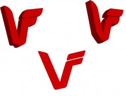
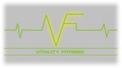
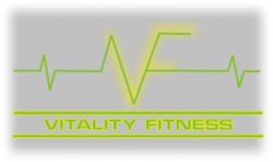
Ive just started a new fitness company called Vitality Fitness. I have been fooling around with Illustrator cs3 for a few days and came up with the attached file. Problem is I want it to kind of feel 'organic' maybe with wavy lines or swooshes. I don't like the straight lines....this is only the logo part . It will say the name next to it but I'm not really worried about that , only the logo. Any ideas for you pro logo designers>? :eek: ( the 3d of it is only for fun)

obviously I'm trying to have a 'V' with F part of it..
 

Attachments

  • test.jpg
    test.jpg
    44 KB · Views: 153
I think where your headed is good, but I think you should make the "F" part larger
 
I was thinking I wanted "vitality" to be the focus....the "fitness" is kind of a description...I just don't want the F to be the focus..maybe I am wrong though..
 
less linear

Its very linear and feels like its trying to hard.

If you're going for organic, and if this is not going to be monolithic corporation and you don't want it to look like one, I'd suggest starting fresh and drawing inspiration from proportions found in nature (google "golden ratio") and the human body - perhaps referring to De Vinci's work as well.

Right now it looks too much like everything else out there in the fitness industry. How will you differentiate yourself?
 
Just a thought, but I'd think about using a solid color rather than what you are using now. It looks nice but from a practical standpoint a solid color would hold up better when reduced for business cards or photocopied or scanned or put on the web at different sizes.
 
I would actually suggest staying away from having the F be a part of V. Looks too much like an inversion of the Van Halen V (unless that's what you're going for).

Just a thought.
 
If you're going to be taking your new business seriously, have you considered hiring a professional to get the you the result you need?

I've nothing against you doing it yourself, but you have to realise that a well designed logo and supporting items can add unimaginable value to your business. Not done right, it could cause immeasurable damage.

I agree with this
 
Use the spaces just above the earlobes

I've nothing against you doing it yourself, but you have to realise that a well designed logo and supporting items can add unimaginable value to your business. Not done right, it could cause immeasurable damage.

^^ Sad but true. Don't shrug this off as smug advice. ^^

What you are attempting can be likened to a passenger taking over of a commercial aircraft and asking the control tower to help him to reroute the flight to Miami. In the unlikely event the passenger is successful in reaching his destination, things won't look so bright after the plane lands. In the end, it would have been cheaper and more enjoyable to purchase a first-class ticket.
 
I had a few minutes and thought I'd help you out. The arm is in the shape of a V (expressing the big V you wanted). Vitality is in red (blood, etc. etc.) so it pops.

Figured even if you do choose to go the professional route (which you should as others have already commented on), if you like this concept, you can have something to show them as a mock up.

Good luck. ;)
 

Attachments

  • logo.jpg
    logo.jpg
    32.1 KB · Views: 123
If you're going to be taking your new business seriously, have you considered hiring a professional to get the you the result you need?

I've nothing against you doing it yourself, but you have to realise that a well designed logo and supporting items can add unimaginable value to your business. Not done right, it could cause immeasurable damage.

I totally understand!. In fact I do not even want to be doing this. :eek: I just dont have any more money to go into it right now. I already have clients waiting. I just need things like business cards with contact info to give to them. I can even go back later and pay a professional to design it but for the next weeks I am on my own. I just need to get it goin...Know what I mean?
 
Totally :) Just wanted to throw it in there. I wish you the best of luck. I'll hopefuly have time later to add some more useful comments :rolleyes:

/Doug
 
I totally understand!. In fact I do not even want to be doing this. :eek: I just dont have any more money to go into it right now. I already have clients waiting. I just need things like business cards with contact info to give to them. I can even go back later and pay a professional to design it but for the next weeks I am on my own. I just need to get it goin...Know what I mean?

If you can't afford the cost of a professional to design your logo... then don't use one. A nice type face and a decent tag line is probably all you need to get started. Budget for a complete identity design (logo, business cards, stationary, and maybe a website design) when you feel confident that the business is going to take off. If aren't able to raise the money to develop your brand, then you should reconsider staying in business.
 
"you should reconsider staying in business"?......wow thanks for the tip Bill Gates. I was just seeing what other artists might think of my ideas. You know , maybe a little constructive criticism. This was not meant to get to in depth about business etc. My business is based on health & fitness, not my logo. Of course it helps to set the right "image" but people come to me to be trained not get graphic design done. I have a huge network of friends/clients and my business will do just fine with or without a logo, so I don't think I'll "reconsider staying in business". Thanks though...

...so now back to the logo for anyone else that cares or is bored...:)
 
What you are attempting can be likened to a passenger taking over of a commercial aircraft and asking the control tower to help him to reroute the flight to Miami...

Hahahahaha come on.... I can't help myself clicking on anything that says "help me with my logo" for the absolute rubbish that some 'designers' spout. But, designing your own logo is like landing a plane!? Hahahaha Oh dear....

Anyway, to the question you actually asked... two simple but possible options you could look at:
1. If you're looking at organic you could make it flat and use a brush style effect –*keeping the VF idea as you have it. The lines on the V would be pretty straight but the two horzontals coming off would be like paint strokes which deteriorate at the ends.
2. Use a chunky hand drawn VF in white and place on a red ellipse shape, the letters bleed out of the shape – making an ellipse with a negative 'VF' inside it
 
If you can't afford the cost of a professional to design your logo... then don't use one. A nice type face and a decent tag line is probably all you need to get started. Budget for a complete identity design (logo, business cards, stationary, and maybe a website design) when you feel confident that the business is going to take off. If aren't able to raise the money to develop your brand, then you should reconsider staying in business.

Exactly... If you do not market yourself you will fail... Do it yourself amatuer hour simply will not cut it. I know that was harsh, but it's 100% true. That being said...
 

Attachments

  • vf.jpg
    vf.jpg
    7.1 KB · Views: 2,526
this may be better if it will attach)... sorry for the quickie...

good luck!
 

Attachments

  • vf2.jpg
    vf2.jpg
    8.8 KB · Views: 2,523
I would actually suggest staying away from having the F be a part of V. Looks too much like an inversion of the Van Halen V (unless that's what you're going for).

Just a thought.

So glad I'm not the only one who saw that... great to know there are still VH peaople out there too!
 
last try... sorry, I can see it, just can't make it work...
 

Attachments

  • vf3.jpg
    vf3.jpg
    9.1 KB · Views: 2,507
Not to be rude, it's just not professional. Part of being taken seriously and merit skill/expertise for a set price is defined by professionalism.

The first point of contact for ANY prospective client is the branding, this determines how your business is perceived, being fun, athletic, corporate, etc...

I had the luxury of rebranding a set of 5 gyms about 18 months ago and I can say without a doubt 90% of potential client base membership upon the style of the logo, graphics and colours representative of the organisation.

Although I cannot print the qualitative and quantitative research good design in the company is a high priority and directly proportional to how much a client is willing to spend. A better designed brand positioning will attract more money, case in point is with the Sony Ericsson phones until they brought out a slick logo, solid campaign and added "walkman" to the phones they sold 30% less at 30% of the cost.

My advice is to have a solid idea of the type of style you want for your company and go to a professional, they will be able to inject the "wow" factor without you needing to waste time that would be better spent elsewhere in operations.
 
Register on MacRumors! This sidebar will go away, and you'll see fewer ads.