Got a tip for us?
Let us know
Become a MacRumors Supporter for $50/year with no ads, ability to filter front page stories, and private forums.
I need some design advice
- Thread starter ghall
- Start date
- Sort by reaction score
You are using an out of date browser. It may not display this or other websites correctly.
You should upgrade or use an alternative browser.
You should upgrade or use an alternative browser.
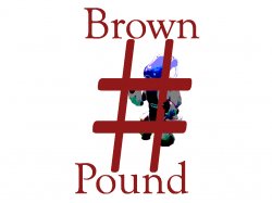
As someone who has no clue what a "RoboCup" is, it's really hard to tell what's behind the "#" symbol. Looks like some sort of robot.
Also, if the RoboCup is an international thing, I'd suggest against using the "#" symbol if you're expecting everyone to call it a "pound" sign. Outside the US it's called all variety of other things. The UK, for instance, already has a "pound sign" that isn't a "#" That makes your "Brown Pound" joke fall flat if the person has a different word for the hash symbol or octothorpe.
Also, if the RoboCup is an international thing, I'd suggest against using the "#" symbol if you're expecting everyone to call it a "pound" sign. Outside the US it's called all variety of other things. The UK, for instance, already has a "pound sign" that isn't a "#" That makes your "Brown Pound" joke fall flat if the person has a different word for the hash symbol or octothorpe.
As someone who has no clue what a "RoboCup" is, it's really hard to tell what's behind the "#" symbol. Looks like some sort of robot.
Also, if the RoboCup is an international thing, I'd suggest against using the "#" symbol if you're expecting everyone to call it a "pound" sign. Outside the US it's called all variety of other things. The UK, for instance, already has a "pound sign" that isn't a "#" That makes your "Brown Pound" joke fall flat if the person has a different word for the hash symbol or octothorpe.
There is nothing behind #, it's a pun. A bad one at that, but don't take it up with me, I'm just doing what I'm told.
")
By the way, I should have been more specific with what RoboCup is. http://robocup.org/
There is nothing behind #, it's a pun. A bad one at that, but don't take it up with me, I'm just doing what I'm told.
No, no, no. I mean literally "behind" in your logo. The "#" is completely obscuring the robot (?) that's behind it.
My other point about the naming of the "#" symbol was a second point -- that your pun doesn't work for a lot of people who have no idea that "#" is called a "pound sign" here in the States.
i.e. you'll have to do a second version of the logo with a £ sign instead of a # sign when your team visits the UK for RoboCup tournaments there.
The colors also look very weird, was that intentional? Like it's using a badly-mapped 8 bit palette instead of all the colors it ought to have.
No, no, no. I mean literally "behind" in your logo. The "#" is completely obscuring the robot (?) that's behind it.
My other point about the naming of the "#" symbol was a second point -- that your pun doesn't work for a lot of people who have no idea that "#" is called a "pound sign" here in the States.
i.e. you'll have to do a second version of the logo with a £ sign instead of a # sign when your team visits the UK for RoboCup tournaments there.
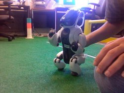
I attached the original photo I took. It's a robotic dog.
The colors also look very weird, was that intentional? Like it's using a badly-mapped 8 bit palette instead of all the colors it ought to have.
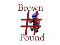
Yes. They didn't want a photo, but a very simple image. I tried a silhouette, but it made the dog unrecognizable, even by the people who knew what it was supposed to be.
I would also loose the #, and make the robot a little bigger, with a different font.
The # is the whole joke. I know it's stupid, and doesn't make sense outside the US, but I'm just doing what I'm told. I will bring it up with the team though.
I have also attached a slightly updated version
Attachments
The # symbol representing the word "pound" is wrong for this logo design IMO, and is not at all clever or symbolic.
"Doing what you're told" is not a part of logo design; listening to the clients ideas and requirements, then creating a viable and clever solution is.
Logo design is probably the most difficult aspect of graphic design.
It would seem appropriate for this logo design to convey the tech/robotic nature of this competition, either through appropriate font selection, letter substitution, or the development of a simple icon representing the amalgam of robotics and soccer.
The pentagonal shape of the soccerball segments would be one direction you could explore.
The final logo design should be simple and instantly recognizable at a distance.
ie: The Dallas Cowboys score a perfect "10" for their 5 pointed star logo; the Detroit Lions get a "2" for the nondescript-lion-thingamabob.
If it was in the UK it would say 'Hash Brown'.
Brilliant!
snickelfritz said:"Doing what you're told" is not a part of logo design; listening to the clients ideas and requirements, then creating a viable and clever solution is.
This is so very true. Much of design is knowing when (and how) to tell the client that the reason you're doing the work is because they don't know how.
The logo looks more like a riddle then a logo. A logo should be clear and not leave you scratching your head trying to piece the message together.
The # symbol should really go. I had no idea what was going on at first, I thought - Brown - Number - Pound.
The # symbol should really go. I had no idea what was going on at first, I thought - Brown - Number - Pound.
This is a good example of someone who can't design and takes the crappy pay that companies offer and real designers struggle to find a decent paying job.
This is a good example of someone who can't design and takes the crappy pay that companies offer and real designers struggle to find a decent paying job.
Actually, I'm not getting payed.
This is a good example of someone who can't design and takes the crappy pay that companies offer and real designers struggle to find a decent paying job.
what i think is that good, talented, professional designers get plenty of work doing real projects, and that the high-school amateurs doing freebies (no offense, ghall) for local non-profit college clubs are in no way are competition for "real" designers.
what i think is that good, talented, professional designers get plenty of work doing real projects, and that the high-school amateurs doing freebies (no offense, ghall) for local non-profit college clubs are in no way are competition for "real" designers.
No offense Ghall, i didn't realize you are in high-school. You're getting some practice work then. Play around with position of those elements more. All elements don't need to be 100% of it's color or 4 Color. Look online at logos. Is it really a logo they are using it as? Ask how it's being used. How small will it be?
Pound as in pummel; pound as in dog-pound is emphasized with a dog robot of equal weight to the sign. Unless the pound sign is immediately recognized as delete, purge, or better, terminate in programming, lose it.
If your "clients" absolutely require a pound sign, put it on a boxing club or hammer with a small flattened robot underneath the glove or hammer. You want to emphasize the "pounding" not the "poundee".
If your "clients" absolutely require a pound sign, put it on a boxing club or hammer with a small flattened robot underneath the glove or hammer. You want to emphasize the "pounding" not the "poundee".
Register on MacRumors! This sidebar will go away, and you'll see fewer ads.