Become a MacRumors Supporter for $50/year with no ads, ability to filter front page stories, and private forums.

zerocustom1989

macrumors regular
Original poster
Sep 5, 2007
247
22
Hey guys,
I've come here occasionally for some design advice, and now im back!

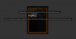
I'm working on porting my iPhone app to the iPad and I wanted to make it feel like the user was holding a small chalkboard in their hands. (granted it doesn't work like a chalkboard at all, but still...)

I've had a problem with appropriately displaying the title of the application('Fourpoint') and styling the two buttons that are on the upperright corner of the frame. ('options' and '+').

I've hit a wall and I could use some input.

Here's a pretty small image of the interface.
[same image from my recent post]
Screenshot2011-01-09at102831PM.png


Thank You.
 
Last edited:
No idea how your app works or what it does, but it would be kinda cool for you to put "options" on the left part of the frame and "+" on the right part, making those whole parts of the frame clickable buttons.

As in the two vertical pieces of your wooden frame would be clickable, with one being options and the other the +. Also you could write "options" going down like
o
p
t
i
o
n
s


to still have it say options. Just my 2 cents :)
 
No idea how your app works or what it does, but it would be kinda cool for you to put "options" on the left part of the frame and "+" on the right part, making those whole parts of the frame clickable buttons.

The app is a GPA calculator. It exists on the store now in its iPhone form:
http://itunes.apple.com/app/fourpoint/id383417299?mt=8
(that link wont open in itunes)

I think your Idea is pretty neat, though I'd worry about accidental taps...

I was trying to follow apple's Calendar App aesthetic with the buttons. I was also trying to stay similar to my iPhone design so existing users would feel comfortable.

At this point I think i'm just looking for advice on how to design the buttons to make em look like they fit well. (granted, making the frame the buttons would qualify, so thanks for that input!)
 
I know you didn't ask for this advice, but I'm going to give it anyway...

I'm not sold on the chalkboard idea. I get what you're trying to do with it, but why take up all that real estate on bad wood grain? According to my calculations it takes up nearly 25% of your available working area. IMO, that 25% would put to much better use enlarging and cleaning up your actual content, and giving the various elements more margin would make the whole thing easier to read. There's more to be gained with a clean, modern, organized and readable interface than one that trades that in for a wood frame.

But again... that wasn't the advice you were seeking.

My bad.

That's all valid input. When transitioning from iPhone to iPad I knew i'd still be displaying things with tableviews. I also knew that the iPad would offer way more space than I needed. The frame was actually a way for me to get rid of some space. Without it I worried that the application would just feel empty.

Apple, with their address book and calendar applications, sort of used the 'realistic' design idea to fill in space with some detailed graphics. I decided to take an approach like that.

Readability doesn't really take a hit to much (I dont think). The screen shot is 50% the size of the iPad interface.

The wood grain comment hurt the most, I have no idea what to do about that. wood grain advice?

Here's the updated buttons that I'm pleased with.
[Image removed, see below]

To those viewing the thread who dont think they have any 'advice' I'd love to hear your opinions too. This is a near-final appearance image.
 
Last edited:
To those viewing the thread who dont think they have any 'advice' I'd love to hear your opinions too. This is a near-final appearance image.

For some reason, I don't like the frame within a frame design for the two sections at the top of the screen. Maybe a messily drawn white chalk-outline would act as a better border.
 
For some reason, I don't like the frame within a frame design for the two sections at the top of the screen. Maybe a messily drawn white chalk-outline would act as a better border.

hmm I like that, so I'll sleep on it.

I think I'd end up only changing the 'inner-frame' on the right side though since the green frame is swipe-able; I like the distinction the smaller frame makes there.
 
Oh, and one more thing. I have some other recommendations in the attached IMG. Let me know if they make sense.
 

Attachments

  • Screen shot 2011-01-08 at 9.48.08 PM.png
    Screen shot 2011-01-08 at 9.48.08 PM.png
    185.3 KB · Views: 104
My 2 cents...

1) Not really sold on the chalk board idea, you can make it look cool with typography without going done the theme route.
2) Bad font choice.
3) Give more spacing around the text, it will look far cleaner and will be easier to read.
4) Typography :)
5) BTW it seems what you're doing is a rather good idea, and do hope it ends up on the app store.
 
Oh, and one more thing. I have some other recommendations in the attached IMG. Let me know if they make sense.

Well, the user as the ability to enable another one of those boxes. If it is enabled all three boxes would be side by side with the two buttons underneath. I felt like keeping the boxes above the buttons even when there were two would be good consistency. Do you think that for the 2box-view I should arrange them as you say, but keep it different for 3 boxes?

2) Bad font choice.
3) Give more spacing around the text, it will look far cleaner and will be easier to read.
4) Typography :)

Thanks for number 5! The iPhone version is already out (with all those typography mistakes) so im confident this iPad inclusive update will be approved as well.

I'm a senior computer engineering student so design is really just a side hobby of mine. I know nothing about how to use typography well. I just chose a font that looked like it was hand written to go with the whole chalkboard theme.

Which fonts need improving(im guessing the handwritty-ones) and what could use better spacing (You guys are saying spacing but I dont know what)? Typography is a big empty area for me so I'm up for anything really.

[I'm gonna keep my frame damnit!]

Here's an updated image. (I was asking about the frame in my OP post and I've been making other planned changes since).

I attempted to do the chalkborder for the right-hand tableView. (I'll probably refine my implementation of that; I like the idea)

The image includes the 3-box view I mentioned earlier in my post.

[hide]
Screenshot2011-01-09at102831PM.png
[/hide]

Typographical advice requested! (spacing, fonts, etc)
If you even have some typographical theory resources I'd like to see em. (book titles even)

Thank you!
 
Personally I would use Helvetica, it will look far clear than mixing fonts. Also I mean giving the text a little more padding around the information, reduce the font size a little and then add a little more space around the text.

It would be easier to read a look more professional.
 
Register on MacRumors! This sidebar will go away, and you'll see fewer ads.