Lets get the accusations out of the way first: I've used Android alongside iOS since the G1. I more than bought into Google's ideas during the launch of Lollipop and my most recent handset was a Pixel 8 Pro.
My main phone however has been an iPhone for years. I admire the customisation options in Android but always preferred the more, shall we say 'professional' look of iOS. Or at least I used to.
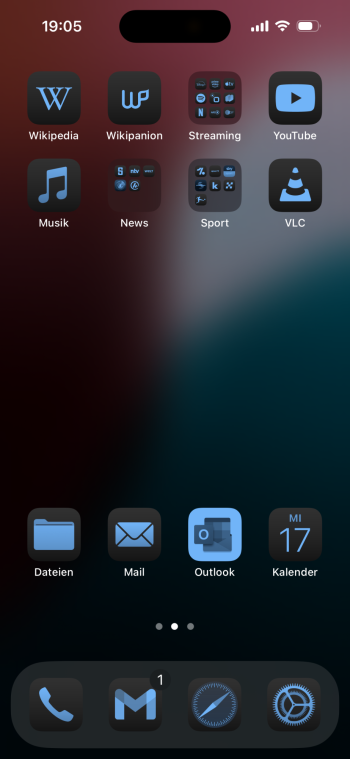
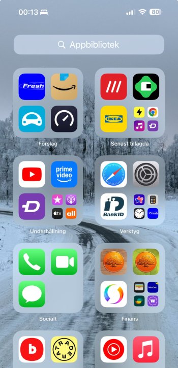
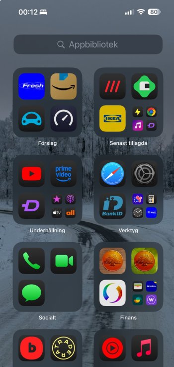
Apple seem to have just kind of fudged in the iOS18 theming options without giving it much thought. The Dark icons are one thing but if you apply a hue across the board it still ends up looking illegible. At the same time the dark icons have an annoying gradient to them rather than appearing as proper black. Given Google has been offering system-level theming for 2 years now I would have thought apeing it would have been easier. I feel we are at a point now where Google are starting to look a lot nicer from a graphic design point of view
Which do you prefer?


My main phone however has been an iPhone for years. I admire the customisation options in Android but always preferred the more, shall we say 'professional' look of iOS. Or at least I used to.
Apple seem to have just kind of fudged in the iOS18 theming options without giving it much thought. The Dark icons are one thing but if you apply a hue across the board it still ends up looking illegible. At the same time the dark icons have an annoying gradient to them rather than appearing as proper black. Given Google has been offering system-level theming for 2 years now I would have thought apeing it would have been easier. I feel we are at a point now where Google are starting to look a lot nicer from a graphic design point of view
Which do you prefer?