Become a MacRumors Supporter for $50/year with no ads, ability to filter front page stories, and private forums.

Which Icon do you prefer?

  • I prefer the Original Trism Icon and would more likely buy Trism if it remained as such

    Votes: 1 10.0%
  • I prefer the New Icon and would more likely buy Trism if this icon was implemented

    Votes: 1 10.0%
  • I prefer an entirely different icon and would more likely buy Trism if it was made to my liking

    Votes: 0 0.0%
  • I prefer the Original Icon, but my buying decision is not affected

    Votes: 4 40.0%
  • I prefer the New Icon, but it would not incite me to buy Trism

    Votes: 2 20.0%
  • I prefer an entirely different icon, but it would not incite me to buy Trism

    Votes: 2 20.0%

  • Total voters
    10

EvryDayImShufln

macrumors 65816
Original poster
Sep 18, 2006
1,094
1
Hey guys

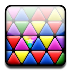
I'm just conducting a little experiment. Trism is obviously a great iPhone game, probably the best I've tried so far. I'm just wondering what everybody thinks of the icon.

The icon is definitely nice and well done, although it doesn't stand out all that much. What I'm assaying is how much more willing people would be to purchase a program based on its icon.

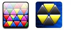
I threw together an new icon for Trism using a gameplay screenshot that I took (mind you, I'm definitely no graphic designer) using Photoshop.

Would a change in icon affect your purchasing decisions for this app? Plus which icon do you prefer? Or even, would you prefer an entirely different icon (and if so what would it be like)?

Thanks! Please reply and leave some comments.

Edit: I realize this thread may seem to belong in the design section, but it is the opinion of the consumers in the App store section that I'm looking for.
 

Attachments

  • Trism Icon.png
    Trism Icon.png
    226.1 KB · Views: 121
  • icon-large 19-45-50.jpg
    icon-large 19-45-50.jpg
    110.7 KB · Views: 93
  • Compared.jpg
    Compared.jpg
    74.9 KB · Views: 83
The icon on the right would be better, because the image is simpler and uses fewer colors, so, will stand out more, esp in the smaller format.

But, yes, I think the icon does play a part to some degree in what apps people choose, just as happens with CDs and labels on wine bottles.

After all, most people who buy Apple products are design-aware, so, it would make sense that a better icon could lead to better sales.
 
I like your icon better but for me icons have no influence on my purchase. It's all about the description and screenshots for me (going by if it was a new app with no reviews to read)
 
I like the new icon, as it represents gameplay a lot more (as opposed to the old 'nuclear waste hazard thing' symbol- it reminds me of that logo, I'm aware they're not the same!).

BUT! I do not base purchases on the icon on the phone, purely because many apps have app store graphics that are different to their home screen icon. So basically, unless you purchase there is no way of telling what icon an App has (which invalidates this thread/poll).
 
I don't like the official Trism icon, it's an awkward shape, especially when surrounded by the square.

Having said that, I would much prefer your icon if it was zoomed in, so you could only see about 6/7 trisms on the screen. There are too many and they're too small at the moment.
 
If I zoomed in any more, my icon would look too pixelated. But if one of you has any higher than iphone screen resolution Trism pics, I could quickly change mine up.

Edit: to Small White Car (I'm posting here because I don't want to excessively bump my own thread)

Thanks for posting, although I had seen your thread before. It's definitely interesting to reread it, however.
 
Register on MacRumors! This sidebar will go away, and you'll see fewer ads.