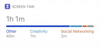
So who is this brainiac at Apple that came up with this complete eyesore on the widget screen of iOS 12? I don't know about anyone else, but the light blue and red/orange colored text overlaying that shade of gray hurts the eyes and is plain hard to see. Not to mention the ridiculous little "Set up Screen Time in Setting" splash that occurs right over the top of everything when you first swipe over to the widgets screen. Wow is all I can really say. How does stuff like this slip through final approval?

Last edited: