Become a MacRumors Supporter for $50/year with no ads, ability to filter front page stories, and private forums.

djsound

macrumors 6502a
Original poster
Dec 4, 2006
791
17
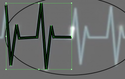
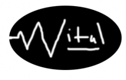
I SUCK at Illustrator haha...I am trying to make a logo for my new business but I am getting nowhere. Some of you guys know it very well so I thought I'd try and get some advice...attached is a picture. I am trying to use the 'heartbeat' as a 'V' for Vital.....what I want is two the heartbeat to actually just be a split in the oval shape..the two parts will be in black.I have drawn the heartbeat with the pen tool hoping that I could split the parts and get rid of some....then straighten them out....if anyone can understand what I am trying to explain....HELP!! thanks guys =) :confused::confused:
 

Attachments

  • Picture 1.png
    Picture 1.png
    59.4 KB · Views: 106
A more descriptive and precise thread title will help cater to the right audience and get you more responses.
To edit your thread title, just click on the
edit.gif
button on the bottom right of your original post and then click the "Go Advanced" button below your message.
 
I'm not entirely sure what you are after, but here is the solution to what I'm thinking you are asking:

Outline stroke for the beat (make sure it is in front of the oval)
Then fill the oval
Then use pathfinder and minus front
 
I did a quick example with Photoshop. Everything white would be transparent. It should also be perfectly straight except I would like ot make the corners a bit rounded since a real heartbeat is not square on the corners...hopefully this clears it up a bit....
 

Attachments

  • test1.png
    test1.png
    38.8 KB · Views: 324
Don't really need to outline the stroke, just go to the scisor icon & cut the line where the oval meets it & the end of the v. click on the lines you dont want & delete.
 
more abstract

I would have less of the EKG readout showing. Push the simplicity of it until it's just barely recognizable as an EKG. Like, have the large "V", then maybe just one smaller "v" before it, or even have just the large "V" with a short trailing flatline before and after it. You'll have to keep the flatline short, or else people will think "his heart stopped beating". So, generally, don't overstate the medical/EKG thing. Don't be literal about visually "describing" the idea. Just hint at it. Also think about getting your type to go beyond the edge of the oval. So the oval would be split by the letterform. Would mean less of the oval showing, and more transparent "white" space.
 
TSD.....great ideas!! Both are very good. I know what you mean about not literally tracing the EKG thing....because I was wondering to myself how I would blend that with a font for the rest of the word....it would probably look weird....and the second idea of the letters leaving the oval...brilliant. I like that kinda stuff.....what about the oval? I kinda of hate ovals..I might try a circle...or something else...ovals remind me of old trucker logos for some reason..or something
 
Register on MacRumors! This sidebar will go away, and you'll see fewer ads.