Become a MacRumors Supporter for $50/year with no ads, ability to filter front page stories, and private forums.

MattJessop

macrumors regular
Original poster
Apr 24, 2007
215
43
Manchester, UK
Ok, I'll admit it. I got bored, so I decided to draw what would be a cool iMac. It's not great :p but I like it.

iMacdesign.png


Please don't hit me on the quality, l drew it quickly. As you'll notice as well, it looks like a iMac G4 with the exception that the spinal column of it is FULLY repositional. Like a microphone stand, if you get what I'm saying.

Btw, please tell me if you think it's crap :p or how I can improve, and I'm sorry that this design isn't MUCH of an innovation, I was just bored like I said :)
 

pjarvi

macrumors 65816
Jan 11, 2006
1,289
190
Clovis, CA
I'd buy it. The only thing missing is an iSight built in to the screen (unless it's supposed to be hidden within the center of the screen, and I just wasn't as forward thinking as yourself ;) ). I don't personally care for the way the screen is attached to the base, as I think it would make it difficult to keep the screen correctly positioned without it twisting (rotating). A 2 part arm system similar to the kind used in many desk lamps would be my choice.

Love the black with blue disc slot lighting. :cool:
 

Dany M

macrumors 6502
Jun 18, 2007
473
2
Earth
Ah, i remember where those scrunchies for the lights down stairs, where you can move it around

Everything else looks nice exept the stand thingy, maybe some real use to it?
 

MattJessop

macrumors regular
Original poster
Apr 24, 2007
215
43
Manchester, UK
Yeah... the iSight.... it's hidden.... err....
>>
<<

*hits head on desk* knew there was summit I forgot to put in.

As for the rotating, that would be intentional I felt, it would be cool to rotate it so you could have it like an A4 document. Of course if enough people disagree. :) I'll change it for next time.
 

shipdestroyer

macrumors 6502
Jun 5, 2007
267
0
New Hampshire
I don't know if microphone stand is nearly pretty enough for an Apple design. I get what you're going for, though, but it makes me question where reasonable adjustability ends and ridiculousness begins.

I think the sunflower design looks awful in black and metal, too.
 

emptyCup

macrumors 65816
Jan 5, 2005
1,482
1
Ok, I'll admit it. I got bored, so I decided to draw what would be a cool iMac. It's not great :p but I like it.
... Btw, please tell me if you think it's crap :p or how I can improve, and I'm sorry that this design isn't MUCH of an innovation, I was just bored like I said :)

Since you're asking for feedback: No, it is not crap. In fact it is better than some of the mock-ups I've seen that are not adjustable. However, it is much like the G4 iMac so many would see that as a step backward. Also, is your flex arm strong enough to support a 24" screen without drooping and still be easy to adjust? I know in your mind it is, but in the real world this would be an engineering consideration.

What I like about the current design is that you can have a large machine on your desk and it takes up very little room. I would miss being able to store the keyboard under the screen. The current design is better than the G4 design in that it can support a bigger screen in a smaller footprint with easier access to the internals. Now come up with a design that is better in some meaningful way to the current design and you will have something. Best wishes.
 

roland.g

macrumors 604
Apr 11, 2005
7,472
3,257
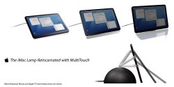
Sorry guys, while the touchscreen version looks better than the OPs, honestly the move back to a G4 style isn't going to happen. I think while many call it the pizza box etc, and dislike the chin, that the current iMac is a natural and necessary evolution in the design. I seriously don't think there will be a move to taking up more desk space which a base does. They will move towards a thinner bezel, less chin, hopefully giving it more of a uniform trim line and possibly a bit thinner. With the coming of Time Machine I would hope that the 20" and 24" models, or at least the 24" may have room in there for a second HDD. That would be a huge benefit. And of course I am partial to the anodized aluminum that encases all the pro hardware (Mac Pros, Cinema Displays, and MacBook Pros) so I would hope to see that transition as rumored to the iMac, though I would welcome black as an alternative to white. I can get past the lack of upgradability (which is where a 2nd internal drive helps) and the the all-in-one aspect if they got rid of the white.
 

Digital Skunk

macrumors G3
Dec 23, 2006
8,100
930
In my imagination
I think it is a good first try mockup... at least you didn't just post some other person's junk... thanks for the original.

If Apple releases something that looks like the iMac G4 I would be surprised... Apple very rarely uses other designs in other lineups or repeats the way things look. They may update the look or make something look better but they very rarely go backwards on designs. The only time I think they have used a former design in a new lineup or update is with the eMac which carried an updated version of the iMac G3.

Good work... keep it up and you will be the next John Ive.

TO: WildPalms... yes... there was a typo
 

WildPalms

macrumors 6502a
Jan 4, 2006
995
2
Honolulu, HI
I think it is a good first try mockup... at least you didn't just post some other person's junk... thanks for the original.

If Apple releases something that looks like the iMac G4 I would be surprised... Apple very rarely uses other designs in other lineups or repeats the way things look. They may update the look or make something look better but they very rarely go backwards on designs. The only time I think they have used a former design in a new lineup or update is with the eMac which carried an updated version of the iMac G3.

Good work... keep it up and you will be the next John Ives.

John Ives? Do you mean Jonathan Paul Ive?
 

sigamy

macrumors 65816
Mar 7, 2003
1,399
185
NJ USA
I have no photoshop skills so I'll ask one of you to mock this up for me...

I see the new iMac as basically a Cinema Display attached to a base similar to the current iMac base. But, the base will be thick enough to include a horizontal optical drive. The base would also swivel 180 degrees, in additon to the current tilt feature.

No chin, much thinner, more elegant. This one would really make you say, "where did the computer go?"

I'd like a memory card reader included in the iMac. I've felt this should have been there from day one of the iMac G5 design. Apple is all about eliminating cables, right?

I've owned every iMac form factor.
http://web.mac.com/brian.andrews29/iWeb/Family/iMacs.html

Can't wait to see the next one.
 

MattJessop

macrumors regular
Original poster
Apr 24, 2007
215
43
Manchester, UK
Thanks for the response guys. Like mentioned, this was just a quick mock up (it was even drawn in Adobe Flash) - because I was bored - I plan on taking the feedback you guys give me, and making something a little bit better :) - and hopefully making something a tad bit more original.

Sigamy, I'm interested in what you described in your last post. Could you possibly just go into a bit more detail on what you mean't? - You mentioned getting rid of the chin, which I'm just unsure of how you mean't it in respect to the Cinema Display style screen. I understand what you mean by getting rid of the chin - just not how that would correlate to the display. Otherwise, it sounds like a good idea :)
 

amc382

macrumors regular
Nov 4, 2003
102
0
nice design... but i think apple will go forward, not back to the g4 design. apparently, that form factor wasn't as popular as people on these boards like to think.
 

caffeeneaddict

macrumors regular
Feb 23, 2007
109
0
i like the designs but like everyone says, Apple won't go backward in designs but probably just smaller than the sizes they have now (smaller chins, thinner overall, etc.) along with SR. like this?
 

Attachments

  • new iMac.JPG
    new iMac.JPG
    49.5 KB · Views: 406

gdesalvo@umail.

macrumors member
May 1, 2007
57
0
I have no photoshop skills so I'll ask one of you to mock this up for me...

I see the new iMac as basically a Cinema Display attached to a base similar to the current iMac base. But, the base will be thick enough to include a horizontal optical drive. The base would also swivel 180 degrees, in additon to the current tilt feature.

No chin, much thinner, more elegant. This one would really make you say, "where did the computer go?"

I'd like a memory card reader included in the iMac. I've felt this should have been there from day one of the iMac G5 design. Apple is all about eliminating cables, right?

I've owned every iMac form factor.
http://web.mac.com/brian.andrews29/iWeb/Family/iMacs.html

Can't wait to see the next one.

You are missing the initial design of the G5 Imac which was a tad fatter than when they introduced the revised slimmer isight imac G5 just prior to the intel switch.
 

Chaszmyr

macrumors 601
Aug 9, 2002
4,267
86
Two comments:
1. It seems like it would be moving backwards, not forwards.
2. imho the iMac G4's neck is vastly better than this one would be.
 
Register on MacRumors! This sidebar will go away, and you'll see fewer ads.