So, I upgraded 5 days ago from a 5-year old iPhone XR to an iPhone 15 Pro. I am overall a little underwhelmed - here's why.
- Design: the 15 Pro is definitely nicer to hold and less slippery. It reminds me of the 5/5S/SE and feels nice in the hand. Alas it is now. in a silicone case (Ryan London leather case arriving later this month) and I can't see that design. The square sides make the silicone case bulkier than the one I had on my XR. However, the ginormous cameras are monstrous. This thing can't be used flat on a table without a case and the cameras are preventing me from using the (rounded square) Anker Qi charging case I have been using for 5 years at work. Big WTF moment when I tried charging it. Finally, I opted for Natural Titanium (which looks like the space grey of the iPhone 6) but I really wish they had fun colours. It's a boring colour. I still have so much regret over buying a black XR instead of a yellow or orange one.
- Cameras: alright, the back cameras are a fair bit better. But compared to my partner's iPhone 13 Mini, I am not amazed. They still look by and large like smartphone photos. Nice to have a zoom but the 3x camera is of noticeably lesser quality. The front camera is... the same I guess? Very grainy in low light. I don't use video much but the XR already had great stabilized video so I am not appreciating the improvements of the Pro fully here.
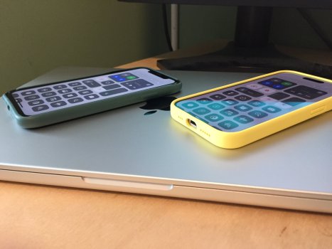
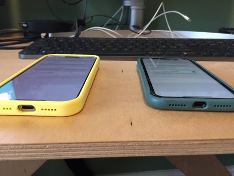
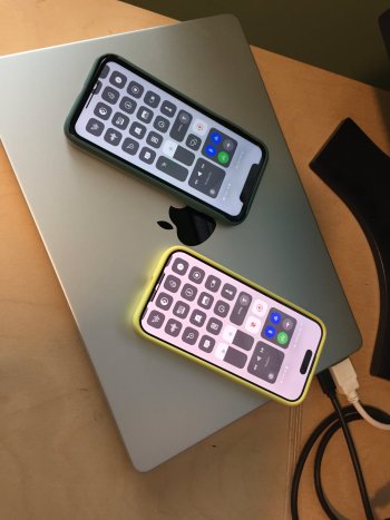
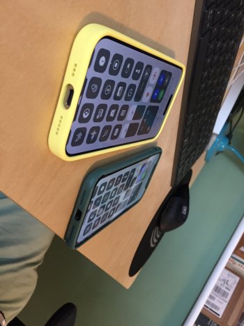
- Screen: I did not notice 120Hz first but when going back to my XR I missed it. You got me, Apple. However, I think I prefer the "Liquid Retina LCD" over the "Retina XDR Oled". Big surprise as I was SO much looking forward to going OLED, having enjoyed having an OLED TV. The OLED has a greenish tinge, the colours don't pop as much as on the LCD (except for when I am watching HDR videos/photos) and the viewing angles are noticeably worse. I am going to attach photos to show how, at identical luminosity levels, an off-centre viewpoint sees a shift in light and colour. Disappointment. I also find OLED more tiring than LCD, which is also going against my expectations. There is also the fact that the iPhone 15 Pro screen, despite having the same diagonal as the XR and, apart from the slightly more rounded corners, about the same area, and of course a higher pixel density, shows less content. Now I remember that the XR was actually using the layout of the XS Max. I miss that extra line or two, it's like going for a smaller phone but not getting the benefit of a smaller size. Even lowering the font size to try and increase the amount of data shown, you cannot go as low as on the XR.
- Dynamic Island: it kind a takes more vertical space overall than the Notch so I don't really get it. It's slightly prettier but the phone doesn't display anything above the island and underuses the sides. Reader, I am not much impressed!
- Battery: meh. Hard to compare, but I remember being amazed by my XR when I got it. The 15 Pro does get hot (when setting it up it had to pause charging) and does use up battery at a faster rate, it seems. It's faring better than my XR at 82% battery health but It's probably not a significant upgrade compared to if I had replaced the XR's battery.
- UWB, LiDAR, Bluetooth 5.3 vs 5, Wifi 6E vs AX, MagSafe vs Qi: these upgrades are not useful to me. Is there any cool app out there that uses LiDAR and that is not a home furniture seller's or kitchen designer's app?
- 5G: haven't noticed a difference compared to 4G (I get 150-180Mbps in 4G here in London, which is more than enough for my needs) and I am on Wifi most of the time when in the office or at home.
- Speed: it's a bit faster but nothing like the increases in speed I had going from a 3GS to a 6 and from a 6 to an XR. The XR is still very comfortable with iOS 17.1. The main speed increases are felt when loading web pages, opening the camera app and dealing with a few badly programmed apps like Tesco (groceries). Otherwise, going through the home screen, Spotlight and system apps, it's more or less the same speed. Shocking, I know. I can still slow down the phone to a crawl (or my M1 Pro computer) by opening a big (>500MB) Excel file, reviewing a heavily modified Word document (e.g. a contract) with "tracking" on or receiving big attachments in MS Teams (thanks Microsoft for keeping Apple's CPU engineers on their toes). MS Office apps are consistently the most demanding apps on my computers (take that, games).
- Action button: I have tried various clever things (Shortcut that depends on the position of the phone etc) but I have settled on using it for the flashlight. I don't like that it has to be a long press. I'd prefer options to enable short press, double press etc. Not using it very often.
- USB-C: it's fine, and useful to be able to reuse the same charging cables as for my MBP 14, Logitech mouse and keyboard, etc. Now, my Apple keyboard at work and my Airpods still use Lightning, and my home chargers are Lightning (partner using a 13 Mini) so it will be a while before I ditch Lightning. I enjoy being able to plug the phone to my USB-C hubs at home and at work and using screen, keyboard and (through enabling Assistive Touch) mouse. But why didn't Apple enable an iPad-like interface on external displays? the narrow vertical area of the screen used is ridiculous. And iOS doesn't even let you fill a vertical display. Feels like a huge missed opportunity - I could almost leave the Macbook at home and just bring my iPhone to work! Feels like the potential of USB-C is far from being fully realized here.
All in all it's an extremely nice but very incremental update, and I miss LCD and finally understand why micro-LEDs have the potential of being an interesting upgrade. Long gone are the days or needing to upgrade every year or two: every 6 years seems feasible and I could have rocked my XR for another year easily, in exchange for parting with just £85 for fresh battery.
What I am most excited about for the future of the iPhone is its ability to become what John Siracusa calls a "naked robotic core" that I can dock to a USB-C hub at work and at home, use as a computer and save myself the work of carrying 14-inch brick... MBP (sorry) on my 2x hour-long cycle commute. I am also excited about micro-LED and about future advances in battery technology.
I'm just not really excited with my iPhone 15 Pro, but that's okay, as it's hopefully going to last me 5+ years.


