Become a MacRumors Supporter for $50/year with no ads, ability to filter front page stories, and private forums.

Erastopic

macrumors regular
Original poster
Jun 4, 2014
221
46
Norway
I made this post to discuss the inconsistency Apple is leaving within Yosemite which is to release in 2 weeks or less.

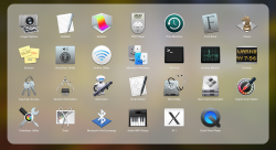
The most noticeable would be the Utilities icons, you can see several icons are still unchanged and we are already at GM3 so I'm starting to think Apple won't change these for final release.

Note: Someone mentioned that you get a new AirPort Utility icon when you install the OS X Server 4.0 Developer Preview.

Why would this annoy people you might ask.. Well because when something undergoes such a big make-over it's important to make the make-over everywhere to not make it feel inconsistent. I'm sure they will update these in later updates.

It would be like if Apple left the settings and Photos icon in the iOS 6 style when iOS 7 released.

And look at that Network icon.. Does not fit Yosemite at all.

I hope I'm not alone on this.. It's starting to annoy me.
 

Attachments

  • Screen Shot 2014-10-10 at 12.31.16.png
    Screen Shot 2014-10-10 at 12.31.16.png
    2 MB · Views: 430
  • Screen Shot 2014-10-10 at 12.32.05.png
    Screen Shot 2014-10-10 at 12.32.05.png
    28 KB · Views: 600

leman

macrumors Core
Oct 14, 2008
19,521
19,674
Yeah, the icons are a match and mix of different visual styles. This has been noted in multiple threads here. My hypothesis is that they are still not sure which visual style to go with and are experimenting with the icons. I hope that they will fix the icons to be more consistent, but I do not believe this will happen for the 10.10 release.
 

AirThis

macrumors 6502a
Mar 6, 2012
518
14
This has been a concern (for me) in many versions of OSX. For instance, in Mavericks, if you put the Safari icon next to the Maps or iBooks icon you can clearly see that there is a massive difference in perceived depth and glossiness. When I look at the Mavericks dock, it looks like half the icons were designed for one OS and half of the others were designed for another. This was equally the case in other parts of the UI such as the LaunchPad. The Safari icon looks disproportionately beveled when compared to the iPhoto or TextEdit icon.

To my eyes, all this lack of consistency gives the OS a very sloppy look... Either its Candy UI all the way or it's a "flatter" more sober look throughout. But mixing and matching is just tasteless as far as I'm concerned...
 

afsnyder

macrumors 65816
Jan 7, 2014
1,270
33
I made this post to discuss the inconsistency Apple is leaving within Yosemite which is to release in 2 weeks or less.

The most noticeable would be the Utilities icons, you can see several icons are still unchanged and we are already at GM3 so I'm starting to think Apple won't change these for final release.

Note: Someone mentioned that you get a new AirPort Utility icon when you install the OS X Server 4.0 Developer Preview.

Why would this annoy people you might ask.. Well because when something undergoes such a big make-over it's important to make the make-over everywhere to not make it feel inconsistent. I'm sure they will update these in later updates.

It would be like if Apple left the settings and Photos icon in the iOS 6 style when iOS 7 released.

And look at that Network icon.. Does not fit Yosemite at all.

I hope I'm not alone on this.. It's starting to annoy me.

Go work for Apple and tell them to fix it lol or change it to something you like better. (Something you can't do on iOS that easily!)

I actually like that Network icon haha :) You should've seen the system preferences icons before they were all redone! :mad:
 
Register on MacRumors! This sidebar will go away, and you'll see fewer ads.