I have been running inDesign now for about 2 years now and used PageMaker for years before that. I have had an ongoing problem with inDesign now and it's time I found out if it can be fixed or not. Whenever I print a page it always cuts off the left edge of the page. So I have to set the margin at .5 and then move the text box so it is just inside that or it will cut the edge off. Doesn't matter which printer I use or what computer I use it does the same thing. (I have an ibook as well as my G5). And also, why can't I just make any font bold like I used to in PageMaker?? Thanks for you help!!
Got a tip for us?
Let us know
Become a MacRumors Supporter for $50/year with no ads, ability to filter front page stories, and private forums.
InDesign Masters - I need help
- Thread starter BLDun
- Start date
- Sort by reaction score
You are using an out of date browser. It may not display this or other websites correctly.
You should upgrade or use an alternative browser.
You should upgrade or use an alternative browser.
Cannot help you with your main question... sorry...
This is supposedly done because the quality of those "home-built" bolds and italics is too poor for professional printing.
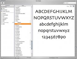
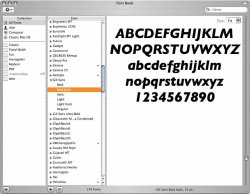
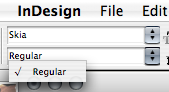
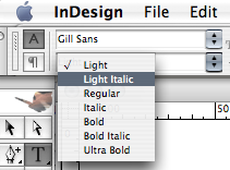
But I got an explanation about this a while back. InDesign doesn't let you "bold up" fonts. If the font hasn't got a bold variant you cannot use that font in bold (or italic, if it doesn't have that either, for that matter). Like Skia, which only comes in Regular. Eg. Gill Sans, on the other hand, comes in a multitude of variants, and you may use those in InDesisign. (See FontBook and InDesign screen shots.)BLDun said:And also, why can't I just make any font bold like I used to in PageMaker??
This is supposedly done because the quality of those "home-built" bolds and italics is too poor for professional printing.
Attachments
BLDun said:Whenever I print a page it always cuts off the left edge of the page. So I have to set the margin at .5 and then move the text box so it is just inside that or it will cut the edge off.
Hi
I have been running InDesign since it appeared, and actually never experienced the problem you desribe with printing (albeit many many others
") )
)Make sure your page set-up is correct. There is a slight difference in width of an A4 and Letter size paper that might somehow cause this.
This might sound obvious, but please also note that a lot of printers do have a margin of about 2-5mm on either side of the paper that does not usually get printed - so if you try to print an A4 page on an A4 printer you will obviously get that "border" around your printout...
Might also be that if your ruler zero point is offset, it will cause something like this, but that I never tested (I sometimes use this feature when manually tiling prints though, to indicate where to divide the page)
Other than that I can't think of anything just now...
BLDun said:And also, why can't I just make any font bold like I used to in PageMaker?? Thanks for you help!!
About the font question the above gentleman is absolutely correct; InDesign does no longer support (did before CS versions) "fake" bold, italic and such. The reason being it is a pro-software, and not using proper fonts can (and did) cause all kinds of problems later in the printing-process when such problems are not at all welcome
Cut off text.
I agree with the above poster. Especially if the printer is a laser/inkjet. If you save the file as a PDF, then render the PDF in Photoshop you'll be able to know for sure. i.e. Send the same PDF down to your printer, and check the rendered PDF in Photoshop. If everything looks fine in PS but you're still losing margins along the left on your printer, well...
I agree with the above poster. Especially if the printer is a laser/inkjet. If you save the file as a PDF, then render the PDF in Photoshop you'll be able to know for sure. i.e. Send the same PDF down to your printer, and check the rendered PDF in Photoshop. If everything looks fine in PS but you're still losing margins along the left on your printer, well...
And also, why can't I just make any font bold like I used to in PageMaker??
The real question you should be asking is "why can't modern 'pro' layout programs recognize that words like 'oblique' and 'italic' mean exactly that, just like 'bold' or 'heavy'?
And why doesn't the opentype standard, which is so terribly advanced, have a simple bit flag that indicates to any program that can read the bit that a particular font represents the "bold" version of the master font, or italic, superscript or smallcaps whatever? Then we could use the "bold" button in quark or indesign and it would, provided that such a font existed in the font set, use the appropriate "styled" version of the font.
When you use a font like Minion Pro a lot, it can be pretty frustrating trying to get something bolded or italicized in an efficient way. Keyboard shortcuts can only do so much...
benpatient said:The real question you should be asking is "why can't modern 'pro' layout programs recognize that words like 'oblique' and 'italic' mean exactly that, just like 'bold' or 'heavy'?
And why doesn't the opentype standard, which is so terribly advanced, have a simple bit flag that indicates to any program that can read the bit that a particular font represents the "bold" version of the master font, or italic, superscript or smallcaps whatever? Then we could use the "bold" button in quark or indesign and it would, provided that such a font existed in the font set, use the appropriate "styled" version of the font.
When you use a font like Minion Pro a lot, it can be pretty frustrating trying to get something bolded or italicized in an efficient way. Keyboard shortcuts can only do so much...
Good idea, although I could imagine the number of variants in some families would make that idea a little impractical. Helvetica Neue, for instance?
I've yet to even come across OpenType fonts, but we're a little backwards in the UK -- none of our vendors seem to have them available. Just good old-fashioned Type 1 Postscript versions.
InDesign Help
As far as your margins... Each printer is different. Refer to your printer margins for reference.
Indesign does bold fonts just as good, in fact better than pagemaker. If the font you want doesn't include a bold option, you can cheat and outline it with the same color. Adjust your stroke to make it thicker or thinner to your liking... even .1 can make a difference sometimes.
BLDun said:I have been running inDesign now for about 2 years now and used PageMaker for years before that. I have had an ongoing problem with inDesign now and it's time I found out if it can be fixed or not. Whenever I print a page it always cuts off the left edge of the page. So I have to set the margin at .5 and then move the text box so it is just inside that or it will cut the edge off. Doesn't matter which printer I use or what computer I use it does the same thing. (I have an ibook as well as my G5). And also, why can't I just make any font bold like I used to in PageMaker?? Thanks for you help!!
As far as your margins... Each printer is different. Refer to your printer margins for reference.
Indesign does bold fonts just as good, in fact better than pagemaker. If the font you want doesn't include a bold option, you can cheat and outline it with the same color. Adjust your stroke to make it thicker or thinner to your liking... even .1 can make a difference sometimes.
Thanks for the word on the fonts. Never thought of that. As for the margins, I have had six printers over the time I have been using InDesign and it happens with everyone. I now have a brother laser printer, and HP 1200 all-in-one and an HP 5850 and it does the same no matter how I change the settings in the printers.
No
I might just be plain old fashioned or something, but I would strongly recommend against using outlines to achieve "bold", and even skewing letters to achieve italic effects. Allthough not that important in home-projects and things like that, these processes "destroy" the look of the font; bold is usually not just a bit fatter, and italic is not just a skewed font - these versions are carefully designed to achieve the correct visual appearance. So my advice is use this approach with great care - especially if it is going to be offset-printed.
I might just be plain old fashioned or something, but I would strongly recommend against using outlines to achieve "bold", and even skewing letters to achieve italic effects. Allthough not that important in home-projects and things like that, these processes "destroy" the look of the font; bold is usually not just a bit fatter, and italic is not just a skewed font - these versions are carefully designed to achieve the correct visual appearance. So my advice is use this approach with great care - especially if it is going to be offset-printed.
---
On the side; InDesign CS does offer shortcuts to "real" versions of the fonts - if you use the bold button or the b keyboard shortcut InDesign is supposed to use the corresponding bold version of that font (if it exists). I say suppose because obviously there is some fonts causing some problems to the flow, but in general it works quite good (at lest for me and the fonts I generally use).
On the side; InDesign CS does offer shortcuts to "real" versions of the fonts - if you use the bold button or the b keyboard shortcut InDesign is supposed to use the corresponding bold version of that font (if it exists). I say suppose because obviously there is some fonts causing some problems to the flow, but in general it works quite good (at lest for me and the fonts I generally use).
Register on MacRumors! This sidebar will go away, and you'll see fewer ads.