Become a MacRumors Supporter for $50/year with no ads, ability to filter front page stories, and private forums.

supabooma

macrumors newbie
Original poster
Feb 19, 2006
27
0
Hi guys,

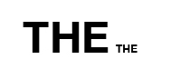
I'm designing an iPad magazine and having an issue with inconsistent text letter heights. You'll notice the "H" renders higher than the other letters.

This only happens after exporting to jpeg. (72ppi, max quality, progressive) Zooming in the actual indesign file shows the letters are the same height.

I think this is limited to onscreen viewing only. When printing, everything looks normal. Outlining text seems to fix the issue, but I'm hoping it's not the only solution.

Any ideas?

Thanks-
 

Attachments

  • Screen shot 2011-05-06 at 9.30.10 AM.png
    Screen shot 2011-05-06 at 9.30.10 AM.png
    6.9 KB · Views: 345
What version Indesign and which font? Is this part of an epub project?
 
ID CS5, Helvetica Neue Bold.
It's running through Adobe AIR frame work.

But that's a separate issue. The issue is why exporting as jpeg renders the text inconsistently.

Thanks-
 
Are you viewing that jpg in PS? I tried this with the same font in ID and PS CS3 and didn't have the reported effect on screen. My monitor is a 23in Samsung HD panel. What monitor are you using?

Dale
 

Attachments

  • progressive.jpg
    progressive.jpg
    18 KB · Views: 248
Dale,

Strange.. yes, viewing through photoshop.

Attached is a screenshot showing two windows.
Left is viewing in ID, and right is viewing in PS after exporting to jpeg (nvm the pixelation, just blowing up to show what's going on).

Using an iMac 27", and I also see this discrepancy on my iPad.

I setup the ID size to 1024 x 768, for iPad resolution.

Just can't figure out why it's doing that.

Thanks-
 

Attachments

  • Screen shot 2011-05-06 at 11.56.06 AM.png
    Screen shot 2011-05-06 at 11.56.06 AM.png
    14.1 KB · Views: 78
1) Does it have to be exported as a jpeg? I find .PNG files are much better with type.
2) Or maybe if the text is just a simple headline, or what not, creating outlines out of the type may help reduce this inconsistency?
 
1) Does it have to be exported as a jpeg? I find .PNG files are much better with type.
2) Or maybe if the text is just a simple headline, or what not, creating outlines out of the type may help reduce this inconsistency?

NXTMIKE,

Unfortunately, there's no way to export a png from ID. Jpeg is the only option.

I was able to test out another similar font, Helvetica, however, and it seems to work OK.
It appears that the Helvetica Neue variant causes issues when exporting.

It looks like outlining the text may be the only solution at this point, as you suggested.

Thanks for the help guys.
 
Yes its quiet strange to know this. But I find it quiet interesting and impressive about graphics and designs. Thank you so much for sharing this idea.
 
Register on MacRumors! This sidebar will go away, and you'll see fewer ads.