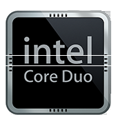
Has anyone else noticed that the "intel core duo" picture Apple's put up all over it's iMac and MacBook pages uses the old intel logo, with the "e" slightly below the rest of the "int" and "l"? Just thought I'd point it out; maybe it's proof that intel's decision to switch logos hadn't anything at all to do with Apple. but it's weird...(to me) it looks like the "e" is slightly below, but it's not as far down as in the old intel logo, and it certainly doesn't look much like the new logo.
Got a tip for us?
Let us know
Become a MacRumors Supporter for $50/year with no ads, ability to filter front page stories, and private forums.
"intel core duo" picture
- Thread starter wide
- Start date
- Sort by reaction score


