Hi,
Now, we all know that amazing color photos have been achieved as far back as in the early 1900s, but the majority of photography from around the 1960s and earlier looks black and white, fuzzy, and/or even distorted.
Because I usually deeply ponder these things, I began to wonder what such photographs could have done to make the subjects within them not relatable to many people in our current day. Sure, design and fashions of yesterday are a major factor, and, well, some people back then simply didn't look how they do now. However, the other thing that really creates a divide is color vs. black-and-white, and the quality of the photo. Oddly enough, it's not black-and-white that might SEEM like the major culprit; most don't think so, at least. However, color and quality make a HUGE difference, leaving design and fashion to be more or less the only remaining factors to consider.
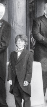
Now, we've all seen old photos that were either colorized then or have been now, but it's less common to see a new photo transformed into an old one. One would swear that the original photo is modern and relatable, but they might change their mind once they see the photo transformed to look old. In fact, if shown the "old" photo first and not told anything, one might even agree that it's an old photo and, at the same time, not be able to relate to it or its subjects!
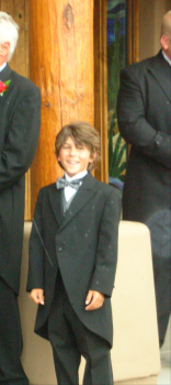
Okay, so here is a scanned photo that was taken in around the 1920s/1930s or so - maybe at some event(?) I see artifacts on the image, fuzziness, splotches, odd exposure, and subjects who are wearing clothing that would seem dated compared to even today's fancy dress. (If the photo doesn't appear at this line, it's the first one below.) BUT, here's the trick: This isn't a 1930s photo... sorry, I lied for the sake of making my point. This photo was actually taken at a wedding in 2007, and *sigh* that little kid is me. The second picture (either in this line or below) is the ACTUAL photo, which, in itself, almost looks to be an old photo that was colorized; but, in reality, it seems to be a bit too vivid in color - that's just the camera and lighting. Oh, and the attire for that wedding was specifically a suit with coat tails... in summertime Arizona weather. Lastly, that streak across the photo is a droplet of rain. That was lucky - it looked like an artifact one would see on a printed photo from the old days.
Notice how much more relatable the color image is, especially now that you know that it was taken less than a decade ago? Sure, the outfits are archaic no matter what, but once you see any photo in color, all that's left for you to try and imagine is the design and fashion being normal. I mean, this may not be insightful to some, but others cannot get it out of their head that the olden days were black-and-white. To many, it feels as though the whole world back then was black-and-white. Seeing normal-looking people with old dress and old cars and then realizing that you can look outside your window right now and that's what it would have looked like back then is... well... intriguing (at least, to myself).
Anyway, I hope at least one person out there related to this or found it interesting. Just a quick Photoshop project that I've been wanting to do, and something I've been wanting to discuss with others. DO NOT even get me started with my theories on how people back then sounded on audio! ;-) That's a much larger discussion, but I do have some observations I could share.
-MDD
(Scan back and forth between the two photos and compare. Note that I edited the smile in the "old" photo, as the facial expression originally there just didn't seem fit for the old photo look. Of course people smiled back then, but it looked to be too sharp and detailed. I wanted to create something that looked slightly obscured and distorted, but still apparent that it was a smile. Additionally, I wanted to create a more serious and professional tone. I think I was making that goofy smile because I caught someone snapping the photo of me... but not too sure.)
Attachments
Last edited:


