Become a MacRumors Supporter for $50/year with no ads, ability to filter front page stories, and private forums.

3lionsbecks

Suspended
Original poster
Jul 19, 2010
607
119
Ontario, Canada
Okay...question for you folks here.

I look at my Safari browser screen when on the internet on my 27" iMac and I feel the useable space for the browser to be relatively small.

I bought the MTP to use with my iMac because of the pinch and zoom feature to use when web-browsing. I really enjoy this aspect on my MBP.

Now when I pinch and zoom it does make the images and fonts bigger but it really doesn't expand the size of the website's width like it does on the MBP. It really just pushes everything down wards and eventually causes things to overlap and become jumbled together.

This does not happen on my MBP. Basically I can get a bigger internet display on my 15" MBP than I can on my iMac 27" display.

Please let me know what I am doing wrong here. (website examples are: www.soccernet.com, www.manutd.com)

MacRumours works much better than most sites.

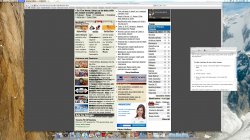
here is a screen shot of what I mean.
 

Attachments

  • screen shot.jpg
    screen shot.jpg
    927 KB · Views: 133
Basically I can get a bigger internet display on my 15" MBP than I can on my iMac 27" display.

As a web developer myself, I can tell you that most web sites are optimized for the size of display that comes with a 15", 17",19" monitor. Basically, you cannot control the width of elements on a web page yourself unless the web site allows you to. The CSS files used to style a page will either be in percentages (which will resize according to the resolution of the screen), or they will be hard-coded to say something like width: 900 px; - in which case you cannot go beyond 900 pixels. Like you said, some web pages work better than others simply due to the fact that some people wrote the code using percentage based values instead of hard-coding it.

I don't think there is a magic bullet for fixing your problem, as web sites are simply not built with a 27" monitor in mind. It is like asking for a way to make a 4:3 movie fill out a 16:9 monitor without distorting the picture at all.
 
Now when I pinch and zoom it does make the images and fonts bigger but it really doesn't expand the size of the website's width like it does on the MBP. It really just pushes everything down wards and eventually causes things to overlap and become jumbled together.

This does not happen on my MBP. Basically I can get a bigger internet display on my 15" MBP than I can on my iMac 27" display.

OK try this: go in Safari's View menu, uncheck Zoom Text Only.

Does this help?

Edit: BTW OP, an easy way to take a screenshot is Command-Shift-3 (the whole screen) or Command-Shift-4 (part of the screen). You can customize these keyboard shortcuts in System Preferences > Keyboard > Keyboard Shortcuts > Screen Shots.
 
As a web developer myself, I can tell you that most web sites are optimized for the size of display that comes with a 15", 17",19" monitor. Basically, you cannot control the width of elements on a web page yourself unless the web site allows you to. The CSS files used to style a page will either be in percentages (which will resize according to the resolution of the screen), or they will be hard-coded to say something like width: 900 px; - in which case you cannot go beyond 900 pixels. Like you said, some web pages work better than others simply due to the fact that some people wrote the code using percentage based values instead of hard-coding it.

I don't think there is a magic bullet for fixing your problem, as web sites are simply not built with a 27" monitor in mind. It is like asking for a way to make a 4:3 movie fill out a 16:9 monitor without distorting the picture at all.

okay...I mostly understand your answer but isn't it weird that I can the internet displayed larger on my 15" MBP than on my 27" iMac?

I guess I'm not tech savvy enough to really understand why it works better on the MBP than on the iMac but I was hoping there would be a way to emulate the online experience.

Thanks
 
OK try this: go in Safari's View menu, uncheck Zoom Text Only.

Does this help?

OH MAN! you are awesome. That was totally my problem. Thank you very much you just made my internet viewing 100% better.

Wow, I wonder if I clicked that setting by accident at some point or is that the default setting?

sooooo goood! :D
 
Unfortunately most sites are formatted for 1024x768 - the most popular resolution. That should change as more and more displays are capable of displaying higher resolutions and hd video becomes widely adopted. Bandwidth availability in certain regions also conrtibutes. All of those reasons add to the relatively small amount of media that wi look "native" to such a large display.

1080p only fills about 3/4 of the 27" screen.
 
I'm not entirely sure about Safari, but I do know that Google Chrome for Mac do save your zoom settings too, for the respective web sites. So that when you return later another day, you won't have to zoom again and it'll immediately adapt properly to your 27" display. Just saying. :)
 
Register on MacRumors! This sidebar will go away, and you'll see fewer ads.