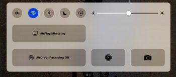
I wonder if Apple really spent much time on tweaking the OS to work with this iPad.
For one thing having no "Slide to Open" on a non-Touch ID device is just stupid. It's fine on my 6s, dumb on the iPad 4.
Then there are UI things like Control Center. This is just a terrible waste of space.
Why take out the volume controls etc. and leave so much room and make certain buttons larger? Did someone really chime in at a design meeting and say "wow intern, this is a great idea! Those AirDrop and AirPlay buttons are large enough to smack with the palm of your hand"
View attachment 676544
And it confuses me why it takes a year to have decisions like this addressed and/or changed. Did it really take a year to make such a boneheaded choice in the first place? This was a well thought out design solution?
This reminds me of how incredibly stupid Newsstand looked when iOS 7 was released. Big frickin' gradated bars. Oooh such nuance. Every time I looked at that or this new Control Center I wonder what the hell is going on in the Apple design department.


