so I installed the beta on my iPad Air 2; and us iPad users are back to the iPhone experience blown up...
Few main problems for me is how the widgets screen on the left is so narrow, there is so little space. It's pretty much the width of an iPhone; and just has blank space either side. You need to rotate to landscape to get duel panels.
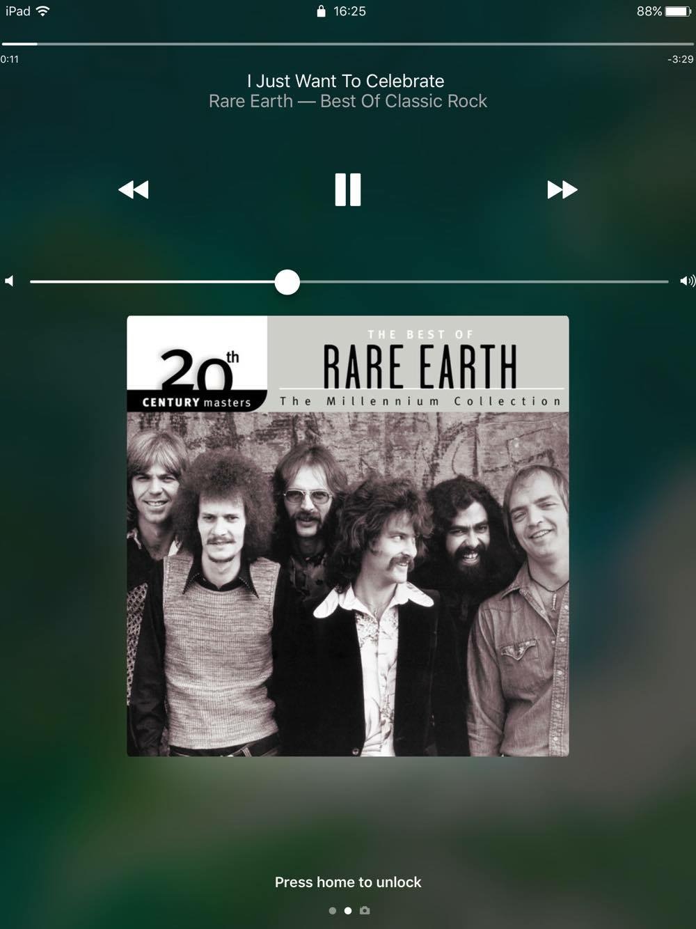
Another major annoyance is how the new control centre takes up so much of the screen. The iOS 9 control centre takes up a small part of the screen but gives all of the purposeful information and toggles nessasery. Having this massive (and ugly non edge to edge curved Windows) panels popping up that are more than twice the size of the iOS 9 one with no new main features, and the fact that I need to swipe to control centre Number 2 to get even music control!?!?!
And when you get a nofication on iPad, it's not a tiny box (again, with over rounded corners) that show little information about the nofication compared to their iOS 9 counterpart.
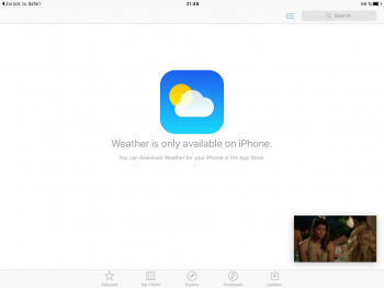
I'm not even going to describe this next one. Just look at the screenshot attached.... It looks more like a website with badly implemented responsive design... At least this will be good for the elderly community.....
Seems to be, the more android features iOS gets, the more the iPad becomes an android tablet in the way it's just a blown up phone experience...
Rant over.

[doublepost=1465986694][/doublepost]Thanks to Apple, I am now the not so proud owner of a 9.7 inch phone (without the phone bit).
Few main problems for me is how the widgets screen on the left is so narrow, there is so little space. It's pretty much the width of an iPhone; and just has blank space either side. You need to rotate to landscape to get duel panels.
Another major annoyance is how the new control centre takes up so much of the screen. The iOS 9 control centre takes up a small part of the screen but gives all of the purposeful information and toggles nessasery. Having this massive (and ugly non edge to edge curved Windows) panels popping up that are more than twice the size of the iOS 9 one with no new main features, and the fact that I need to swipe to control centre Number 2 to get even music control!?!?!
And when you get a nofication on iPad, it's not a tiny box (again, with over rounded corners) that show little information about the nofication compared to their iOS 9 counterpart.
I'm not even going to describe this next one. Just look at the screenshot attached.... It looks more like a website with badly implemented responsive design... At least this will be good for the elderly community.....
Seems to be, the more android features iOS gets, the more the iPad becomes an android tablet in the way it's just a blown up phone experience...
Rant over.
[doublepost=1465986694][/doublepost]Thanks to Apple, I am now the not so proud owner of a 9.7 inch phone (without the phone bit).


