Become a MacRumors Supporter for $50/year with no ads, ability to filter front page stories, and private forums.

AppleFan91

macrumors 68000
Original poster
Sep 11, 2012
1,813
3,827
Indy, US
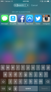
Hey guys, I don't use the search and proactive pages daily and this is the first time I've noticed this on the album art on the lock screen. I'm running iOS 9.3 Beta on an iPhone 6S Plus. I'm noticing some weird UI differences now. Is anyone else seeing these or are these just Beta bugs? A soft reset didn't change it either.
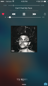

image.png image.png image.png
 

Attachments

  • image.png
    image.png
    1.4 MB · Views: 153

AppleFan91

macrumors 68000
Original poster
Sep 11, 2012
1,813
3,827
Indy, US
Haha weird. I can't get it to go away either haha. Not a big deal as I rarely use proactive and search
 

afsnyder

macrumors 65816
Jan 7, 2014
1,270
33
I think that's a bug but clearly shows that the dock can fit more than 4 icons, c'mon Apple...

It's not about how much you can fit on one page. It's about keeping it clean and simple. Perhaps have the option, yea? Apple doesn't really do options, which is why a lot of people actually like Apple... cuz it's simple for the most part lol.
 
Register on MacRumors! This sidebar will go away, and you'll see fewer ads.