I'm new to 9 (loaded 9pb1 for 10 min but hated it). With 9b4 everything seems to be running smoothly enough BUT...
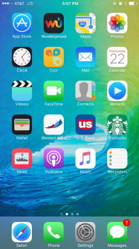
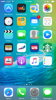
Does anyone have input on the large gap between the top row of icons and the status bar on the home screen? This seems unusual for Apple who are usually very design conscious. I hope this is a beta issue and not intentional. It annoys me whenever I'm on the home screen.
Does anyone have input on the large gap between the top row of icons and the status bar on the home screen? This seems unusual for Apple who are usually very design conscious. I hope this is a beta issue and not intentional. It annoys me whenever I'm on the home screen.


