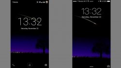
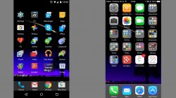
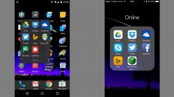
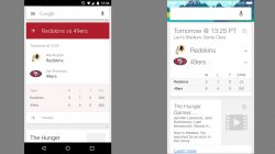
Palm's webOS & RIM's QNX (circa 2011)
If anyone remembered three years ago, the BlackBerry PlayBook's QNX UI borrowed alot of ideas from webOS. QNX had been around years before Research In Motion bought them. While webOS had so-called cards, QNX used a similar UI pattern. But one thing I liked with QNX was adding an extra element to it. When videos were streaming or playing, it could still be played in the background while you switched between apps on the homescreen.
QNX took real-time multi-tasking ideas from webOS which was already a great idea to begin with and improved it in some way. Add The Astonishing Tribe (TAT) which specializes in interfaces to the mix. I think the BlackBerry PlayBook was one of the most underrated tablets of all-time. More so than the HP Touchpad which went on that fire sale that same year. Both their UI was phenomenal that made both iOS and Android look archaic even by today's standards. Too bad BB10 lost the elements that made QNX so good.
Yet, with Palm going under thanks to HP and BlackBerry on its way, both user interfaces became mere footnotes to the history of the industry while Apple, Google, and Microsoft get all the credit for innovation and original style. The thing with Android is you can always change up a few things visually. And it has swipe gesture shortcuts which makes navigating even easier while iOS you have to scour for apps, can't hide ones by default, and lacks a BACK button or Screen Off app which forces users to wear out a physical button if Assistive Touch isn't turned on.
I am aware iOS can look cooler and unique while jailbroken. I was into Vista themes years ago. I even make iPhone OS 1.1.4 look like a desktop UI where right half of the screen had zero app icons before blank/invisible apps existed. But Android can be changed around rooted or not. I've seen many Android OEM's even outdo Google's stock look with better lockscreens or whatever. Even Nokia's Meego borrowed ideas from iOS. Rows of icons were always around before iOS. Hopefully, Material Design is branching away from the already archaic row of icons whether flat or skeumorphic and very LINEAR path/pattern habits that iOS possessed since inception.
My favorite homescreen UI still comes from the Sony Ericsson Xperia X1 (2008). Too bad it had WinMo instead of Android and SE never wanted to expand on the tiles idea better which lacked any real-time live tiles. Sony did make purple/violet tones look appealing in later wallpapers. The tiles eventually moved into the Metro UI look which gave birth to Windows Phone's Live Tiles. Unfortunately, when Microsoft wanted it simpler for WP, it also lost some useful functionality that old Windows Mobile once possessed.
The problem of wanting simpler is it gets boring fast (for us tech geeks) and it becomes too limiting. And it is very, very EASY to copy if its depth is shallow deep. Draw a stick figure and anyone can draw a stick figure just like it. Now iOS7 gave iOS a nice face-lift last year which some loved or hated. But wait another two years when people will start growing tired of the flat design. Even Material Design or Metro UI will get old fast. And without too many options of changing it, that's when users start wandering their eye to something else like Android which gives you more flexibility to experiment and with different skins. It isn't all about DESIGN but PHILOSOPHY too.
I just left checking out the iPhone 6/6 Plus again. Any other phone store, same habits. All mobile OSes can look the same or different but human behavior will have similar habits and postures. People with slanted spines and stiffer necks staring at a small screen all day. Swiping left or right with our thumbs. Open an app to check of that millisecond difference in speed. With a tap or step less or more here and there. It doesn't matter what the OS looks like anymore, the human behavioral patterns is generally the same. The next revolution is no longer what the UI might look like but how a device changes our daily habits like what the Moto X tried doing last year. Design is one of the LEAST PRACTICAL area which is generally just eye candy that gets old fast.


