Become a MacRumors Supporter for $50/year with no ads, ability to filter front page stories, and private forums.

sentinelsx

macrumors 68010
Original poster
Feb 28, 2011
2,004
0
Open the messaging app, little difference between a galaxy s1 and s4, In fact zero at first glance.

Open settings, notice the same cartoonish icons?

Look at the icons, they are the same (except for the colored back grounds on galaxy s1 in froyo, which were removed in GB update).

The power toggles.

The gallery.

Email.

Status bar.

Status bar icons.

Radios and buttons (notice the sharp rectangular buttons? Which never changed?)

A co worker yesterday told me he switched from his iPhone to the galaxy s4 because "the UI has been the same old with minor changes and feature additions".

But looking at touchwiz history, isn't it similar?

I am amazed at this.

(Disclaimer: this is not in favor of ios btw, which I consider to be horrible compared to stock jellybean or sense 5 jellybean in my opinion).
 

mattopotamus

macrumors G5
Jun 12, 2012
14,738
6,109
You are comparing apples to oranges. Android is the OS not touchwiz. People say IOS is stale and Android is not. Touchwiz only adds features to android.
 

Dr McKay

macrumors 68040
Aug 11, 2010
3,531
262
Kirkland
Your friend switching from iPhone to Android isn't a very good example, because TouchWiz is all new to him. If he eventually gets bored of them he can change them with ease in the future, if he gets bored of most things he can change them.
 

sentinelsx

macrumors 68010
Original poster
Feb 28, 2011
2,004
0
You are comparing apples to oranges. Android is the OS not touchwiz. People say IOS is stale and Android is not. Touchwiz only adds features to android.

Well ios has no skin so what else can I compare it to.

Semantics aside, we are talking about a UI comparison here, so lets not get off topic.
 

onthecouchagain

macrumors 604
Mar 29, 2011
7,382
2
If you want to talk specifically about the apps of that particular skin, sure. But then you can say that about almost any app. Apps themselves don't normally go through major cosmetic changes.

You can't ignore that the skin is also on top of android the actual operating system which allows you to make your home screens completely different, unique, and original. Ever see this site? There are many like it. http://mycolorscreen.com

It really is comparing apples to oranges even if that's all you have to compare. If you want to just look at apps it's a wash. Even stock android apps have been relatively unchanged for a while. Look at say the calculator app.

But when people say ios is stale it's about more than individual apps and how they look. It's about the core operating system itself and the unchanging grids of icons that offer little customization. You just don't have that problem with touch wiz and android. You can, if you wish, make touch wiz and android look like anything you want (again look at that website. So many original ideas that you could hardly tell it's touch wiz or android). And you can do so relatively easily.
 

ch900712

macrumors newbie
Mar 26, 2012
14
0
I would rather have the same old iOS than touchwiz its so ugly and none of the apps match each other. Just look at the messaging app... no aesthetics at all. Another thing is the dialer app check online how long it takes to open the contacts app within the dialer.
 

cynics

macrumors G4
Jan 8, 2012
11,959
2,156
It also depends on the person. Someone could say iOS is stale if they used it for years and Android/touchwiz is not to THEM if they never used it.
 

durant35

macrumors member
May 2, 2013
74
0
Open the messaging app, little difference between a galaxy s1 and s4, In fact zero at first glance.

Open settings, notice the same cartoonish icons?

Look at the icons, they are the same (except for the colored back grounds on galaxy s1 in froyo, which were removed in GB update).

The power toggles.

The gallery.

Email.

Status bar.

Status bar icons.

Radios and buttons (notice the sharp rectangular buttons? Which never changed?)

A co worker yesterday told me he switched from his iPhone to the galaxy s4 because "the UI has been the same old with minor changes and feature additions".

But looking at touchwiz history, isn't it similar?

I am amazed at this.

(Disclaimer: this is not in favor of ios btw, which I consider to be horrible compared to stock jellybean or sense 5 jellybean in my opinion).

First off, TouchWiz is the skin, not the OS. That already tells me you have no clue what you are talking about. Even so, Samsung adds a ton of new features to TouchWiz with every S and Note phone release. Just you mentioning the Gallery proves you have no clue what you are talking about. Look at the gallery on the S2 and the S4 and then come back and try to tell me they are the same :rolleyes:
 

cynics

macrumors G4
Jan 8, 2012
11,959
2,156
I would rather have the same old iOS than touchwiz its so ugly and none of the apps match each other. Just look at the messaging app... no aesthetics at all. Another thing is the dialer app check online how long it takes to open the contacts app within the dialer.

That's opinion based IMO. The messaging app in iOS is pretty bland. And if we (you) are cherry picking look at find my friends. That's just hideous!

Dialer app...that's just strange its like you are staging a problem. I could say look how long it takes to open contacts from the home screen of iOS. Which btw neither are really that "long" of a time.
 

LIVEFRMNYC

macrumors G3
Oct 27, 2009
8,878
10,987
Open the messaging app, little difference between a galaxy s1 and s4, In fact zero at first glance.

Open settings, notice the same cartoonish icons?

Look at the icons, they are the same (except for the colored back grounds on galaxy s1 in froyo, which were removed in GB update).

The power toggles.

The gallery.

Email.

Status bar.

Status bar icons.

Radios and buttons (notice the sharp rectangular buttons? Which never changed?)

A co worker yesterday told me he switched from his iPhone to the galaxy s4 because "the UI has been the same old with minor changes and feature additions".

But looking at touchwiz history, isn't it similar?

I am amazed at this.

(Disclaimer: this is not in favor of ios btw, which I consider to be horrible compared to stock jellybean or sense 5 jellybean in my opinion).
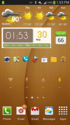
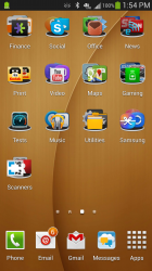
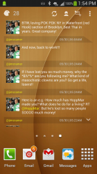
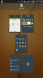
Thing is, I can't do this on iOS ............. And my setup is extremely simple with stock TW. I can easily change things around completely and/or use a launcher. With the iPhone, your stuck in an app drawer with only wallpaper options.
 

Attachments

  • 2013-05-30 13.53.32.png
    2013-05-30 13.53.32.png
    750.1 KB · Views: 129
  • 2013-05-30 13.54.12.png
    2013-05-30 13.54.12.png
    892 KB · Views: 144
  • 2013-05-30 13.54.32.png
    2013-05-30 13.54.32.png
    910.6 KB · Views: 140
  • 2013-05-30 13.56.07.png
    2013-05-30 13.56.07.png
    341.5 KB · Views: 124
  • 2013-05-30 13.57.47.png
    2013-05-30 13.57.47.png
    489.3 KB · Views: 114

Lava Lamp Freak

macrumors 68000
Jun 1, 2006
1,572
624
I think that saying something is stale is subjective. I've been using the iPhone since the day it was released, so I am always excited when something new comes out because I want something new to play with. However, I do not like TouchWiz. It still looks like Gingerbread. Replacing the launcher doesn't change that. If the only choices were TouchWiz or iOS, I'd never look at an Android device again.
 

sentinelsx

macrumors 68010
Original poster
Feb 28, 2011
2,004
0
Thing is, I can't do this on iOS ............. And my setup is extremely simple with stock TW. I can easily change things around completely and/or use a launcher. With the iPhone, your stuck in an app drawer with only wallpaper options.

Looking at those screenshots, and never minding the fact that green is my favorite color, green is an awful UI choice by Samsung. Seriously, that statusbar is just, ugh.

That is why I don't like oled screens. The abundance of green sub pixels compared to red and blue forces you to use more green, which doesn't always look nice.

I would prefer a bluish shade, perhaps I was spoiled by the nexus 4 lol.
 

LIVEFRMNYC

macrumors G3
Oct 27, 2009
8,878
10,987
Looking at those screenshots, and never minding the fact that green is my favorite color, green is an awful UI choice by Samsung. Seriously, that statusbar is just, ugh.

That is why I don't like oled screens. The abundance of green sub pixels compared to red and blue forces you to use more green, which doesn't always look nice.

I would prefer a bluish shade, perhaps I was spoiled by the nexus 4 lol.


Don't understand ........ "forces you to use more green"? :confused:

BTW .... If your looking at these pics from a matte screen, they might look dull. As they do on my Asus netbook. On my Macbook they show very vibrant.
 
Register on MacRumors! This sidebar will go away, and you'll see fewer ads.