Become a MacRumors Supporter for $50/year with no ads, ability to filter front page stories, and private forums.

What is your opinion of iOS widgets?

  • Love 'em!

    Votes: 11 15.5%
  • Hate 'em!

    Votes: 6 8.5%
  • Not bad but they need some work.

    Votes: 46 64.8%
  • Try to use them but ...

    Votes: 6 8.5%
  • Come on Apple! Really?

    Votes: 7 9.9%
  • Keeping my thumbs crossed hoping that someday..

    Votes: 7 9.9%

  • Total voters
    71

dk001

macrumors demi-god
Original poster
Oct 3, 2014
11,121
15,472
Sage, Lightning, and Mountains
Widgets

This is a bit of a curiosity on how everyone is finding widgets for iOS.

My personal view is ... meh.
To be fair, I may be a bit biased. I have been using widgets on Android for a good while and was happy when they came out for iOS. Not talking the Today screen. That was another thing on its own.

I have been trying to use widgets to help my workstream on iOS now for a good while yet find myself trying them, trying to fine tune them, looking for other widgets (or replacement widgets), then turning them pretty much off. Some of the things I find where widgets have a bit of a shortcoming...
1. They are static. Most often you have to refresh them or launch the associated app to get updated widget info. Even then the widget may not display up to date info.
2. They are not scalable. You usually get S/M/L.
3. When you shop for widgets so many are subscription based. WTF?
4. Notifications and Widgets don't work well together if at all. Get a Notification, take a quick Widget look ... go to the app.
5. Placing widgets sucks. Too many times I will drop a new widget (or maybe an old one) and it blows up the layout of my screen(s). I have gotten into the habit of placing the screen I am going to impact to the last position, do what I need, then rearrange screen order. PITA.

So please, share your thoughts, opinions, rants, and praises. I really am curios to see others points of view on these.
What do you like or dislike?

Kindly take a moment and score the poll. You can choose more than one response.
 

Brenster

macrumors 6502a
Jul 7, 2008
827
837
Use a widget stack at the top of my first home screen - like the at-a-glance weather, today/tomorrow calendar, podcasts, photos of my son when he was younger being surfaced etc.

It's the only widgetI use, but I like the 'splash' of my own info & content it brings to a home screen that would otherwise just be an app launcher.
 

NoBoMac

Moderator
Staff member
Jul 1, 2014
6,244
4,931
Big meh for me as in most cases more info and more useful to just go straight to an app.

Like above, I have a stack widget for weather and stock market indices. A battery widget to see where the headphones and watch are at.

Only one that is really useful for me is the Shortcuts widget. I put my top Shortcuts in a folder and have the widget show that: a menu of the most used Shortcuts on the widget screen vs having to bring up the app. But even then, only using that a couple of times a day.
 
  • Like
Reactions: dk001

Blue Hawk

macrumors 68000
Dec 18, 2017
1,623
1,231
Germany
They look good but aren’t very useful. Not live, not even possible to refresh them and some developers are desperate because their widgets stop working after a while.
 
  • Like
Reactions: Itinj24 and dk001

bilibug

macrumors 6502
Aug 27, 2008
360
256
Stockton NJ
I actually appreciate the added functionality. I wish they were as robust as some of the old jailbreak springboard modifications that were available. I'd love to have an agenda view on the Lock Screen, instead of the Home Screen. But, that is my main use case. I think the default built-in widgets are weak, but apps like Widgy and Widget Wizard allow some great customization.

1646771858880.png
 
  • Love
Reactions: dk001

BBDDVV

macrumors regular
Oct 30, 2014
186
83
I really wanted to use widgets, but I find that even the smallest size is too big for what it shows (taking up 4 app-slots on iPhone; on iPad the same widget only takes up 2 app-slots...)
Why can't we e.g. configure the weather app icon to display e.g. the current temperature and temperature range of the day like the weather complication on Apple Watch when added to a corner of a watch face. Same for chance of rain? The Calendar app icon shows the day, the clock app icon shows the time...

I do like the:
- Siri App Suggestions widget. I have one screen with 2 of them below each other and it works great for me to get to the apps I use frequently, although they're 'out of order' compared to the app organization of the other screens.
- Clock widget with World Clocks

On iPad I do use a smart stack with weather, world clocks, batteries, and a second one with Calendar info...
 
Last edited:
  • Like
Reactions: dk001

ParagJain

macrumors 6502a
Jul 24, 2011
590
141
The only widget i found useful is battery indicator and calendar/todo. Others, i just can’t seem to find any usage.
 
  • Like
Reactions: dk001

johaen8

macrumors regular
Aug 17, 2010
109
177
Near Montgomery, AL
I voted "Not bad, but need some work." like most people, but overall I do like the ones I have. Before widgets I had a mishmash of folders and apps on my home screen. Now my home screen is nothing but widgets:

1. Medium photo widget on top
2. Small calendar widget center left to tell me what's on my schedule for the day.
3. Small Astronomy Picture of the Day widget center right because space is cool.
4. Stack of small Carrot Weather widgets bottom left that do a good job of rotating to show me what's relevant at that moment.
5. Small Fitness widget bottom right for a quick glance at my progress for the day.

I've had this basic layout since iOS 14 was released and I'm still pretty happy with it. The only thing that I'd like is if they added interactivity (playing/pausing/skipping music).
 
  • Like
Reactions: BBDDVV and dk001

Knowlege Bomb

macrumors G4
Feb 14, 2008
10,274
8,957
US
I love the Fantastical widget I have on my main home screen and to the left I have a ton of useful information displayed via widgets of all sizes.

Sure, they could be better but I’m still a fan of what we currently have.
 
  • Like
Reactions: dk001

dk001

macrumors demi-god
Original poster
Oct 3, 2014
11,121
15,472
Sage, Lightning, and Mountains
That has been one of the biggest disappointments with widgets - the lack of real functionality so you don't have to open the app.

Hoping that Apple opens this up. Then I wonder what the limits are that stops some great widget creation by devs.
 

johaen8

macrumors regular
Aug 17, 2010
109
177
Near Montgomery, AL
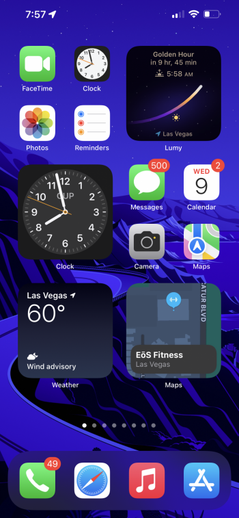
They are ok. I don’t really find them useful. If I need something done I just open up the app. However, it does come in handy when you want a big clock, weather update, or current map location. This is my current setup.
That Lumy widget is gorgeous! I checked it out in the app store; so many beautiful widgets! I might have to buy this app and mess up my perfect home screen layout.
 

Pilot Jones

macrumors 6502a
Oct 2, 2020
891
1,675
As long as:
  • They aren't fully interactive right on the homescreen
  • You can't remove the text labels under them
I'm not gonna be totally happy with them.

I do really love them though, I can't imagine going back to iOS without any widgets. I just need all kinds of weird workarounds to make them work optimally, which shouldn't be necessary in the first place.
 

jmarsh5

macrumors member
Mar 10, 2022
42
88
I find the most most useful ones are News related widgets. For example, Reddit, Apple News, iMDB, The Athletic etc. And the Weather widget displayed on the Home Screen is nice. But yeah, most widgets aren't doing a great job at being useful. I would like to believe they'll put some focus on making those more useful in iOS 16 -- but who knows...
 

PandaPunch

macrumors regular
May 4, 2015
204
186
Widgets could be handled better, for example, I was hoping to be able to use widgets for podcast/music apps to control what I was listening to. Instead, I'll just get icons of albums and podcasts.

Otherwise, the widgets are fine, they show the info I need in most cases and that's all I really need.
 

Reggaenald

Suspended
Sep 26, 2021
864
798
They are somewhat ok. I’m disappointed by the options apple offers for its own app‘s widgets, very little info density imo and no customisation at all.
But it’s nice to get a quick overview of important stuff, like the 12h calendar preview. Apart from that I don’t really use apple‘s widgets. However,
the Weather app is useless where I live, I use the Windy.com widget for my weather forecast exclusively, have a UV, Watch (with seconds hand because that’s the only way I know to accurately tell the time on an iPhone if you don’t use an Apple Watch (! stupid)), moon phase and time/position charts, battery (for not well supported BT devices) and air quality widgets in my today view. I can see them without unlocking my phone and am up to date with what I need to know. The big 12h calendar widget on my first Home Screen page and all apps and folders beneath for easy reach. It’s a nice set up, however interactive widgets and more frequent updates would be welcome. I also use the screen time widget which updates every 15-30 minutes at times, which is pretty useless. Also the layout you have to use is of course as stubborn as ever with apple and the Home Screen.
 
  • Like
Reactions: dk001

MalcolmJID

macrumors 6502a
Nov 1, 2005
771
150
England
I'll go with "good start, but a way to go". I think in the next few iterations of iOS we'll see more functionality come to the widgets (at the expense of older iPhone compatibility).
 
  • Like
Reactions: dk001

dk001

macrumors demi-god
Original poster
Oct 3, 2014
11,121
15,472
Sage, Lightning, and Mountains
I'll go with "good start, but a way to go". I think in the next few iterations of iOS we'll see more functionality come to the widgets (at the expense of older iPhone compatibility).

That is a hope. Would be cool as in the past there was a good bit of widget functionality in the Jalbreak community. We know it is doable.
 

Traverse

macrumors 604
Mar 11, 2013
7,710
4,489
Here
Widgets have completely changed the way I set up my devices and I very much appreciate that “Today View” where I can scroll through all of my glanceable information. I only wish Apple would increase the foundational afforded to developers to make them more interactive.
 
  • Like
Reactions: dk001
Register on MacRumors! This sidebar will go away, and you'll see fewer ads.