It sucks that this view is gone -- the one with the dedicated space on the left for the clock and widgets. Apple, if you're reading this, please bring this view back as an option. I REALLY got used to using it.

Got a tip for us?
Let us know
Become a MacRumors Supporter for $50/year with no ads, ability to filter front page stories, and private forums.
iPadOS 15: I Miss This View...
- Thread starter clayj
- Start date
- Sort by reaction score
You are using an out of date browser. It may not display this or other websites correctly.
You should upgrade or use an alternative browser.
You should upgrade or use an alternative browser.
Did you submit feedback to Apple? That's more direct than the very slim chance Apple even reads MacRumors or will see your post.Apple, if you're reading this, please bring this view back as an option. I REALLY got used to using it.
Same here. It was nice having the 6x5 grid AND widgets.
What disappoints me the most is how the icon layout changes from landscape to portrait. Was so nice when we got 6x5 for both orientations. Now back to the old switcharoo.
What disappoints me the most is how the icon layout changes from landscape to portrait. Was so nice when we got 6x5 for both orientations. Now back to the old switcharoo.
I mostly posted it here so that other people would see it and ALSO complain to Apple. I am also going to post it to Apple when I have some time.Did you submit feedback to Apple? That's more direct than the very slim chance Apple even reads MacRumors or will see your post.
Thank you, yes, I know. There ARE features in 15 that I want to use (particularly the Mail Privacy Protection).You know you could've stayed on iOS 14, right? There's no reason to upgrade immediately, much less so since Apple is reportedly going to keep supporting iOS 14 with security updates.
Seems like a step backward toward "giant iPhone" territory again, where we have all this empty space on the screen.
The ability to squeeze more info and widgets onto the home screen without sacrificing the utility of having plenty of apps on the screen was a way that iPad OS was distinguishing the device from iPhones by actually using that screen real estate. Wonder why they eliminated it. Seems like an oversight or a mistake.
The ability to squeeze more info and widgets onto the home screen without sacrificing the utility of having plenty of apps on the screen was a way that iPad OS was distinguishing the device from iPhones by actually using that screen real estate. Wonder why they eliminated it. Seems like an oversight or a mistake.
It also makes the ‘Today View’ an absolute waste of a screen. There’s a lot Apple got right, I think the split screen multitasking is a huge step forward. Aesthetically, there are a few odd quirks.
Can you post the iPadOS 15 version of that screen?I mostly posted it here so that other people would see it and ALSO complain to Apple. I am also going to post it to Apple when I have some time.
Thank you, yes, I know. There ARE features in 15 that I want to use (particularly the Mail Privacy Protection).
 ...sorry just had to!!
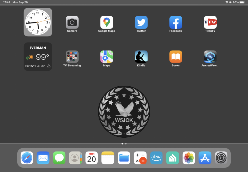
It is a backwards step. To see non-iPadOS 14 or 15 widgets you have to swipe right on the left side of screen like in ipados 13. It truly sucks. So does Safari in iPadOS 15.Can you post the iPadOS 15 version of that screen?
Attachments
100% agree. I was looking forward to the Home Screen changes because I’d assumed I would be able to get more info on my home page but now I find that before the upgrade I could get the clock and various widgets on the left plus a full 6x5 grid of icons. Now all I can get is just the 6x5 grid of icons - on my 12.9” iPad Pro screen - and if I want widgets permanently on the Home Screen as well then I have to sacrifice some of the icons to make space. This is a definite step backwards in functionality.
Register on MacRumors! This sidebar will go away, and you'll see fewer ads.