Got a tip for us?
Let us know
Become a MacRumors Supporter for $50/year with no ads, ability to filter front page stories, and private forums.
iPhone 12 Pro iPhone 12 pro bezels?
- Thread starter webjeff
- Start date
-
- Tags
- iphone 12 pro
- Sort by reaction score
You are using an out of date browser. It may not display this or other websites correctly.
You should upgrade or use an alternative browser.
You should upgrade or use an alternative browser.
Nope.
They are slimmer bezels than my XS Max, which I have no issue with anyway; which is good. Nowhere did Apple advertise or say it was edge to edge so had no need to expect it.
They are slimmer bezels than my XS Max, which I have no issue with anyway; which is good. Nowhere did Apple advertise or say it was edge to edge so had no need to expect it.
I don't get how is it possible to spend $1k on a phone without at least take a close look at the front face
Looks good to me and I'm not sure how they can even improve the front except by shrinking the notch.
I prefer having the side bezels being equally sized to the top/bottom bezel compared to those very thin side bezels that make the bottom bezel look like "a chin".
What's your impression of an "edge to edge" screen? The iPhone screen looks as "edge to edge" as a symmetric screen can get to me.
I prefer having the side bezels being equally sized to the top/bottom bezel compared to those very thin side bezels that make the bottom bezel look like "a chin".
What's your impression of an "edge to edge" screen? The iPhone screen looks as "edge to edge" as a symmetric screen can get to me.
there have to be bezels somewhere. Previous phones with curved edges masked that a bit with the curve, but they were still there.
As someone that went from X to 11 with chunky bezels, I'm very happy to see them slimming down.
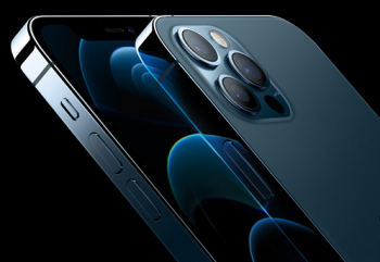
There doesn't have to be. Have you seen the samsung phones? Edgeless, wraps around... I think they went too far, but even the marketing photos are a tad questionable cause they were showing dark screens that made you think they go all the way... check it out
Attachments
There doesn't have to be. Have you seen the samsung phones? Edgeless, wraps around... I think they went too far, but even the marketing photos are a tad questionable cause they were showing dark screens that made you think they go all the way... check it out
yeah the renders were very conspicuous in being hard to judge. In the presentation with Tim Apple, I was looking carefully because if the pro had noticably thinner bezels than the 12 (like the 11 vs 11 pro) it would have been a big reason for me to go pro. But it was really hard to tell with the dark wallpapers
Sounds like you need to cancel your order if you're that unhappy
Have you seen the samsung phones? Edgeless, wraps around...
Yeah, they're f***-ugly.
I really need to leave this place alone for a few weeks following a release. Not sure why but all the pedantic whining about the choices Apple made this year are really getting under my skin. They shrunk the bezels from last year's Pro. That's a good thing, no? Everybody likes to stroke off the latest Samsung phones to try to make the iPhone look dated. Go get a Samsung then. Have fun with that s***-tastic UI and the lack of updates and terrible customer service when you need to replace it. You don't need to come here and tell us how much better they are. WE DON'T CARE.
OP needs to get a Samsung and be done.
OP needs to get a Samsung and be done.
lol, hell naw... just pointing out the bezels. Still pre-ordered but I know next year, I'll need to get that one too. Just wish they pushed a tad further on the bezels & the faster refresh rate.
Agree but I like the top and bottom bezels to access the Notification center, home page, and search windows...lol, hell naw... just pointing out the bezels. Still pre-ordered but I know next year, I'll need to get that one too. Just wish they pushed a tad further on the bezels & the faster refresh rate.
Wouldn’t your fingers or hand not interfere with the screen if it was totally edge to edge? The screens look fine to me, not at all disappointed.
Anyone else kind of disappointed not to see an edge to edge screen? They were VERY careful in the presentation not to really show it.. but now seeing the reviews (after I preordered)... Am a bit upset the pro's don't go edge to edge. Anyone else have the same thoughts?
Have you never looked at a iPhone 11 Pro? Its the same. Never did Apple state they were changing the bezels, so how can you act shocked that they didnt cater to you?
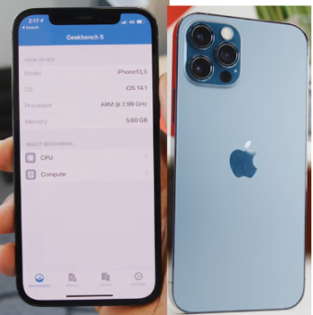
How the hell are they "fat"? Biggest complaint of Samsungs I've owned are the curved edges.Here's an image of the front & back. I expected the screen to be more like the back (up close to the edge). Instead we get ugly fat bezels again
As a matter of fact, no. Not interested.Have you seen the samsung phones?
How the hell are they "fat"? Biggest complaint of Samsungs I've owned are the curved edges.
I just wish they were edge-to-edge. The picture above I posted looks like an iphone 8 phone
Wouldn’t your fingers or hand not interfere with the screen if it was totally edge to edge? The screens look fine to me, not at all disappointed.
Holy cr@p, that's deep.
It looks absolutely nothing like an iPhone 8. 😂I just wish they were edge-to-edge. The picture above I posted looks like an iphone 8 phone... viewing from the front screen w/ large bezels.
Yeah, they're f***-ugly.
I really need to leave this place alone for a few weeks following a release. Not sure why but all the pedantic whining about the choices Apple made this year are really getting under my skin. They shrunk the bezels from last year's Pro. That's a good thing, no? Everybody likes to stroke off the latest Samsung phones to try to make the iPhone look dated. Go get a Samsung then. Have fun with that s***-tastic UI and the lack of updates and terrible customer service when you need to replace it. You don't need to come here and tell us how much better they are. WE DON'T CARE.
Couldn’t agree more, and it gets worse every year!
Okay so I’m not sure if this a “real” comparison but it made sense in my head.
Using the Pythagorean theorem, the diagonal of the triangle made of the height and width of the phone, we should be able to figure out the total versus the usable screen diagonal.
For iPhone 12 pro - (5.78)^2 + (2.82)^2 = 41.36. Which, when square rooted, is 6.43 or .33 greater than the 6.1” display. Meaning we lose approximately .33 inches to bezels.
For the iPhone 11 Pro - (5.67)^2 + (2.82)^2 = 40.04. Which, when square rooted, is 6.32. Meaning that we lose approximately .52 inches to bezels (remember the 11 pro had a 5.8” screen).
So, in theory, yes the bezels did shrink slightly compared to the 11 pro.
Register on MacRumors! This sidebar will go away, and you'll see fewer ads.


