Become a MacRumors Supporter for $50/year with no ads, ability to filter front page stories, and private forums.

Luis

macrumors 65816
Original poster
Jul 19, 2006
1,227
0
Costa Rica
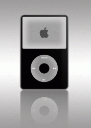
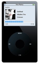
Well, today I decided to try to make an iPod and here is the result. I am by no means a photoshop expert. I know it is far from perfect but I feel it is good. BTW, everything is made from scratch.

So what do you think?

iPodLuisJPG.jpg
 
Hmmm, did that trying to get a little bit of realism but guess it's not the best way. So I took you're advice and made it a little more consistent, I think it's better. It still has a little "glow" because I think it just looks bad without a little bit of "glow".

iPodLuisJPG2.jpg

EDIT: also added the "iPod+iTunes" just for fun.
 
Backlight bleed ;)

The apple logo on the new colour based iPod is Silver on a black background.

But other than that looks pretty good.

Thanks.

Forgot about the screen color! Guess I just have the image of my 4G in my mind. Will do something about it or maybe it'll be a monochrome startup screen on a 5G ;)
 
I'd say it looks great considering it's made from scratch. You did a nice job!

The only thing that bothers me a bit are the edges.. I understand what you were trying to do, but they just look fuzzy/blurry to me. Kind of like a vignette that you don't actually want, lol.
 
I'd say it looks great considering it's made from scratch. You did a nice job!

The only thing that bothers me a bit are the edges.. I understand what you were trying to do, but they just look fuzzy/blurry to me. Kind of like a vignette that you don't actually want, lol.

Thanks!

How do you think I could improve the edges? Sharpen them a bit?

I did spend some time trying to get them to look good but I definately agree "they need something". Hmm, guess i'll play around some more tomorrow in English class :D.
 
First I'd like to say, good job.

There are a couple of minor improvements you could make to improve the realism.

First, it looks almost "too" perfect. It would be nearly impossible to capture an iPod like that in real life, as far as the lighting is concerned. Consider giving it a little uneven lighting to show a proper light source and perhaps add some glossiness to the overall case.

Second, try adding a shadow at the bottom so it looks like the iPod is standing up.

I think you've got a winner.
 
If you would add a gradient drop shadow for the entire device it would appear I could remove it from the screen on my HiRes screen. Nice work.

A little fun...
 

Attachments

  • ipod.gif
    ipod.gif
    72.8 KB · Views: 102
First I'd like to say, good job.

There are a couple of minor improvements you could make to improve the realism.

First, it looks almost "too" perfect. It would be nearly impossible to capture an iPod like that in real life, as far as the lighting is concerned. Consider giving it a little uneven lighting to show a proper light source and perhaps add some glossiness to the overall case.

Second, try adding a shadow at the bottom so it looks like the iPod is standing up.

I think you've got a winner.

Thank you... I agree it does look very realistic, however I yet need to perfect my abilities in lighting... I'll try to work on it from now on.

Well done Luis.... :apple:

Gracias Bro.

If you would add a gradient drop shadow for the entire device it would appear I could remove it from the screen on my HiRes screen. Nice work.

A little fun...

Wow that's pretty good! It does look more realistic, I'll play with it to see what I get...


Expect updates sometime soon :D
 
i was thinking the same thing kcross, did you use specific measurements? i have an older one so my perception might be a little off.

i was just shooting from the hip but i do own a number of ipods and ive seen about 30,000 of them... id check but im unmotivated.
 
First I'd like to say, good job.

There are a couple of minor improvements you could make to improve the realism.

First, it looks almost "too" perfect. It would be nearly impossible to capture an iPod like that in real life, as far as the lighting is concerned. Consider giving it a little uneven lighting to show a proper light source and perhaps add some glossiness to the overall case.

Second, try adding a shadow at the bottom so it looks like the iPod is standing up.

I think you've got a winner.

I agree. I think it is well done but a shallow drop shadow at the base would help as the other posted noticed so it doesn't appear to be floating. An added overall gradient type lighting effect over the unit would also help to polish it. See attached.
 

Attachments

  • ipod.jpg
    ipod.jpg
    34.1 KB · Views: 96
Another one

So maybe if I try something like this to show like it is lying on it's back?

ipodluisshadow.png
 
You could try making it 3D like this I tried making back in 7th grade:

desktopkj7.gif

Wow that is pretty good! I could try, but I am not sure if I have the skills necessary for making something 3D-ish...

Otherwise, nice work.
 
Register on MacRumors! This sidebar will go away, and you'll see fewer ads.