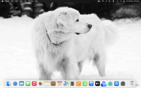
I'm using a 2020 MacBook Air M1 and I've just noticed that some of the icons in my dock seem to be lacking in clarity? Is this something I can fix, or is this how it is meant to look now? I have attached a screenshot so you can see it for yourselves. The calculator icon, for example, looks especially bad to me. The Messages icon also looks really off and soft around the edges. Looking on my girlfriend's 2015 MacBook Air, all the icons in the dock seem crystal clear. She is running Monterey as well.
Got a tip for us?
Let us know
Become a MacRumors Supporter for $50/year with no ads, ability to filter front page stories, and private forums.
Is it just me or are my dock icons not very sharp?
- Thread starter Scott M
- Start date
- Sort by reaction score
You are using an out of date browser. It may not display this or other websites correctly.
You should upgrade or use an alternative browser.
You should upgrade or use an alternative browser.
have you tried resizing the dock? (you can always bring it back to the size you prefer). and does changing the desktop picture help? try a few things like that first.
you can otherwise try resetting the dock in the terminal (type the following, then hit "enter"): killall Dock
you can otherwise try resetting the dock in the terminal (type the following, then hit "enter"): killall Dock
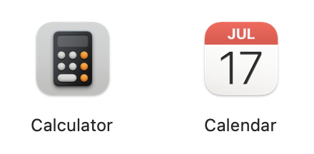
Just tried all that, no change. Even in the applications folder, some icons seem to have less clarity than others. See attachment of how the calculator icon looks next to the calendar icon, for example... it doesn't even have a shadow.have you tried resizing the dock? (you can always bring it back to the size you prefer). and does changing the desktop picture help? try a few things like that first.
you can otherwise try resetting the dock in the terminal (type the following, then hit "enter"): killall Dock
Attachments
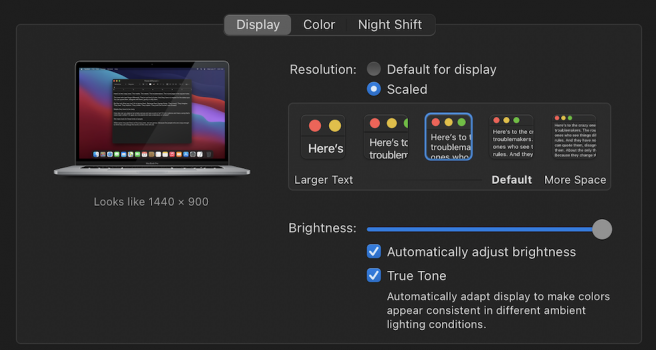
so, it's not just the dock. try changing your screen resolution (system preferences>displays), ie 'more space', or something (and again, you can change it back to the default).
you could also check the display settings in system preferences>accessibility, make sure all settings are on default (ie unchecked)...
you could also check the display settings in system preferences>accessibility, make sure all settings are on default (ie unchecked)...
Is it just Apple apps that look fuzzy/low-res or are there 3rd-party app icons that also suffer? Try right-clicking Calculator and Show Contents and look in Resources for the icon file. Open the icon file in Preview. Does the icon file have four versions? I have four versions inside the file. The first one is crystal clear and sharp (256x256 144ppi) and the others get progressively smaller/lower resolution. Yours looks like Calculator is using the second icon (128x128 72ppi) based on my Calculator's AppIcon.icns file. Not sure if any of this helps, just part of the investigation.
If you turn on 100% magnification for the dock, when you pass over the Calculator, is it clear/sharp at all through the various sizes as you pass over the icon?
If you turn on 100% magnification for the dock, when you pass over the Calculator, is it clear/sharp at all through the various sizes as you pass over the icon?
Is it just Apple apps that look fuzzy/low-res or are there 3rd-party app icons that also suffer? Try right-clicking Calculator and Show Contents and look in Resources for the icon file. Open the icon file in Preview. Does the icon file have four versions? I have four versions inside the file. The first one is crystal clear and sharp (256x256 144ppi) and the others get progressively smaller/lower resolution. Yours looks like Calculator is using the second icon (128x128 72ppi) based on my Calculator's AppIcon.icns file. Not sure if any of this helps, just part of the investigation.
If you turn on 100% magnification for the dock, when you pass over the Calculator, is it clear/sharp at all through the various sizes as you pass over the icon?
I can only seem to see one version of the icon in that location. The 256x256 one. Unless I am missing how to view different versions?
Turning on 100% magnification for the dock and then passing through them, the calculator icon looks a little bit sharper when it is enlarged, but still not as sharp as some of the others. Messages is having the same issue, I think. The rest seem fine, now that I’ve really looked at them all closely.
Interestingly, I couldn’t locate the AppIcon.icns file for Calendar, but the icon for that is very crisp (I spot checked some other apps).
Edit: I figured out how to see the other versions now. All 4 are there for the calculator.
Last edited:
Checked this and it appears to be on the default. I changed it just to see if anything changed and none of the other resolutions seemed to have an impact on how the icons looked to me.are you running the MBA at a resolution other than default for display?
if so, that's the problem
I tried putting the system into dark mode and instantly, these icons became much cleaner. Flicking between dark mode and light mode made it clear to me that the edges of the affected icons are impacted by the darkness/lightness of the background.
Could someone else try looking at their calculator icon (in the dock or in finder, it doesn’t matter) and flick between dark mode and light mode and let me know if you experience the same?
Could someone else try looking at their calculator icon (in the dock or in finder, it doesn’t matter) and flick between dark mode and light mode and let me know if you experience the same?
No one fancy trying this out for me?I tried putting the system into dark mode and instantly, these icons became much cleaner. Flicking between dark mode and light mode made it clear to me that the edges of the affected icons are impacted by the darkness/lightness of the background.
Could someone else try looking at their calculator icon (in the dock or in finder, it doesn’t matter) and flick between dark mode and light mode and let me know if you experience the same?
Mine look sharp in light and dark mode. Using dark mode right now at the moment. I should also mention a few things: 1) I'm running Big Sur 11.6.6; 2) I don't use Apple's "default" resolution, I set it to 1440x900 equivalent which was the resolution pre-retina - I feel this gives me the best/sharpest look on 15" dispaly - I think it was Sierra or sometime after that macOS made the "default" 1680x1050 equivalent on the 15" MacBook Pros but I prefer the 1440x900 instead; 3) I'm using a 15" 2019 Core i9 so not sure if my display is that much different from yours or not (P.S. If Apple went to a higher "default" resolution on your Air like they did with my Pro, try setting your display to "Looks like 1280x800" as that was the default for 13" screens pre-retina - you won't fit as much onto the screen, but it will be easier to read and icons likely will be sharper).No one fancy trying this out for me?
Attachments
@conmee do you mind replicating the picture I attached in the above post? In light mode. I want to see how your calculator icon looks next to your calendar icon. I’m really confused by the lack of shadow underneath my calculator one, (yet it becomes clear and defined as soon as I switch it to dark mode!)Just tried all that, no change. Even in the applications folder, some icons seem to have less clarity than others. See attachment of how the calculator icon looks next to the calendar icon, for example... it doesn't even have a shadow.
Last edited:
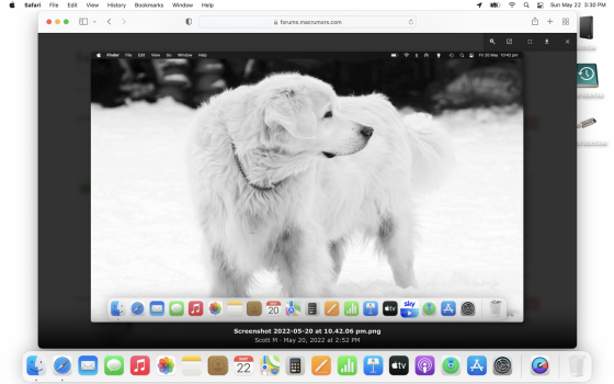
I think ALL my icons look sharper than yours. I changed the desktop to white to replicate your wallpaper. I also maxed out the size of the dock and ordered icons and have the same number of icons as you are using (I don't have the Sky app so I have Podcast as a placeholder).@conmee do you mind replicating the picture I attached in the above post? In light mode. I want to see how your calculator icon looks next to your calendar icon. I’m really confused by the lack of shadow underneath my calculator one, (yet it becomes clear and defined as soon as I switch it to dark mode!)
In my screenshot, I have your screenshot pulled up and below you'll see my dock.
Attachments
P.S. I just took a look at the screenshot, and in the screenshot as attached, my icons look fuzzy too. But on the screenshot on my MacBook it's a very noticeable difference in clarity between my icons and yours. Maybe I have to DM you the full resolution screenshot, but can definitely tell the difference.
P.P.S. I clicked on the attached screenshot and then went full screen. It shows a bit of a difference between our icons. Also seems my icon colors/shadows/accents are a bit more vivid than your icons.
P.P.P.S. Actually when you open the attached screenshot you can choose to download it. That will download the full resolution it seems. When I download it is very noticeable the difference in icon quality.
Did you ever find and answer to this? I have noticed the same issue. Even setting icons to the largest setting still has slight blur. Only when setting magnification on, do icons appear sharp while magnified.P.S. I just took a look at the screenshot, and in the screenshot as attached, my icons look fuzzy too. But on the screenshot on my MacBook it's a very noticeable difference in clarity between my icons and yours. Maybe I have to DM you the full resolution screenshot, but can definitely tell the difference.
P.P.S. I clicked on the attached screenshot and then went full screen. It shows a bit of a difference between our icons. Also seems my icon colors/shadows/accents are a bit more vivid than your icons.
P.P.P.S. Actually when you open the attached screenshot you can choose to download it. That will download the full resolution it seems. When I download it is very noticeable the difference in icon quality.
I didn't see this until now. Images uploaded to this forum are resized to a maximum of 2000 pixels wide, and therefore there's a loss of clarity. That's usually not a problem, but in this case it's complicating the troubleshooting process.P.S. I just took a look at the screenshot, and in the screenshot as attached, my icons look fuzzy too. But on the screenshot on my MacBook it's a very noticeable difference in clarity between my icons and yours.
Register on MacRumors! This sidebar will go away, and you'll see fewer ads.


