Become a MacRumors Supporter for $50/year with no ads, ability to filter front page stories, and private forums.

Hephaestus

macrumors 6502
Original poster
Apr 4, 2010
356
13
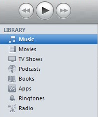
I sure hope it is! After installing iTunes 11, I was quickly reminded of how beautiful the finder was before they stripped out all of the colour. Why they did that in the first place still baffles me. Look at how wonderful the colours look in the new iTunes compared to the bland old one!

Here's hoping that in the next OSX update, they restore colour to the finder.
 

Attachments

  • 2012-12-04 01.35.47 pm.png
    2012-12-04 01.35.47 pm.png
    48.4 KB · Views: 406
  • 2012-12-04 01.33.19 pm.png
    2012-12-04 01.33.19 pm.png
    57 KB · Views: 103

Ddyracer

macrumors 68000
Nov 24, 2009
1,786
31
I sure hope it is! After installing iTunes 11, I was quickly reminded of how beautiful the finder was before they stripped out all of the colour. Why they did that in the first place still baffles me. Look at how wonderful the colours look in the new iTunes compared to the bland old one!

Here's hoping that in the next OSX update, they restore colour to the finder.

Yeah i think we may slowly see beauty come back through out everything. Finder and dialog windows, and across apps.
 
Last edited:

Krazy Bill

macrumors 68030
Dec 21, 2011
2,985
3
iTunes has always had a UI of its own and never really followed OSX convention as far as looks are concerned. Also, the left hand seldom works with the right hand at Apple.
 

AQUADock

macrumors 65816
Mar 20, 2011
1,049
37
iTunes has always had a UI of its own and never really followed OSX convention as far as looks are concerned. Also, the left hand seldom works with the right hand at Apple.

Actually iTunes has always been a sign of how OS X might look like. iTunes 5 brought the grey windows and iTunes 7 brought cover flow both we're introduced in 10.5 leopard. iTunes 9 brought a lighter windows and 10 brought colour less icons and both were introduced in 10.7 lion, see the pattern?
 
Last edited:

Krazy Bill

macrumors 68030
Dec 21, 2011
2,985
3
Actually iTunes has always been a sign of how OS X might look like. iTunes 5 brought the grey windows and iTunes 7 brought cover flow both we're introduced in 10.5 leopard. iTunes 9 brought a lighter windows and 10 brought colour less icons and both were introduced in 10.7 lion, see the pattern?
But OSX never got the scrollbars nor the overall color scheme. (At least it looks that way to me).

I truly believe the iTunes coders are in a world of their own.
 

Siderz

macrumors 6502a
Nov 10, 2012
991
6
Not sure if I like or dislike the Finder icons having colour.

I guess I wouldn't mind the colour being there.
 
Register on MacRumors! This sidebar will go away, and you'll see fewer ads.