Hi everyone!
I'm pretty sure this is not against the rules, as I did not find anything in the rules disallowing it. I thought, with all these rumors and ideas floating around about the iSlate/Apple Tablet, some people might be interested in seeing what they can come up with in Photoshop/GIMP/Pixelmator as far as what they think the iSlate MIGHT look like. I'll start!
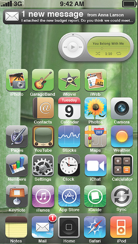
I am home for the holidays, and therefore had to edit this image on an iMac in an older version of Photoshop, so excuse me if it's not super precise. I haven't been thinking about the UI as much as the Apple engineers, so I'm unsure about whether or not this is even a viable mockup, but I thought it looked alright either way. Integrated iLife/iWork mobile, virtual home button (hovers over content, hides automatically) and a really robust Notes app (hence in the "dock.") I also think having widgets on the "Desktop" is a neat idea, so I included the iTunes control widget. I also added an iGuide store application (for buying books/magazines/newspapers) and my best try at iChat.

Available here.
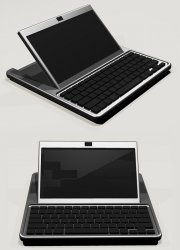
If someone wants to superimpose this onto an iSlate hardware mockup, that would be neat! Besides that, please don't steal this/claim it as your own/claim it as real (ha!)
Let's see your mockups and concepts!
I'm pretty sure this is not against the rules, as I did not find anything in the rules disallowing it. I thought, with all these rumors and ideas floating around about the iSlate/Apple Tablet, some people might be interested in seeing what they can come up with in Photoshop/GIMP/Pixelmator as far as what they think the iSlate MIGHT look like. I'll start!
I am home for the holidays, and therefore had to edit this image on an iMac in an older version of Photoshop, so excuse me if it's not super precise. I haven't been thinking about the UI as much as the Apple engineers, so I'm unsure about whether or not this is even a viable mockup, but I thought it looked alright either way. Integrated iLife/iWork mobile, virtual home button (hovers over content, hides automatically) and a really robust Notes app (hence in the "dock.") I also think having widgets on the "Desktop" is a neat idea, so I included the iTunes control widget. I also added an iGuide store application (for buying books/magazines/newspapers) and my best try at iChat.

Available here.
If someone wants to superimpose this onto an iSlate hardware mockup, that would be neat! Besides that, please don't steal this/claim it as your own/claim it as real (ha!)
Let's see your mockups and concepts!


