Become a MacRumors Supporter for $50/year with no ads, ability to filter front page stories, and private forums.

fleursdumal

macrumors newbie
Original poster
Jul 29, 2012
2
0
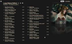
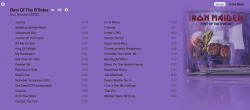
Hi there - first post! I'm really loving the new iTunes 11 extended album view. I'm rediscovering my music and the long-forgotten pleasure of album covers and liner notes (I used to religiously read liner notes and who wrote what and who played what).

How about we post screenshots of really cool album views? I'll add some when I get home. [Edit: still can't figure out how to add images on here]

:)
 
Last edited:

tkermit

macrumors 68040
Feb 20, 2004
3,586
2,921
These all came out pretty well:
3.png


2.png


4.png


1.png


5.png


This one not so much... :D

7.png
 

tkermit

macrumors 68040
Feb 20, 2004
3,586
2,921
there are some awful ones though...

That's true. Sometimes it makes a difference if you just make slight changes to the album cover though. For example, I just managed to pretty much 'fix' the Neil Young cover I posted before . I think it looks decent now.
 

Attachments

  • neil.png
    neil.png
    236.2 KB · Views: 236

firedept

macrumors 603
Jul 8, 2011
6,278
1,130
Somewhere!
Here are some of mine I like.
 

Attachments

  • Screen Shot 2012-12-05 at 2.12.49 PM.png
    Screen Shot 2012-12-05 at 2.12.49 PM.png
    373.9 KB · Views: 324
  • Screen Shot 2012-12-05 at 2.14.36 PM.png
    Screen Shot 2012-12-05 at 2.14.36 PM.png
    192.8 KB · Views: 301
  • Screen Shot 2012-12-05 at 2.15.57 PM.png
    Screen Shot 2012-12-05 at 2.15.57 PM.png
    158.9 KB · Views: 226

tkermit

macrumors 68040
Feb 20, 2004
3,586
2,921
Wonder why the OP isn't posting his? I went through my library a bit more and liked these quite a bit:

3.png


1.png


6.png


2.png


4.png
 

olup

Cancelled
Oct 11, 2011
383
40
I also have the actual 7" of this ....too bad they broke up
 

Attachments

  • Screen shot 2012-12-06 at 3.03.46 PM.png
    Screen shot 2012-12-06 at 3.03.46 PM.png
    93.6 KB · Views: 190

panda bear

macrumors 68000
Apr 5, 2010
1,664
1
All the ones for The Antlers albums I have came out pretty nice..

Screen%20Shot%202012-12-06%20at%2010.56.32%20AM.png

Screen%20Shot%202012-12-06%20at%2010.57.40%20AM.png

Screen%20Shot%202012-12-06%20at%2010.58.30%20AM.png

Screen%20Shot%202012-12-06%20at%2010.59.07%20AM.png

Screen%20Shot%202012-12-06%20at%2010.59.43%20AM.png


Except for this one..
Screen%20Shot%202012-12-06%20at%2011.03.57%20AM.png
 
Last edited by a moderator:

Bigtree

macrumors 6502
Aug 7, 2007
333
110
What is the purpose of this? Do most of you have more songs than albums?
I have 5 songs and 791 full albums. Not enough room.
 

Jessica Lares

macrumors G3
Oct 31, 2009
9,612
1,057
Near Dallas, Texas, USA
What is the purpose of this? Do most of you have more songs than albums?
I have 5 songs and 791 full albums. Not enough room.

Mostly full albums here too. The purpose is that the new album view is really cool in iTunes. Especially when it's not just trying to just match the album cover, it's also taking into account that there might be some excess borders. So it attempts to make it all look very nice.
 

Ddyracer

macrumors 68000
Nov 24, 2009
1,786
31
They remind me of the windows 8 ui just without the live titles. Not a bad thing though. I like them!
 

diggfandan

macrumors member
Jun 1, 2008
63
32
My favorite so far
 

Attachments

  • Screen Shot 2012-12-06 at 11.51.16 PM.png
    Screen Shot 2012-12-06 at 11.51.16 PM.png
    136 KB · Views: 232

fleursdumal

macrumors newbie
Original poster
Jul 29, 2012
2
0
These look great. I notice that if I improve the image quality of the album cover the rendering looks even better. I'm still trying to figure out how to post images on here (sorry, newbie).
 
Register on MacRumors! This sidebar will go away, and you'll see fewer ads.