Got a tip for us?
Let us know
Become a MacRumors Supporter for $50/year with no ads, ability to filter front page stories, and private forums.
iTunes text looks like poop
- Thread starter mnkeybsness
- Start date
- Sort by reaction score
You are using an out of date browser. It may not display this or other websites correctly.
You should upgrade or use an alternative browser.
You should upgrade or use an alternative browser.

This is just my opinion, but I think Apple un-anti-aliased the text in iTunes to speed it up. I've noticed that scrolling and browsing iTunes is much faster without the smoothed text. My songs with non-English text like French, Spanish, Chinese, and Japanese are still smoothed, and when I scroll down to them, iTunes slows down a bit.
This is just pure speculation of course. However, as much as I would prefer the smoothed text, I enjoy the increase in response from iTunes much more.
This is just pure speculation of course. However, as much as I would prefer the smoothed text, I enjoy the increase in response from iTunes much more.
Just to stir the pot. The text in iTunes on my computer did not change at all. It's still in it's anti-aliased goodness.
I'm thinking some-peoples permissions got screwed up.
I'm thinking some-peoples permissions got screwed up.
Please remember to report spam, personal attacks etc so that the moderators can deal with the offending parties.
Thank you.
BTW, My iTunes text looks just ducky.
Thank you.
BTW, My iTunes text looks just ducky.
Re: iTunes text looks like poop
I agree that it looks pretty crappy on my system too, but man, what are you listening to?
Originally posted by mnkeybsness
yeah...just what the title of this thread is...
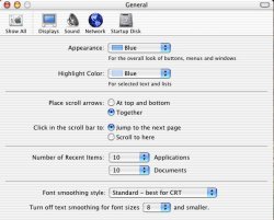
check this out
I agree that it looks pretty crappy on my system too, but man, what are you listening to?
But will you look at the GUI!
Is it me, or am I the only person who's felt that the iTunes GUI has gotten uglier and uglier with each new version? The jump to v.4 has been especially ugly... I'm still trying to understand the reason behind the little blue dot on the volume slider and the almost completely flattened metal control buttons.
Plus, the anti-aliasing of the app-wide text seems a lot different to me too. Overall, something to get used to, I guess.
Re: But will you look at the GUI!
i agree to some extent that some of the GUI features kind of look...well...crappy. as you mentioned, the little dot in the volume control bar?? i hate it! and the browse button needs to not be filled with that rainbow gradient...
and then there is the itunes icon...i do like the way apple likes to slightly modify the icon, but suddenly it doesn't look nice in my dock with that bright green color.
Originally posted by Skandranon
Is it me, or am I the only person who's felt that the iTunes GUI has gotten uglier and uglier with each new version? The jump to v.4 has been especially ugly... I'm still trying to understand the reason behind the little blue dot on the volume slider and the almost completely flattened metal control buttons.
Plus, the anti-aliasing of the app-wide text seems a lot different to me too. Overall, something to get used to, I guess.
i agree to some extent that some of the GUI features kind of look...well...crappy. as you mentioned, the little dot in the volume control bar?? i hate it! and the browse button needs to not be filled with that rainbow gradient...
and then there is the itunes icon...i do like the way apple likes to slightly modify the icon, but suddenly it doesn't look nice in my dock with that bright green color.
Re: Re: But will you look at the GUI!
I quite like the green actually.
Originally posted by mnkeybsness
and then there is the itunes icon...i do like the way apple likes to slightly modify the icon, but suddenly it doesn't look nice in my dock with that bright green color.
I quite like the green actually.
Register on MacRumors! This sidebar will go away, and you'll see fewer ads.