woah...
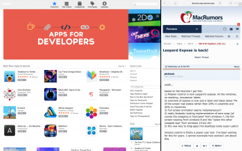
based on the keynote I got this:
1) Mission Control is now Leopard's expose. All the windows, no stacking, mouseover labels
2) overview of spaces is now just a label and takes about 7% of the screen real estate rather than 20% in yosemite and 25% in mavericks
3) Full screen animation seems instantaneous!!!
4) really fantastic-looking implementation of aero snap (of course the snapping is 'borrowed' from windows 7, the full-screen resizing from windows 8 and the "select the other snapped app" from windows 10 but eh)
5) the new way to drag apps into desktops looks super useful!
mission control is finally a power user tool. I've been waiting for this for years. I cannot overstate how excited I am about this.


