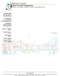
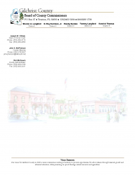
I have been working on a letterhead for the county where I work. I have already changed quite a few things to meet there specs, and this is what I've come up with. There are 2 copies with different versions of the county seal. Please give me some input on it.
Got a tip for us?
Let us know
Become a MacRumors Supporter for $50/year with no ads, ability to filter front page stories, and private forums.
Letterhead critique needed
- Thread starter bowens
- Start date
- Sort by reaction score
You are using an out of date browser. It may not display this or other websites correctly.
You should upgrade or use an alternative browser.
You should upgrade or use an alternative browser.
Hey look; I'm no designer, but jeez it's very busy. Very VERY busy!! hehe.
Obviously you need the text, but can you not place District 1 etc etc at the bottom of the page, preferably in a lighter colour (Smaller and lighter?) along with the telephone numbers of the relevant contacts?
Having said that, I love the watermark and I think it could be very good in general if you just make the top cleaner. The big problem is that the company name text just doesn't stand out because of all the other content.
My 2 c
What I like:
• The watermark seems nice. What's the opacity set at? Be sure it's enough to where you will still be able to read text easily.
• The Vision Statement is fine visually.
Needs work:
• The top is very crowded. Of course sometimes you have a lot of info that needs to be there (and client wants to have), which I think is the case here. Why don't you try moving the names for District 1 - 5 on the side, along with the other three. It looks very top heavy and takes away from the subtle watermark. If you move them to the side, try justifying the text alignment to the right so there will be a visual "line" when you have the body text in. Hopefully that makes sense. In other words, put he District 1-5 on the left and justified to the right, then leave a enough of a gap below and put the three names in. And align all the text to the right so the "jaggies" are on the left. Oh yeah, be sure that the text of both the body and the other info line up with something above. Don't just put them somewhere, align them to a grid of some sort. Like the left of the body text could align with the left of "Board" and the right of the name info could align with the right of the logo. Not saying that will work, just giving you an example.
For the two versions of the logo you have. I sorta like the one with the circle; makes it look more "tight". But see how it all comes together if you try those changes. If you have revisions, perhaps you can put in some dumby text to get an idea how body text will look.....?
Good luck!")
• The watermark seems nice. What's the opacity set at? Be sure it's enough to where you will still be able to read text easily.
• The Vision Statement is fine visually.
Needs work:
• The top is very crowded. Of course sometimes you have a lot of info that needs to be there (and client wants to have), which I think is the case here. Why don't you try moving the names for District 1 - 5 on the side, along with the other three. It looks very top heavy and takes away from the subtle watermark. If you move them to the side, try justifying the text alignment to the right so there will be a visual "line" when you have the body text in. Hopefully that makes sense. In other words, put he District 1-5 on the left and justified to the right, then leave a enough of a gap below and put the three names in. And align all the text to the right so the "jaggies" are on the left. Oh yeah, be sure that the text of both the body and the other info line up with something above. Don't just put them somewhere, align them to a grid of some sort. Like the left of the body text could align with the left of "Board" and the right of the name info could align with the right of the logo. Not saying that will work, just giving you an example.
For the two versions of the logo you have. I sorta like the one with the circle; makes it look more "tight". But see how it all comes together if you try those changes. If you have revisions, perhaps you can put in some dumby text to get an idea how body text will look.....?
Good luck!
Personally I dont like the actual design of the pages, theyre too crowded, and the watermark (especially a colour one) is pretty pointless on a letterhead in my view. I also think that theres going to be more "addresses" than actual letter on the first page, when you take into account a normal letter layout ,which would include the address of the person youre sending to, you will have lost about half the page with your current design.
If I was to pick one though it would be the circular logo, it works better out of the two options.
Can you not produce a seperate letterheads or setup a template for each person on the letterhead to try and reduce the clutter at the top.
I would also knock the bottom text down in size to fit on one line.
I've had a look at both of them. But before I say anything, what are their requirements?
All of the info that is on there has to be on there. They actually wanted one more line and I told them that it wasn't needed. This actually takes up about half the space as their last letterhead. They want the seal, they want a picture of the courthouse which I have as a watermark, and all of the text has to be on there.
Thanks for all the ideas so far. I agree that it is a little crowded but they wanted all the info in less space than their old one.
Personally I dont like the actual design of the pages, theyre too crowded, and the watermark (especially a colour one) is pretty pointless on a letterhead in my view. I also think that theres going to be more "addresses" than actual letter on the first page, when you take into account a normal letter layout ,which would include the address of the person youre sending to, you will have lost about half the page with your current design.
If I was to pick one though it would be the circular logo, it works better out of the two options.
Can you not produce a seperate letterheads or setup a template for each person on the letterhead to try and reduce the clutter at the top.
I would also knock the bottom text down in size to fit on one line.
I have printed text over the watermark and it looks good. The opacity is low enough that you can see the text clearly. I like the circular seal better also but they wanted both versions because the one without the circle is actually the official county seal. No I can't do separate letterheads for each. This is a county-wide letterhead that a lot of different people will use. Thanks for the tips.
Edit: and to make the bottom text fit on one line I would have to shrink it to a size of 5.5 which is pretty unreadable.
Okay...now that I know that...All of the info that is on there has to be on there. They actually wanted one more line and I told them that it wasn't needed. This actually takes up about half the space as their last letterhead. They want the seal, they want a picture of the courthouse which I have as a watermark, and all of the text has to be on there.
Thanks for all the ideas so far. I agree that it is a little crowded but they wanted all the info in less space than their old one.
...I like this idea, and was thinking of this immediately, but didn't know if there was some parameter that would keep this from happening. Now that they haven't said no to it yet, it's definitely worth a shot and will help clear up more usable space.Why don't you try moving the names for District 1 - 5 on the side, along with the other three. It looks very top heavy and takes away from the subtle watermark. If you move them to the side, try justifying the text alignment to the right so there will be a visual "line" when you have the body text in. Hopefully that makes sense. In other words, put he District 1-5 on the left and justified to the right, then leave a enough of a gap below and put the three names in. And align all the text to the right so the "jaggies" are on the left.
Next, no circle on the seal. The seal already says "Gilchrist County" and the letterhead already says "Gilchrist County." No need to add yet another "County of Gilchrist" to the piece. It's redundant.
Also, I would photoshop out the top of the watermark specifically the trees coming in from the top corners, where you only see a branch on each side. Next, adjust the levels or otherwise erase the blue sky. This will allow the watermark to appear open from the top, rather than delineating exactly where that picture begins and ends. It will create far more interest.
I'd even try playing with the position of the watermark. Maybe it would look better aligned to the bottom of the page, and resized horizontally, so that it took up the entire width of the page, and just kind of bled into the page on its top end as I mentioned earlier.
Play around with these and other ideas, and then show us some more tries. I want to see 10 more by the end of the day. (;
Why don't you try moving the names for District 1 - 5 on the side, along with the other three. It looks very top heavy and takes away from the subtle watermark. If you move them to the side, try justifying the text alignment to the right so there will be a visual "line" when you have the body text in. Hopefully that makes sense. In other words, put he District 1-5 on the left and justified to the right, then leave a enough of a gap below and put the three names in. And align all the text to the right so the "jaggies" are on the left. Oh yeah, be sure that the text of both the body and the other info line up with something above. Don't just put them somewhere, align them to a grid of some sort. Like the left of the body text could align with the left of "Board" and the right of the name info could align with the right of the logo. Not saying that will work, just giving you an example.
I'm not sure I know exactly what you mean here. Could you show me an example?
I'm not sure I know exactly what you mean here. Could you show me an example?
Something like this...
Attachments
What about something like this? How, then, would I set the area to type the letter. I'm using Word. I tried changing the left margin but it moved all of the names over too.
You're making this in Word? EDIT: Using two columns (one for the list of names, the other for the text) should work.
Besides, your letterhead *should* be printed out without any text on it, usually by an outside company, and then printed on from whatever printer the client has in their office.
You're making this in Word? EDIT: Using two columns (one for the list of names, the other for the text) should work.
Besides, your letterhead *should* be printed out without any text on it, usually by an outside company, and then printed on from whatever printer the client has in their office.
Yes, I'm using Word. What would you suggest? I actually did some of it, the logo and such, in Gimp.
We will do that with some, but we are also going to have it so we can print our own out.
Edit: I tried columns but I don't think they will work well. When I open the file it always goes to the first column and I've got to enter all the way to the second.
Try placing a column break (insert>break>column break) in the first column and then saving the document. That should get you to the right column.
I don't know how well printing to pdf and then placing that image behind all the text would work, but it may. It's worth a shot, I guess.
Ideally, you'd be using a page layout program, but it sounds like you don't have one available to you. If Word is what you got, then that's what you'll use!
I am speaking from a designer point of view here, and what I will say is that you need to use the full width of the page. There can be something like 8mm space but not 20mm. Also some of the less crucial text can eaasily be made 8pt or 9pt.
Apart from that the typefaces look decent as does the logo.
good luck!
Apart from that the typefaces look decent as does the logo.
good luck!
Way too busy.
I want a letter not an ad for the county. Ditch the vision statement. Ditch the watermark. If you are going to keep the watermark, make it a seal of the county. Is that building a retirement home or resort spa or something?
That's all wonderful and good to say and everything...'cept that the client appears to want this stuff.
That's all wonderful and good to say and everything...'cept that the client appears to want this stuff.
Not to come off as a smart aleck or anything but you are a designer, your job is to get your client to see what good design is and get the client to start thinking about corporate image etc from a design perspective - remember your not a secretary putting out what ever the boss tells you. If you blindly go along with a client and do not educate them towards good design you do everyone a disservice in the long run, including other designers etc. (this is just my unsolicited opinion so please do not take it personally).
When ever I have a client that just does not get it, I do one the way they specify and two that look great from a graphic design perspective. I then sit down with them and go over all the designs and give them the copies of all of them - and encourage them to ask people that have no interest in the project for their opinions. 90% of the time they end up going with the good design over there original "demands".
Register on MacRumors! This sidebar will go away, and you'll see fewer ads.