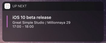
As a UX/UI Designer, I look forward to seeing what Apple does with each iteration of iOS. However, the switch from dark to light notifications was hard to accept. Not only does it make the notifications much harder to read at a quick glance, but I am curious as to why they thought the lighter aesthetic was more important than actual usability? Function over form, or form over function?
Anyway, I am curious to what everyone thinks and/or prefers. I used an iOS 10 GUI in Sketch (@sketchapp) to create the darker version.
Download these to your phone and swipe between them and see what you like best.
For me personally, I notice that when my phone is flat on my desk, or quickly picking up to view a notification , I can quickly read and identify the content of my notification much quicker in the dark version over the light.
If Apple prefers the lighter route, it would be nice if they could give us users the option of having darker based notifications in the next iOS iteration.


