Got a tip for us?
Let us know
Become a MacRumors Supporter for $50/year with no ads, ability to filter front page stories, and private forums.
Like my site?
- Thread starter tominated
- Start date
- Sort by reaction score
You are using an out of date browser. It may not display this or other websites correctly.
You should upgrade or use an alternative browser.
You should upgrade or use an alternative browser.
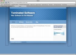
Overall, looks nice. Maybe a bit more content on the homepage and a new banner with the title/etc in it. I like it, though. I guess you used RapidWeaver?
yeah. i am putting mor pages in it. i origonally had just the demo, but i just got the full version today, so i will make it a heap better.
Your stripes are not lining up properly on the left and right hand sides of the table. My assumption, without even looking at your CSS/HTML, is that you're trying to get around alpha-transparency in IE, and manually setting the drop shadow over a static version of those stripes.
I'd just work around alpha transparencies using PNGs. There are many libraries to do this, and there's a gigantic thread in this forum that provides nearly every available option to you.
Otherwise it's nice, but it could use some personality (the header is a great place!). I love the color scheme!")
I'd just work around alpha transparencies using PNGs. There are many libraries to do this, and there's a gigantic thread in this forum that provides nearly every available option to you.
Otherwise it's nice, but it could use some personality (the header is a great place!). I love the color scheme!
Attachments
Your stripes are not lining up properly on the left and right hand sides of the table. My assumption, without even looking at your CSS/HTML, is that you're trying to get around alpha-transparency in IE, and manually setting the drop shadow over a static version of those stripes.
I'd just work around alpha transparencies. There are many libraries to do this, and there's a gigantic thread in this forum that provides nearly every available option to you.
Otherwise it's nice, but it could use some personality (the header is a great place!).
ummmm...... yeah....
i made it in rapidweaver so blame realmac software
BTW: does anyone know how to make a live search thing (like spotlight or inquisitor). i'd prefer if i could make it work pretty easily with rapidwaever
looks very nice.
looks rapidweaverish (which isn't a bad thing, just pointing that out). i guess you will eventually make your blog match?
i want it the other way around. i want to make my site match my blog
Flash can be very annoying though, use it sparingly. It causes problems for uesrs on slower machines.its simple.. maybe a little boring.
you could put a really cool flash banner in
Your site looks pretty good to me. Make sure your nav all stays on one line instead of two. The broser software looks interesting, purley because its less a megabyte of space.
Flash can be very annoying though, use it sparingly. It causes problems for uesrs on slower machines.
Your site looks pretty good to me. Make sure your nav all stays on one line instead of two. The broser software looks interesting, purley because its less a megabyte of space.
thanks for the comment about my browser. I was going to stay away from flash banners. I designed tominated so even a slow mac can use it, and i want the site to be the same
Register on MacRumors! This sidebar will go away, and you'll see fewer ads.