Become a MacRumors Supporter for $50/year with no ads, ability to filter front page stories, and private forums.

mikelong622

macrumors 6502
Original poster
Sep 29, 2006
435
3
St. Paul, Minnesota
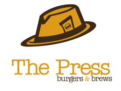
I don't post my projects in here regularly, but thought I'd give it a go since I seem to be stuck on execution of my latest school project. I had to develop a company, and then a logo to go along with it. I came up with a restaurant called, "The Press," that will be heavily influenced by 20's-40's newspaper era on the inside. There's more to the overall strategy and some other thoughts for the company, but I will save that for later if anyone wants to know more about it.

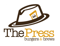
As for now, I am stuck on the logo. I have an idea, but can't seem to get away from it, so I figured, instead of mindlessly moving some things around and getting distracted, I would post the logo's current state up to try and get some feedback, ideas, or direction.

Right now I am leaning most on one that is yellow and brown.

This is only the first draft on the computer. I have a few pages of sketching done up too. Let me know what your opinions/ideas are.

Thanks
 
Last edited:
20s to 40s...

i like the concept... but remember prohibition was during those times, so maybe you could reference it..

something with moonshine instead of brews?

but yeah, that doesnt' really have much to do with the logo.

I like the concept, and I like the color of the top one, and the font... not sure about the weight/size between the name and the "burgers and brews" maybe bring that up a bit... umm the hat though... something about the image of it looks off, and poorly placed.

I'd work with that idea and try differen placement or images...

Perhaps just a feux newspaper headline with an image, or try different angles on the hat...

Sorry I can't be of any more help.

good start though!
 
I have to agree with ktbuster, I like the type choice and color of the top one. The burger and brew do need to be a little bit bigger, especially if you think of this on a small scale, but not too much.

I also strongly agree with the placement of the hat being not quite right. The first though that came to mind was making it look as if the "P" was wearing the hat. That is just a thought and I am not sure if it would work the best either. But anyway something needs to be done with the placement of the hat.

The burger in the hat is a little small and took me a quick second to realize that it was a burger. I don't know that it needs to be bigger, or if maybe a small amount of white space between the bun and the patty would help.

But overall I like it and think it works well. I am just trying to picture how a burger joint would work with a 20's - 40's vibe.
 
I think the whole 20's and 30's vibe may have been the wrong wording.

Basically it is a bar and grill where customers get to order whatever ingredients they want, and have them PRESSED into their burgers. Like between two different patties. There will be a bar with a variety of beers on tap called "The Brewstand." There would be gaudy decorations, and lots of old framed newspaper articles. The burgers would come wrapped in a newspaper-print wrapper.

So I guess generalizing it to the 20's and 30's isn't right. It's just supposed to be a simpler place. Not sure if that is the right wording either.

Anyways here's another quick take at it.
 

Attachments

  • Picture 6.png
    Picture 6.png
    26 KB · Views: 66
I think the whole 20's and 30's vibe may have been the wrong wording.

Basically it is a bar and grill where customers get to order whatever ingredients they want, and have them PRESSED into their burgers. Like between two different patties. There will be a bar with a variety of beers on tap called "The Brewstand." There would be gaudy decorations, and lots of old framed newspaper articles. The burgers would come wrapped in a newspaper-print wrapper.

So I guess generalizing it to the 20's and 30's isn't right. It's just supposed to be a simpler place. Not sure if that is the right wording either.

Anyways here's another quick take at it.

Hat covering too much of the T. Space created between large words is awkward when combined with the edge created on the lower, smaller type. Make it larger positioned the same at the right to close that large gap. Kern the type and close some of the word space in the larger type. Perhaps try not hanging the hat, but raising it up well above the text.
 
the hat now seems awkwardly far from the text.. i think the text has a nice curvilinear aspect to it.. and the hat is contrasting that aspect.. maybe round it out just a tad..
 
Yes, i agree with the above two posters, your last revision is the best so far. It has some undefiniable harmony in itself. I do like it also.
 
how about having a larger 'T' and possibly putting the hat over the letter 'P'...

just a suggestion, it may look rubbish, just came off the top of my head..
 
how about having a larger 'T' and possibly putting the hat over the letter 'P'...

just a suggestion, it may look rubbish, just came off the top of my head..
The last though that just come off the top of my head looked like rubbish. I don't know what I was thinking. It is worth a shot, but it might throw off the balance a little bit.
 
Here's the two ideas right now I am flipping back and forth between. Certainly open to other ideas. I don't think I wanna make the "T" any larger, I like having it all in a line because to me it seems more like a headline, something that would resemble newspaper.

I kinda like the hanging hat in this one since the hat and the "T" are the same color.
 

Attachments

  • Picture 5.png
    Picture 5.png
    29.9 KB · Views: 59
  • Picture 4.png
    Picture 4.png
    42.6 KB · Views: 64
I think the last two are really nice. I think the balance works best with the smaller hat though. Think i'd be tempted to make it a bit smaller still.

Your first brown design you did was cool, good choice of colours – making the theme work well.


You could make some of the best menus and table information for this
 
You could make some of the best menus and table information for this

Yeah I'm pretty sure that is going to be what we will do for our next project. Take our new identity and apply it to things. So for all of you who have helped me out, expect to see menus, business cards, signs, and more in a few weeks!

By the way my professor really digs the one with the hat hanging on the "T." I am leaning most towards that one too.
 
this is nitpicky I know... but can you either shrink or adjust the kerning to the "burgers and brews" by like 1 point smaller? It seems to be JUST a TINY MINISCULE bit too wide under "press" .. by like literally a pixel or two! :) It's just bothersome to me, but I might just be the most nitpicky person ever.
 
No you are right. I have noticed it too...just have been too lazy to worry about it. Brought the whole line in to -10.
 

Attachments

  • Picture 3.png
    Picture 3.png
    48.5 KB · Views: 69
The hat isn't working as well as you think it is. You might want to try using a rolled or folded up newspaper (or some other icon from that era). You could also try taking the letterforms and composing them so that they look like they are on the ends of a mechanical typewriter (the part the strikes the paper), or teletype? If you must keep the hat, try to simplify it. Also, have you tried shrinking it down to see how well it holds up? My guess is that hat is going to lose detail.
 
Register on MacRumors! This sidebar will go away, and you'll see fewer ads.