Become a MacRumors Supporter for $50/year with no ads, ability to filter front page stories, and private forums.

ezekielrage_99

macrumors 68040
Original poster
Oct 12, 2005
3,336
19
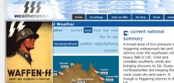
Well all of my hardwork hasn't really paid off instead my company is leaning towards the monstrosity below. I would really love some honest feedback because I don't really think this is the type of logo/direction the site should have.


When I first saw the logo I thought of something, I wonder how many other people will pick this.
 
WTF are the three S shaped things supposed to be? Lightening?

The site looks very MSN-ish with the colors and flat mono colored buttons. There's just too much going on.

And I thought AccuWeather looked bad......
 
Don't need a weatherman to know which way the wind blows

Yeah, totally evokes the SS for me too. Eek, show them these responses, maybe they'll get some sense.
 
I'm trying to do some quantitative testing on the general public to show how people will perceive the brand, because hard testing doesn't lie.


At the moment the product lines are very good however the branding is non-exsistant....
 
Perhaps just type in (Waffen) Schutzstaffel to google image search and show them the results. Think they will change their minds very quickly as there is a clear link graphically and i doubt they want that link or their picture turning up on that page.

Just 10 second PS job.

mimepq7 copy.jpg


Anyway who came up with that and how didn't they know the link.
 
Yea it definitely isn't the best looking weather site I've seen.

And blue is so overdone. Another color would make it way more memorable.
 
Been there and done that, the majority of my response on the logo has been in this area, but I do feel if I get responses that mirror my own opinions that hopefully they will listen to reason.

At the moment I am redoing the logo for weatherzone (or in the process) this was one of the ideas some are keen on developing. For the record I hate this design and I do feel as though it would be a big mistake putting forward a concept around the lightning bolt.

I developed this

And thank you for the responses, they are appreciated.
 
Been there and done that, the majority of my response on the logo has been in this area, but I do feel if I get responses that mirror my own opinions that hopefully they will listen to reason.

At the moment I am redoing the logo for weatherzone (or in the process) this was one of the ideas some are keen on developing. For the record I hate this design and I do feel as though it would be a big mistake putting forward a concept around the lightning bolt.

I developed this

and


And thank you for the responses, they are appreciated.

Well, to be totally honest, I really like your logo and think it is very eye catching, but at the same time, I can sort of see that it will not really fit with this brands current website or image. The website seems too simplistic, while you're logo is more sophisticated and modern/trendy. Your logo would fit perfectly on a well designed site, like Apple or iTunes type site.

With that being said, their alternative is not exactly ideal to say the least. My suggestion would be to revise, take away the gloss effect and gradients and make the style more simplistic, as it seems that this is what they are looking for so it goes well with their current branding/design. Btw, I think a sun and cloud is a lot more appealing then a lightening bolt.

Or, you could offer to develop a new website for them, so things will flow nicely with your current logo :cool:
 
Haha this comparison is hilarious because its a non-contest. Even if your logo was a piece of **** (which it isnt) it at least doesn't make everyone who see it think about the Nazi SS. The first thing that popped into my head seeing their logo was Nazis. I hope to god the powers that be are able to listen to our feedback when we say "don't have a freaking clone of a Nazi symbol!!!"

The great irony is even if it wasnt a Nazi clone your alternative designs run rings around theirs anyways. Yours just looks professional rather than something an amateur put together one afternoon.

The more and more I see of your two cloud version of that Logo the more I prefer it to the single cloud one (it just has a better balance when there's two clouds). That logo is definitely the best I've seen (Unless you can somehow make that 1 cloud bigger so it balances more).

If they are really attached to the idea of lighting though maybe your best bet is to make them a lightning logo. It seems like you know what you are doing so I'm sure you could come up with a logo that incorporates lightning in a modern glossy way and that doesn't look anything like nazi propaganda.

Seriously, its too funny that no one in the company noticed that its a dead on clone of the SS thing. Haha.
 
Thanks for the encouraging words the feedback is appreciated, the idea behind the gloss effect etc to add ideas for the future. The icon without the effect in the blue of the web site does fit the style of the site but also give the opportunity to be updated overtime (like the Google or Apple logo).


The logo also need to be used on TV and print so the basic design should fit the function.

Top one...perfect, simple enough, yet sophisticated and exactly along the lines of what you explained (ability to evolve if need be etc). I think I also prefer the double cloud design personally but I honestly can't see them passing on either of these, but anything is possible I suppose.
 
ezekial- I really do like the latest ones you've got without all those effects. Looking good.

As far as the other logo is concerned, it is so obviously nazi and/or kiss I don't see how they could move forward with that. Even if that prior art didn't exist, it's still harsh and a little bit evil.
 
The last ones look fantastic. Even the plasticky effect ones look good even though everybody's doing it nowadays!

Your problem is convincing them to go for your superior designs. And i think the only way you'll be able to convince the numbskulls is to show it in context. It'll be extra work having to redo a quick website layout, but I find clients are always more likely to go for your design is if they see something other than a logo in isolation.
 
The full two cloud ones have too much going on. Yes, it's three objects, but still too big and noisy. I really like the outline of the second cloud in the one cloud ones. The black and white ones look exactly like what your company is going for, even if they're too dumb to realize it.
 
Man is that other nazi logo ugly. On the other hand, I LOVE the latest two you've put out!
 
Yeah the nazi SS thing needs to be nipped in the bud immediately.

Do up a sheet comparing them side by side and mail it around to everyone concerned and say "a lot of people immediately noticed this connection and we simply can not move forward with this design, it would be a HUGE mistake"

If you end up losing your job over it then I don't think you'd wanna continue working with them anyways.
 
Hi everyone,

Thanks for the great feedback I really appreciate it :D

Over the weekend I've been doing some quantitative testing over weekend with a few logo concepts. It's really funny because the focus group I had (50 people all up) 47 out of the 50 recognised the 1st Weatherzone concept as the Waffen SS logo. With these numbers they'll have to go with my designs or something else.

Again thank you all for the feedbacks and ideas, it's amade my job redesigning the logo a little easier.

Cheers :apple:
 
Register on MacRumors! This sidebar will go away, and you'll see fewer ads.