Become a MacRumors Supporter for $50/year with no ads, ability to filter front page stories, and private forums.

bigus7674

macrumors member
Original poster
Jan 4, 2005
75
1
To all my fellow artists, designers and creative people...

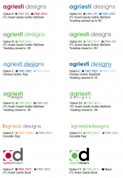
So, several years and many designs later, I realize that my old logo just isn't quite portraying me as a designer as it should. Therefore, I decided to revamp my logo, but I'm at a point where I feel myself starting to favor designs, so it was time for me to take a step back and let others provide feedback so I can see if others are seeing what I see.

To give some background, the idea is for my logo to represent me, not only through name, but also through my style, which tends to be very clean design - not a lot of extraneous "fluff" and a strong use of alignment and lines to guide the viewer through the piece; basically clean and simple.

I've attached a file that has the few options that I am leaning towards right now; some of them are the same with just minor tweaks such as color or font choice and/or face (book vs bold vs demi, etc). I like the idea of my logo visually allowing for it to be used as an acronym as well; for example in the agriesti | designs option, I can use "a|d" as an acronym for pieces that I may not want, or may not have the room for, the entire logo - for example a website favicon, etc.

I should also mention that I do use a tagline sometimes, but don't feel that it's necessary to make part of the actual logo - I plan on using it as a more secondary element. But for interest sake, the tagline is "great ideas. even better design."

With that being said, by all means, please feel free to provide comments, critiques and feedback on the options you see here.
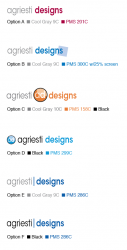
 

Attachments

  • ad logo options.png
    ad logo options.png
    48.4 KB · Views: 310
Option A, though I would work around the colour treatments.

The others are good though I really think they'll date much faster IMO.
 
Mutiny: do you like the logo solely based on the color choices, or are there specifics about that design itself that are stronger than the others?


ezekiel: I agree...the maroon and gray combination has been overused and could be reaching the end of their "shelf life." I feel that black, blue and gray are fairly tried-and-true choices, but I will play around with some color options. How do you feel about the orange in the other option? I was thinking possibly a green - but it would have to be a subtle balance between not too light (neon) and not too dark, but I'll see what happens on paper.

Thank you for the input so far.
 
Nice and clean design... just like you said.

I prefer the simplicity of the first design, but not the color. And you should reverse the color order: I would give "agriesti" the color and "designs" the gray.

My other quibble is with the typeface... or is it the letter spacing? It feels overly tight or condensed. I'd try to make it look more generous and relaxed.
 
Last edited:
citizenzen: it actually is condensed - I reduced the horizontal width of the font to 80% to simulate a "condensed" version of that font. The kerning though is still the font's default and has not been adjusted - perhaps if I open up the kerning a bit that might help. My old logo was way too "heavy" so I want my new one to be "lighter" and have an insinuation of sophistication to it, even though the logo itself is fairly simple in concept. Does that make sense?

Thank you for the input; I will be making some changes in the next day or two and will post the revised options.


Aatos: thank you for your input and your compliment
 
I do like the simplicity you're aiming for - it's easy to try and bring too much into a logo to a point where it's more of a distraction. As for the options, the first one appeals to me the most due to it's simple elegance, and I'm a big fan of the color (201C) you've chosen.

That being said, I have a slight concern over the use of Cool Gray as the color choice for your name - it seems as though it has the potential to get "lost" if your logo is going onto something where the background isn't a clean white. Black (or perhaps a darker gray/charcoal) might lend some weight while maintaining the same overall feel.

The logos with the circled "ad" don't do much for me, and the "|" separator is alright, but seems superfluous to me.
 
citizenzen: it actually is condensed - I reduced the horizontal width of the font to 80% to simulate a "condensed" version of that font. The kerning though is still the font's default and has not been adjusted - perhaps if I open up the kerning a bit that might help. My old logo was way too "heavy" so I want my new one to be "lighter" and have an insinuation of sophistication to it, even though the logo itself is fairly simple in concept. Does that make sense?

Thank you for the input; I will be making some changes in the next day or two and will post the revised options.


Aatos: thank you for your input and your compliment


Never manually condense a typeface. It just looks bad! People spend YEARS perfecting/creating type. Use a condensed version if you want it condensed. I couldn't take in the rest of your logo because I couldn't get passed the squashed type. But then again I am a type purist.

You said you wanted your logo to portray 'you' but I personally can't see anything about you. Letters in a circle don't 'say' anything about anything.

You also say you are not keen on added 'fluff' yet you incorporate a 'web 2.0' highlight. Noooo!!!!!

My personal advice is use an UNcondensed Avantgarde Demi or Medium weight. Close the tracking a little bit just to tighten it up a little. This on its own without the circle icon will show a clean and minimal style and also (if done well) the tighter tracking will show you have an idea when it comes to type. If you must use the circle, get rid of the highlight.

Just my opinion. Hope it helps.

EDIT: just seen you're response saying you want it 'lighter' :) Don't use Demi or Medium hehe. Obviously do as you said lighter weight and space it out a little bit. Also a little trick is not to use solid black. It's just too harsh for 'light' type. ;)
 
from MacBoobsPro:

Never manually condense a typeface. It just looks bad! People spend YEARS perfecting/creating type. Use a condensed version if you want it condensed. I couldn't take in the rest of your logo because I couldn't get passed the squashed type. But then again I am a type purist. I understand - it's like fringing on someone's hard work for the past several years - I know better than this (duh)

You said you wanted your logo to portray 'you' but I personally can't see anything about you. Letters in a circle don't 'say' anything about anything. Well, that statement was based on the fact of once it's on my website and it's seen in combination with samples of my design, so yes, it's a bit difficult to understand that statement in seeing a logo just on it's own I suppose.

You also say you are not keen on added 'fluff' yet you incorporate a 'web 2.0' highlight. Noooo!!!!! Point taken lol

My personal advice is use an UNcondensed Avantgarde Demi or Medium weight. Close the tracking a little bit just to tighten it up a little. This on its own without the circle icon will show a clean and minimal style and also (if done well) the tighter tracking will show you have an idea when it comes to type. If you must use the circle, get rid of the highlight. I will certainly take your advice and try some variances.

EDIT: just seen you're response saying you want it 'lighter' Don't use Demi or Medium hehe. Obviously do as you said lighter weight and space it out a little bit. Also a little trick is not to use solid black. It's just too harsh for 'light' type. If you had seen my old logo, even with the demi / medium typeface, it was still "lighter" than the old one lol, but I do understand the "contradiction" there.

I dont want to shamelessly plug my own site so I wont list it unless you want to see it but I have a section on my site that has hundreds of logos I've put together for inspiration. Let me know if you wanna take a peep and i'll tell you the link. You'll also get a sense of my minimalist style too. :)
 
@MacBoobsPro: Sure. I'm all for inspiration and checking out other designer's work to see what they do (and have done)
 
Go here and click on the LogoBox icon in the bottom right. I put it together so I had an online collection of logos for inspiration when I'm working remotely from home. It also saves carrying books around with you. Hope it proves useful.

I'm working on a redesign which is close to completion so the site will be changing soon.
 
@ MacBoobsPro: wow, the layout of your website is very similar to how my revamp is going to look...that's uncanny. I guess great (creative) minds think alike =) So, do you mind if I ask you what you do to drum up new business? I'm not sure how it is in the UK, but here in the US, the economy is REALLY slow.

I've done everything from sending letters to newly-opened businesses to buying specialized mailing lists and sending out little "hey, im here and this is why you should hire me for contract work" letters and such. I'm hoping it's due to the economy, but I'm always looking for ways to pull in new clients.

I dont actively promote it at the moment but with all the social networking sites around these days its not hard to make a splash. Maybe integrate FaceBook etc into your site, try allowing people to comment on your work and reply to them and try building relationships that way.

Work at getting your search rank as high as possible. Mine was number 1 on google (still is but not how I want it) but I have neglected the site somewhat and it slumped in the rankings. I think because I messed with the code and couldnt be bothered to fix it. Well I'm working on a new site and will be working on the ranking too.

Join design forums and refer people back to your site (much like I've done with yourself). This wont necessarily draw in work directly but it is all about increasing awareness.

If you can run a few ads here and there, in print and on the web. I listing in your local business directory is usually free so you could try that too.

Just firing out random emails isnt really effective. Whats the first thing you do with an email you never asked for? You trash it right? (and if youre like me block it from coming from that address again). However email can be powerful if you take the time to target the correct potential clients. If you know they are looking for a designer, send a polite one over introducing yourself. You could even go as far as giving them a call first to ask if its ok to send an email. Thus giving you more contact with the potential client and more time to 'get your claws in'.

Theres loads of things you can do really, but as you have noticed the economy the world over is completely spannered and not many people are 'advertising'. Promotional spending budgets are usually the first thing to be cut so designers get hit first really when it comes to people tightening their belts. People think (and probably quite rightly) they can use that money to keep running and then spend on advertising when things pick up.

It's crap but stick at it. Best of luck.
 
Actually, I don't see a logo design to critique -- just variations of the same (insert inoffensive synonym for "bastardized") typographic treatment.
 
Actually, I don't see a logo design to critique -- just variations of the same (insert inoffensive synonym for "bastardized") typographic treatment.

Kwill: once you find an "inoffensive synonym for 'bastardized'" please be sure to let me know so that I can incorporate it into my daily dialogue =) With that, when one asks for a critique, they realize that they are opening themselves to both positive, and negative, feedback regarding the topic at hand. Though, as designers, we also are hopeful that being fellow artists and creatives, that we will not always like everything that we see, but we also provide useful feedback that can, hopefully, be useful to the individual asking for the input.

The fact that you find the logos, let's say, nothing shy of crappy variations of the same thing, is absolutely your right as a person, and as an artist. But a complement to that would be to provide some constructive feedback as to what might be done to elevate the logos from their lowly "bastardized" selves to something more visually enlightening.
 
Kwill: and my response was not meant to come across as retaliating, but rather just a means to get offered some input other than a variant of "I don't like it.." - such as mentioning specifically what isn't working and offering feedback as to what may work.
 
Kwill: and my response was not meant to come across as retaliating, but rather just a means to get offered some input other than a variant of "I don't like it.." - such as mentioning specifically what isn't working and offering feedback as to what may work.

Just look at Kwill's CV, and you'll see what I mean ;)

Pot and kettle comes to mind (though I am not an saying that about your wordmark).

But with that said, the wording it by far too long in the logo, IMO I would:
1) Have the text on two lines.
2) Use a better font, a non condensed one.
3) A well kerned quality font will look much better than any logo.
4) Putting "design" after wording doesn't make it unique from a branding POV.

I also think the question you need to ask is do your clients know you as "AD" or "Agriesti Design"?
 
Last edited:
Kwill: once you find an "inoffensive synonym for 'bastardized'" please be sure to let me know so that I can incorporate it into my daily dialogue =)

I used the word in its purest form, omitting elaboration on the adjective since it was already stated... "Never manually condense a typeface." (Well, perhaps that should be "rarely" and if done, it should be so slight it is not apparent.)

bastardized: debase: reduce (something) in quality or value; degrade; depreciate​

My point is that all your "logos" are various colors of the identical "depreciated" (through artificial condensing) font family. If you prefer a typographic solution, there are plenty of fonts available. Take a look at MyFonts.com.

If you want to develop a trademark symbol, try to avoid the tendency to merely type a monogram. Make a list of all the objects or imagery that suggest the key quality of your company's service, its product, or customers' aspirations. Simplify them to their purest form. Rotate, crop and explore. Get creative and make both the positive and negative spaces work together to communicate a singular powerful message. Then ask for a critique.
 
ezekiel: I've always been known as agriesti designs to my clients. My thought on the "ad" was sometimes space may be limited and not allow the full "agriesti designs", such as on a website favicon, etc. thus the thought process of using "ad" or a variant. But thank you for your input.

Kwill: I thank you for your feedback, and it is helpful. I understand completely what you are saying and will take all of your input into consideration. But one must also remember that sometimes critiques are necessary just to have another set of eyes look over what has been done up to that point - because they may see things that one is not while being indulged in their work. If you think back to college (or university, etc), critiques were often used for works-in-progress - for the artist to get an idea of what others were seeing differently and deciding if that is the message that was intended to come across, and if not, to make the necessary changes.

Again, I do appreciate everyone offering constructive feedback - this week has been quite hectic but I'm hoping to get some revised options posted before, or during, the weekend.
 
Ok, I've taken some of your comments and have formulated some revisions - but there are more to come. I just figured I would post these for now so people can see what some of the recommendations turned into.

I had one person ask about the option with the rotated blue square at the end and what the purpose was; my thinking on that was the idea that agriesti designs is not your typical designer - we're different from the others. Thus the concept of taking a standard shape of a square and rotating it just a bit so that it's not the norm. Hopefully that clarifies that concept.
 

Attachments

  • ad logo options 2.png
    ad logo options 2.png
    84.4 KB · Views: 99
Register on MacRumors! This sidebar will go away, and you'll see fewer ads.