Become a MacRumors Supporter for $50/year with no ads, ability to filter front page stories, and private forums.

bluetooth

macrumors 6502a
Original poster
May 1, 2007
662
1
Toronto
Took a crack at revising a logo for a charity. Don't usually do logo design so go easy on me. :p Let me know your thoughts on the initial concept and design.

Background/Client Brief:

The logo should be clear, professional, simple, and compatible with the layout and colours of our website. Preference will be given to logos involving themes of literacy, education, youth, languages, and/or international development. (note: the existing logo below has appropriate themes, but the colours do not match and it is too complicated)

Old/Existing Logo:

27349.png


New Logo Design/Thought Process

The logo is clear, simple and clean. I choose to use the Futura Bold font as Futura has an appearance of efficiency and forwardness. The typeface is derived from simple geometric forms (near-perfect circles, triangles and squares) and is based on strokes of near-even weight, which are low in contrast. I felt these particular elements were fitting for literacy, education and youth.

I added an 'ink blotch' as the dot above the "i" to help further enhance/emphasize the name and youthful appeal. The "i" also takes on an abstract shape of a fountain type pen. The bold, sans type font also adds to a slightly primary feel with straight, clean and simple lines (think letters on a blackboard in a school when you are first learning to print).

New Initial Design Concepts:

mightypenbasic.jpg


mightypeneffects.jpg


mightypenmockwebheader.jpg


Other Working Concepts:

mightypen3.jpg
 
Last edited:
At first I thought that the red and yellow logo was the one that you redesigned, and I was a little shocked until I found out that it was the original one :p

....Anyways, my preference would be the first one, or the bottom one.

I think the bottom one would work really well but it just needs the positioning of the pen to be played with a little, maybe try rotating it so that it's parallel with the type?

Those are just my two cents.

lol...yeah, thankfully the original is not mine. ;)

I agree, I like the first and bottom one as well. Regarding the pen, I had actually been playing around with it for a bit for that very reason tbh, trying to get the right position and the arc to sit over the "h" properly and still have a connection with the tip of the pen and the ink drop over the "i". I didn't try going straight/parallel but will give it a go tomorrow and play with it a bit more, then I will repost for some further feedback...

Thanks for the comments.
 
Last edited:
Playin' around with some minor revisions. Not overly crazy about the slight gradient in an attempt to make the drip look more like ink than a candle, meh...trying to keep it somewhat abstract. I think I might like #5 and moreover #6 (boxed). Thoughts?

#1

mightypen4.jpg


#3

mightypen6.jpg


#4

#5

mightypen8.jpg


#6

mightypen9.jpg
 
Last edited:
I really like number 5 and 6, personally. The gradient does make the drop look more like ink, but I'm not s fan of it - plus it'll make it more difficult to screen print, press print, etc. Nice work nonetheless. :)
 
Always attempt the logo in black and white. If it doesn't work in a one color reproduction method, no amount of color can save it. I like the ink drop idea, but feel that if it needs the gradient to be understood, then it's not making sense. I read raindrop before ink drop. Perhaps a ink splotch, if you want to pursue that idea?
 
Change the typeface. Its too heavy to represent penmanship. You dont write with a chisel-tip marker and thats what it reminds me off. Choose a lighter face like Dax-Regular or possibly Light. Then compliment the width of strokes from that typeface with similar width of lines in the hand drawn pen tip. The sharpness of the edges on the pen tip may not work with Dax as the curves on Dax are smooth and elegant but its a starting point that would set you off in the right direction. Drop the 'ink' blob altogether it adds nothing but confusion as to what it is. If a logo can be simplified then its not working. No gradients, no colour (until its complete). Keep it very simple.

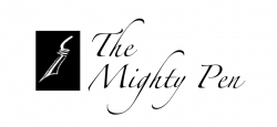
EDIT: Scratch that. Just tried it with Dax and it doesnt work. Attached is your symbol with the type in Zapfino. Note the similar angle of the strokes to your simple and complimentary style. Subtle things like this really make a logo stand out. For this to work i think you would need to to strengthen the strokes on the lettering a tiny bit though as they are too thin at certain points and will almost dissapear when reduce to small sizes (especially on the web).
 

Attachments

  • Picture 2.png
    Picture 2.png
    30.4 KB · Views: 108
Last edited:
I think the typeface is okay the way it is, especially considering that the brand includes the word "mighty" (thus justifying the heavier typeface).

On the other hand, neat design from the above poster, but I don't think that's exactly the style that Bluetooth is going for. :cool:
 
I think the typeface is okay the way it is, especially considering that the brand includes the word "mighty" (thus justifying the heavier typeface).

On the other hand, neat design from the above poster, but I don't think that's exactly the style that Bluetooth is going for. :cool:

Agreed. The design above is nice but if you read the brief by the client:

The logo should be clear, professional, simple, and compatible with the layout and colours of our website. Preference will be given to logos involving themes of literacy, education, youth, languages, and/or international development. (note: the existing logo below has appropriate themes, but the colours do not match and it is too complicated)

Hence the reason for going with a more bold, simple and primary type face, especially since it is for a youth organization. The logo above is nice but a little more elegant and sophisticated looking than what I feel the client is looking for in a logo for a youth group/charity organization et. I do like the feel of it though as a more sophisticated type logo.
 
A few more revisions...

Here are a few more revisions. I tried to go a bit with MacProBoobs advice and lean towards a script, however I went for a more youthful look than elegant as it is a youth organization that teaches education and literacy et.

Let me know your thoughts. I included 1a as it was my first choice going in to these latest revisions. I think I may like the look of 3a, text is not as bold but it flows a little more with the pen vector.

1a (current choice out of previous designs)

mightypen9.jpg


4a

mightypen12.jpg
 
Last edited:
My 2¢

I thought I would join the discussion. I feel that "1a" is your best choice, but I thought some things needed to be shifted/tightened. Here's what I did to your logo...

1) Made "the" a little bigger and shifted it so the vertical stem of the "t" aligns with the stem of the "m".

2) Reduced the "TM" mark and moved it to rest on the baseline of the logo.

3) Shifted the stylized "pen" art down a bit to give it a little breathing room.

I hope it's ok I joined in and added a voice.
 

Attachments

  • mpen.jpg
    mpen.jpg
    32.4 KB · Views: 111
I thought I would join the discussion. I feel that "1a" is your best choice, but I thought some things needed to be shifted/tightened. Here's what I did to your logo...

1) Made "the" a little bigger and shifted it so the vertical stem of the "t" aligns with the stem of the "m".

2) Reduced the "TM" mark and moved it to rest on the baseline of the logo.

3) Shifted the stylized "pen" art down a bit to give it a little breathing room.

I hope it's ok I joined in and added a voice.

Definitely ok! Thanks for the feedback and suggestions.

I had "the" centred over the "m" but aligning it with the t is not a bad look either.

"TM" mark looks pretty good at the bottom too and it is a bit large in general. Perhaps the breathing room under the word "pen" is also a good idea.

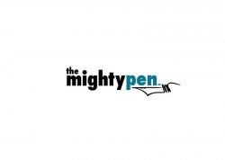
Below were my final two revisions/variations but I may try to go back and play around with some of your suggestions.


Basic/Fundemental Logo Design

mightypenbasic2.jpg


Logo Design with some added polish and an outline to perhaps enhance the youth appeal. Just messin' about with some aesthetics here, logo above will be the dominant design.

mightypeneffects2c.jpg


mightypeneffects2a.jpg


Any further or final comments are welcome before I wrap it up...

Cheers,
 
Last edited:
To my eyes this one is the best logo in the thread.

The pen at the bottom of the text looks… I don't know how to describe it… it just looks awkward and unbalanced.

Plus the idea of ink dropping from the pen and dotting the i is too smart and good to give up. And you don't need a gradient to make it look more like ink.

mightypen3.jpg
 
i think you should ignore other people's opinions and just focus on what you think is the best.

Do stuff you personally really like and enjoy. And let it attract people that think of it the same.


I think honestly believing and loving your design ( regardless of other "expert" opinions) will give you better results, than trying to jump all the hoops of other's criteria.

I agree, just looking for some constructive criticism from some fellow designers is all. Sometimes it is good to bounce ideas of others but I understand and agree with what you are saying, ultimately it comes down to what you feel most confident with.
 
For anyone interested, I made a revision to one of the designs that had some positive feedback. I thought a script font would make more sense with a fountain pen icon (as also suggested by one poster).

Anyways, here it is.

mightypen3basic.jpg
 
I like the font of 1a a lot, You should try designing a tip of a fountain pen to dot the "i" keep it simple, like the "i" is the pen for instance.
 
Last edited:
i think you should ignore other people's opinions and just focus on what you think is the best.

Do stuff you personally really like and enjoy. And let it attract people that think of it the same.


I think honestly believing and loving your design ( regardless of other "expert" opinions) will give you better results, than trying to jump all the hoops of other's criteria.


As a designer you need to take on board criticism to improve. If you stay with what you 'enjoy' your work could be terrible but you believe it to be great. If you take on board the tips, criticism and hints of others then you can improve as a designer.

Just look at the suggestion earlier in the thread to use a script font. Now the OP has experimented with that he's come up with a cracking new version.
 
Wow it's time for a redesign for sure. That red logo with the stars looks like a cheap tramp-stamp tattoo! Your redesigns look great, I like the fountain pen tip under the word "pen".
 
I'd suggest redesigning the i to look like a pen (make the drop into the nib of a fountain pen). Also, lose the pen drawing, it looks like an afterthought and doesn't fit with the overall style. Keep the first font too, it's a lot nicer to read. Looks really good OP
 
Some thoughts from a fellow designer, when it comes to a clean design I try to steer away from stroke, outerglow, drop shadow. Pretty much anything that just bulks the font up, its not needed in most cases and draws the eyes away from the actual logo itself. Which is never a good thing try to stay basic when it comes to just a typefont logo.
 
Register on MacRumors! This sidebar will go away, and you'll see fewer ads.