Got a tip for us?
Let us know
Become a MacRumors Supporter for $50/year with no ads, ability to filter front page stories, and private forums.
Logo Critique
- Thread starter Starflyer
- Start date
- Sort by reaction score
You are using an out of date browser. It may not display this or other websites correctly.
You should upgrade or use an alternative browser.
You should upgrade or use an alternative browser.
")
the new one is MUCH better. Well done. I think they will be very happy.
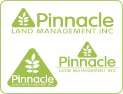
Is this color green bold enough? Maybe a little darker would be better.
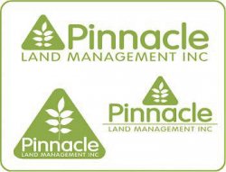
Is this color green bold enough? Maybe a little darker would be better.
Great work. The new logo seems much more...friendly. I also like the new font.
-JDR
edit: P.S.- I agree with the poster above me. The green could be a bit darker--less neon-like.
-JDR
edit: P.S.- I agree with the poster above me. The green could be a bit darker--less neon-like.
i quite like like it.
i prefer the one with the triangle situated centred above "pinnacle".
the triangle with "pinnacle" written inside can at first glance come across as a warning symbol – not so friendly.
i prefer the one with the triangle situated centred above "pinnacle".
the triangle with "pinnacle" written inside can at first glance come across as a warning symbol – not so friendly.
Nice logo design, and I think you nailed the green.
I like the green triangle with all of the text inside.
Seems like it would work well for a wide variety of applications.
I like the green triangle with all of the text inside.
Seems like it would work well for a wide variety of applications.
For the one with all the elements inside the triangle, maybe reduce the word "Pinnacle" so that you get a little more breathing room around the letters inside the shape. Nice work, great improvement.
I like it a lot. Nice font choice and compositions. The only thing, is that there is something off with the color. Maybe its just not my color. Maybe try a pale earthy green.
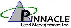
Looks kinda like International Paper ...
I would like to disagree...
...but for Pinnacle this seems to get the job done. The color could use some slight tweaking though as others have stated.

i quite like like it.
i prefer the one with the triangle situated centred above "pinnacle".
the triangle with "pinnacle" written inside can at first glance come across as a warning symbol not so friendly.
I agree with you. the one with the triangle situated centred above "pinnacle" is my favorite.
Nice work!
Register on MacRumors! This sidebar will go away, and you'll see fewer ads.