Got a tip for us?
Let us know
Become a MacRumors Supporter for $50/year with no ads, ability to filter front page stories, and private forums.
Logo critique
- Thread starter Topher15
- Start date
- Sort by reaction score
You are using an out of date browser. It may not display this or other websites correctly.
You should upgrade or use an alternative browser.
You should upgrade or use an alternative browser.

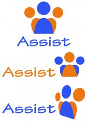
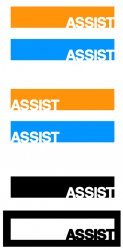
I'd like to give a shot on the assist logo. I think I like the blue one, second down... but make it like you did the last one where you have no sides. And have the dark blue gradient out to nothing to the sides. Does that make sense?
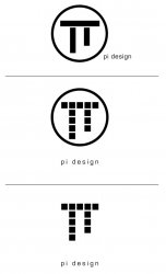
Personally the PI Design logo doesn't do much for me. Maybe keep the cubes in the circle but have the boxes 3d and over lapping the circle as if it's coming out of the circle.
Personally the PI Design logo doesn't do much for me. Maybe keep the cubes in the circle but have the boxes 3d and over lapping the circle as if it's coming out of the circle.
So you mean have the gradient go from dark blue to transparent with the transparent towards the edges?I'd like to give a shot on the assist logo. I think I like the blue one, second down... but make it like you did the last one where you have no sides. And have the dark blue gradient out to nothing to the sides. Does that make sense?
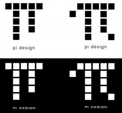
pi is often used in circle calculations, not squares, have you thought about incorporating a circle instead? btw i really like the squares both decorative and rigid. top right 2 i think.Personally the PI Design logo doesn't do much for me. Maybe keep the cubes in the circle but have the boxes 3d and over lapping the circle as if it's coming out of the circle.
Really dig the Pi logos. I actually like the squares, but I also kinda dig smart juxtaposition.
My only critique is pretty nitpicky.
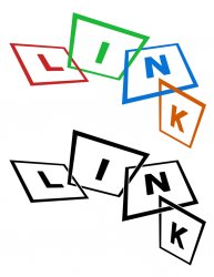
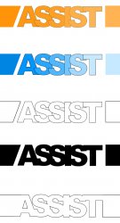
As for the assist logo - it doesn't say 'assistance' to me. My suggestion would be to have the letters linked with each other rather than the super close keming - kind of how the boxes in the 'link' logo intersect. Does that make sense?
Also, and this may be because there are a fair number of Clemsonites around here, but the 'assist' logo with the three people in blue and orange is kinda of making me see a tiger paw.
Overall, that's some pretty great work.
My only critique is pretty nitpicky.
As for the assist logo - it doesn't say 'assistance' to me. My suggestion would be to have the letters linked with each other rather than the super close keming - kind of how the boxes in the 'link' logo intersect. Does that make sense?
Also, and this may be because there are a fair number of Clemsonites around here, but the 'assist' logo with the three people in blue and orange is kinda of making me see a tiger paw.
Overall, that's some pretty great work.
pi doesn't say pi to me it says TT, mainly due to it being straight in design, the pi symbol is curvy.
SAS - looks better in black but it doesn't look too 'stamped' which I assume is the intended look to me
Can't really say much else as theres no cotext as to what/who they're for.
SAS - looks better in black but it doesn't look too 'stamped' which I assume is the intended look to me
Can't really say much else as theres no cotext as to what/who they're for.
Thanks for the comments.
Briefly, apart from the Pi logos, the logos were for a mini project to create a consistent identity for the student peer support department at uni (it was under different names in different campuses! ). 'Assist' was the name the heads of the dept. liked best. All five teams then worked on graphics for it. One of the other teams was picked.
Yes, I had a stamp in mind for the SAS mock-up and was trying to create a brush to replicate the effect of a stamp - couldn't quite manage it!
Briefly, apart from the Pi logos, the logos were for a mini project to create a consistent identity for the student peer support department at uni (it was under different names in different campuses!
). 'Assist' was the name the heads of the dept. liked best. All five teams then worked on graphics for it. One of the other teams was picked.LeviG said:SAS - looks better in black but it doesn't look too 'stamped' which I assume is the intended look to me
Yes, I had a stamp in mind for the SAS mock-up and was trying to create a brush to replicate the effect of a stamp - couldn't quite manage it!
So you mean have the gradient go from dark blue to transparent with the transparent towards the edges?
Yeah that's what I was thinking. I like the bottom one how you did it, but I also like how the letters overlap in the blue on you did.
Few more...
I really like the assist ones.
Well done, good use of color & space.
I'm not sure how the Pi logo relates to the squares, what kind of company is it?
The SAS ones are also good.
Linked in
I like the linked logo concepts, but maybe the K should ride up higher to be more in-line with the other letters? It would be a little more conservative, but it might look more "solid." Cheers.
I like the linked logo concepts, but maybe the K should ride up higher to be more in-line with the other letters? It would be a little more conservative, but it might look more "solid." Cheers.
"Assist". is that someone's title or job description? I bet it would look great on someone's office door.
what software is used to make these ? and how easy is it to learn?- thanks
Photoshop
Yes, there'll be tons of video tutorials around the net. Try Youtube.
Register on MacRumors! This sidebar will go away, and you'll see fewer ads.