Become a MacRumors Supporter for $50/year with no ads, ability to filter front page stories, and private forums.

onegirlcreative

macrumors member
Original poster
Mar 3, 2008
95
0
Colorado
Hello!

Here is a little background of my client's business, so you'll know where it's coming from.

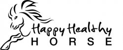
Her business is a Jin Shin Jyutsu technique which involves an alternative/complimentary healing therapy it is unique because it is a complete healing system and can be used to enhance a horse's health from pre-conception, through pregancy and birth, to growing years and training to adulthood, up to performance horses and mature horses.

She likes the design, but says the horse looks too mean (perhaps a friendlier approach), but likes that it's hand drawn. She feels the lettering isn't legible, says she wants it to be readable for the web and/or smaller, business card sizes. I guess the script-like font isn't doing it for her.

I guess I'm a bit blocked on this one, so any advice would be appreciated.

Thanks to all who contribute.
Suzanne
 

Attachments

  • horse_logo.jpg
    horse_logo.jpg
    30.3 KB · Views: 128
I'm not sure the leg of the horse is necessary. Something not right about that bit.

Yeah, I know what you mean. Now that you have brought it to my attention, I'm looking at it differently and thinking the same thing. Almost like he/she is trying to get away. Good catch.
 
HORSE type is spread too wide. The elements seem to be bunched up. Even though the illustration is loose, it seems too technical. Try drawing it on paper. It won't look computery. Play with some font weights.
 
It's a good start.

Put a little upward curl on the horse's mouth and make the eye open a bit wider, and that should make the face appear friendlier and not angry-looking.

Use an extended or wider font for HORSE so there's not so much empty space between each letter.

I don't find the script typeface too difficult to read, but, at smaller sizes it might be hard. Try a less scripted font or try making it a bit larger.
 
HORSE type is spread too wide. The elements seem to be bunched up. Even though the illustration is loose, it seems too technical. Try drawing it on paper. It won't look computery. Play with some font weights.

Agreed 100%.

To explain, I kerned the HORSE type out to be consistent with the "Healthy Horse," only to realize at second view, it isn't working. A good reminder.

You're right, with this particular business that she does, it needs to have more of an organic feel to it, more zen if you will. I need to experiment AWAY from the computer and get back to the old pen & pencil technique.

It's a good start.

Put a little upward curl on the horse's mouth and make the eye open a bit wider, and that should make the face appear friendlier and not angry-looking.

Use an extended or wider font for HORSE so there's not so much empty space between each letter.

I don't find the script typeface too difficult to read, but, at smaller sizes it might be hard. Try a less scripted font or try making it a bit larger.

Definitely. Thanks for the suggestion.
 
Agreed 100%.

To explain, I kerned the HORSE type out to be consistent with the "Healthy Horse," only to realize at second view, it isn't working. A good reminder.

You're right, with this particular business that she does, it needs to have more of an organic feel to it, more zen if you will. I need to experiment AWAY from the computer and get back to the old pen & pencil technique.


Definitely. Thanks for the suggestion.

Print it out in different sizes like 1/2 inch and full page and see what works. Post your studies.
 
In addition to Trajectory's suggestions, maybe make the nostril a little less pronounced. I agree the main reason the client thinks it looks too mean is the facial expression the horse has.

I think that font would be fine, but maybe go in and tweak some of the letters (the p's, e and t seem the most problematic) or find a font that is similar that is just more legible with the combination of letters in "Happy Healthy".

You might also look for a script font that will better compliment the sharp edges of the horse image.
 
Excellent suggestions guys! Thanks.

Definitely agree with all of you on those suggestions. AFter looking at the horse's face again, I realized she was right about the expression looking too stern or "mean." I have curved the mouth up quite a bit and made it look more "happy," if you will.

As far as font goes, I was experimenting with Helvetica and different weights/styles within the typeface. It's such a simple, yet modern font without any legibility problems.

I will post when I'm finished. I just sent her the second round of revisions this morning. I'll see what she says and then I'll repost the changes.

Thanks!
 
I'd suggest maybe losing the foot altogether on the horse...not working for me. I'd also suggest fewer lines throughout the horse. I think fewer lines equates to a more simple and zen type look. Less is more here. I agree that the font is not so good and hard to read. Perhaps if the horse has an organic look you can offset that with simple and clean typography that's not competing with your illustration at all. Good luck, logos are extremely difficult.
 
A little thing.. when you've got a handwritten typeface be careful when you have double letters. In here you have the double 'P' in 'happy and it's obvious that you are using a font rather than drawing by hand. What I tend to do is put them in illustrator (if they aren't already there) and skew one a little bit, and make the negative space within the letters appear different.
I don't like that typeface much anyway – if you find one that looks handdrawn but the baseline doesn't have as much fluctuation in it I think you'll end up with a much tighter design.
 
Register on MacRumors! This sidebar will go away, and you'll see fewer ads.