Got a tip for us?
Let us know
Become a MacRumors Supporter for $50/year with no ads, ability to filter front page stories, and private forums.
Logo Critique
- Thread starter Starflyer
- Start date
- Sort by reaction score
You are using an out of date browser. It may not display this or other websites correctly.
You should upgrade or use an alternative browser.
You should upgrade or use an alternative browser.
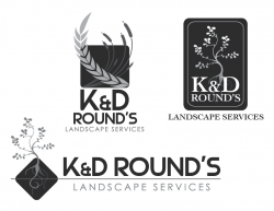
First one is like the Atlanta Bread Company...reminds me of food when you use wheat like that.
Second one reminds me of a wine bottle label...
Third one seems too big, but a step in the right direction.
Second one reminds me of a wine bottle label...
Third one seems too big, but a step in the right direction.
and the third one is awesome for a web banner.
Or plastered on the side of a truck, which is how I envisioned it. Easily readable as you drive by.
I like the 2nd and 3rd one.
With the 3rd, perhaps you could get rid of the roots, and put the tree foliage in the diamond, and have the horizontal line touch the edge of the diamond only.
I think it would look great.
With the 3rd, perhaps you could get rid of the roots, and put the tree foliage in the diamond, and have the horizontal line touch the edge of the diamond only.
I think it would look great.
The third one is great, but the line needs to just hit the edge of the square and I think the roots could also be fixed. Maybe make them less curly.
I like the second (top right) and third (bottom) ones.
The first one looks like wheat etc which is wrong
I like the background image/style but not the text over the top of the second one.
The third one has a nicer layout and I do like the way the plant comes out of the shape.
I will say that the plant image used in 2 and 3 give off an oriental flavour to me though so if the client can't do that style it might be worth revising it. Also will it work as well at small scale as it would with larger sizes.
Its that time again. Tear 'em up!
The apostrophe bothers me for some reason ... K & D Round - Landscape Services seems better. There's something about the possessive that seems cutesy and a bit unprofessional, somehow.
Cheers
Jim
The apostrophe bothers me for some reason ... K & D Round - Landscape Services seems better. There's something about the possessive that seems cutesy and a bit unprofessional, somehow.
Cheers
Jim
I completely agree with this sentiment. To me it makes it all sound like one really long business name or a person's backyard service. Look at Apple. Before they were Apple, Inc., they used to be Apple Computers. I doubt it was ever considered to call the company Apple's Computers. Make the name a "brand", not a person's service.
OH, and as far as the designs go, it's the 3rd one for sure. I don't know if the diamond is necessary. what's it's purpose. Definately re-think the type's overall size, and thicken up the graphic or make it larger (or both).
-je
I like the third one the best - but I think the main font could be made a bit more 'friendly' looking; it's kind of corporate (not very garden-y).
Like he said ^^ It would be interesting to see the black diamond shape on the actual logo removed - the curly tree design I think would be effective enough on it's own.
Like he said ^^ It would be interesting to see the black diamond shape on the actual logo removed - the curly tree design I think would be effective enough on it's own.
Register on MacRumors! This sidebar will go away, and you'll see fewer ads.