Got a tip for us?
Let us know
Become a MacRumors Supporter for $50/year with no ads, ability to filter front page stories, and private forums.
Logo Critique
- Thread starter jpgoebel
- Start date
- Sort by reaction score
You are using an out of date browser. It may not display this or other websites correctly.
You should upgrade or use an alternative browser.
You should upgrade or use an alternative browser.
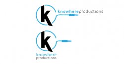
I am designing an identity for a friend of mine's audio production company. Just looking for some feedback on this logo draft. Any suggestions are appreciated
I like it, Make the "cable" longer on the one where the text is horizontal to the right of the logo. make it so the "start of the plug" is right under the start of the word production.
How much do you charge for creating a logo for a company?
 great concept.
My first impression was to favor the second one because it "follows the rules". But then design rules are often the first and best casualties of creativity. The first one has real potential, but the plug does need to be worked with to keep "productions" from hanging on it's own. I love the colors and font choices. Nice work.
I really like both of them. I, however, favor the second one for being clean and concise. There's a lot you could do with this logo.
That is the plan is to use both logos in a horizontal and vertical way as well as just the symbol alone when the brand becomes more recognizable. At least that is what the client was looking for. Should I give the font the same style on both logos(bold on knowhere light on productions) as it would bring unity to both designs?
Relocated "productions" in the first one - it's distracting just hanging out there. Otherwise, I do like it.
is it "know where" or "know here"? if you dont do something to make it obvious (capitalize the w or the k depending which is right, change the text weight between the two words, etc) you're going to have confused customers. word of mouth is the best advertising, and if they dont know what word should being coming out of their mouth, they just wont talk.
i would do this:
knowhereproductions or
knowhereproductions
i would do this:
knowhereproductions or
knowhereproductions
the first thing that stood out to me more than the plug or side text was actually the main k in the middle.
The top of the k is straight in a circular shape and looks out of place to me. In my opinion it either needs extending above the circle (like the lower part) or rounding to match the circle.
I also think the curve where the circle goes into the horizontal line needs a little work too.
As to the knowhere productions bit, well I'd stick it under the plug using the layout of the bottom one.
Sorry, I don't get it.
Why is there a K, with a wire around it?
It seems too literal - wires and plugs are boring and ugly. What is there about sound you can represent? Colour, sound waves, patterns etc?
Have a look at www.logolounge.com
Why is there a K, with a wire around it?
It seems too literal - wires and plugs are boring and ugly. What is there about sound you can represent? Colour, sound waves, patterns etc?
Have a look at www.logolounge.com
Register on MacRumors! This sidebar will go away, and you'll see fewer ads.