Got a tip for us?
Let us know
Become a MacRumors Supporter for $50/year with no ads, ability to filter front page stories, and private forums.
Logo Design
- Thread starter janitorC7
- Start date
- Sort by reaction score
You are using an out of date browser. It may not display this or other websites correctly.
You should upgrade or use an alternative browser.
You should upgrade or use an alternative browser.

Logo deisgn crit
Dear logo designer;
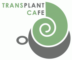
Out of the sample logos you placed for users to view, I do like the last one. Though there are a few things I would change and have questions about.
If you look at the last logo, the one with the green color gradation. Where the swirl ends with the larger opening the line there visually does not look straight and I would go back into your vector program and simply utilize your guides and make this line straight. As it stands now, it looks like it is a mistake.
In your text, is there a reason for the text PLANT AND FE to be separate from the rest of the text by changing the color to orange? The reason why I ask is because you have already placed your text in all caps making a statement that it is important. Though placing certain text as you did in a different color brings on a double standard to your work.
When I saw your logo for the first time I did see TRANSPLANT CAFÉ but I then wondered is there a reason why those particular letters are in another color separating it from the rest?
If you do want to keep the hierarchy level as you have it there. I would perhaps change your gray text to a thinner line weight, and keeping the PLANT and FE in the same line weight but in gray. This visually provides a more pleasing look to your logo.
So what is the significant of PLANT and FE being separated from the rest of the text?
Another note. I would watch your kerning very carefully. Kerning are the spacing between your letters. I do notice that in a few of your letters within your logo. A mark as you may know is very important and is very important part of branding your company. A logo can be separate on its own, fixing these minor flaws can make your logo stand out from the rest.
If need to I would zoom in on your vector program and look at the spacing visually. Then when your think you have it right, print a copy out so you can see it and then look at it again from this hard copy. Because it is a lot about perception and how your eye see things.
Note having equal spacing on your screen does not visually make it look visually balance with the rest. So you need to be a critical judge on your work.
If you would like to see samples of logos that I have done in the past. You can go to:
http://www.unibility.com
My appoplogies there is not a load bar for this Flash site. It may take two minutes to load for the links to link properly. Once the site is up. Please click on PORTFOLIO and then SCHOL WORK and in the lower right corner of the site there is a link titled LOGOS here you will see the logos I have designed.
I hope this helps.
--
unibility
Hoang C. Ton
1+937-838-1770
www.unibility.com
hoang@unibility.com
Dear logo designer;
Out of the sample logos you placed for users to view, I do like the last one. Though there are a few things I would change and have questions about.
If you look at the last logo, the one with the green color gradation. Where the swirl ends with the larger opening the line there visually does not look straight and I would go back into your vector program and simply utilize your guides and make this line straight. As it stands now, it looks like it is a mistake.
In your text, is there a reason for the text PLANT AND FE to be separate from the rest of the text by changing the color to orange? The reason why I ask is because you have already placed your text in all caps making a statement that it is important. Though placing certain text as you did in a different color brings on a double standard to your work.
When I saw your logo for the first time I did see TRANSPLANT CAFÉ but I then wondered is there a reason why those particular letters are in another color separating it from the rest?
If you do want to keep the hierarchy level as you have it there. I would perhaps change your gray text to a thinner line weight, and keeping the PLANT and FE in the same line weight but in gray. This visually provides a more pleasing look to your logo.
So what is the significant of PLANT and FE being separated from the rest of the text?
Another note. I would watch your kerning very carefully. Kerning are the spacing between your letters. I do notice that in a few of your letters within your logo. A mark as you may know is very important and is very important part of branding your company. A logo can be separate on its own, fixing these minor flaws can make your logo stand out from the rest.
If need to I would zoom in on your vector program and look at the spacing visually. Then when your think you have it right, print a copy out so you can see it and then look at it again from this hard copy. Because it is a lot about perception and how your eye see things.
Note having equal spacing on your screen does not visually make it look visually balance with the rest. So you need to be a critical judge on your work.
If you would like to see samples of logos that I have done in the past. You can go to:
http://www.unibility.com
My appoplogies there is not a load bar for this Flash site. It may take two minutes to load for the links to link properly. Once the site is up. Please click on PORTFOLIO and then SCHOL WORK and in the lower right corner of the site there is a link titled LOGOS here you will see the logos I have designed.
I hope this helps.
--
unibility
Hoang C. Ton
1+937-838-1770
www.unibility.com
hoang@unibility.com
Thanks for your reply
1. The line is straight, I dont know why it appears to it
2. The different color has to things, one its half way though both of the words, and two we are based in California so CA.
3. What do you think is wrong with the spacing of my letters
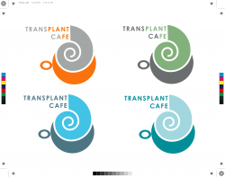
personally I like the orange grey one (top left, 1st set of images) best out of those.
I would seriously consider trying to do something with a deep crimson colour as a potential option too.
As to the line not being vertical, its the spiral, its about 1 degree out anticlockwise - you need to rotate it slightly
I would seriously consider trying to do something with a deep crimson colour as a potential option too.
As to the line not being vertical, its the spiral, its about 1 degree out anticlockwise - you need to rotate it slightly
I like where you're going with this. Although, if you want to bring attention to the CA maybe try switching your colors to use the highlighting color as your focus. I've modified my favorite of the ones you've posted to show what I'm talking about.
As for spacing, it's almost perfect. I actually wouldn't have noticed if it wasn't pointed out. It appears that the spacing is the same between every letter except for additional spacing between the the S and P and the P and L, and less spacing between the L and A.
As for spacing, it's almost perfect. I actually wouldn't have noticed if it wasn't pointed out. It appears that the spacing is the same between every letter except for additional spacing between the the S and P and the P and L, and less spacing between the L and A.
Attachments
3. What do you think is wrong with the spacing of my letters
He's right, the letterspacing is off. Have a look at the wiki explanation of kerning.
This one is loads better than the last one! Nice work! It's getting there.
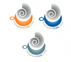
I like any of the ones from the top page more than the others. Simple, easily adaptable.
Particularly regarding the last one- you're looking at 5 colors for that logo. I know that this is for an online forum, and that's all you envision it to be, but general logos rules apply regardless. If you someday want to make this into a full-fledge company (for profit or non), you going to pay a ton to have your business cards, letterheads, and promotional materials printed if you care about your logo colors at all.
Regarding the kerning others have talked about...there is a little bit of work to do there. You may have the tracking set consistently between all of your letters, according to Illustrator or whatever program you used. However, optically, the spaces between some of the letters are inconsistent. The optical distance (the distance read by the eye..essentially "how it looks") is larger between the A and the N than it is between the L and the A (in transplant).
Lastly, about the colors of the words. The California connection is not immediately recognizable, so it needs to go. The brain automatically connects things that are similar in color when placed next to each other. The first instinct is to try to connect "Trans" to "Ca" and "Plant" to "Fe." Obviously, neither of these things make any sense. If you're going to go with two different colors for the words, just do one in one color and the second in another.
my 2¢...
A few observations...
The steam graphic or whatever it is, looks like a snail to me.
The outer shape of the "snail" is not a perfect circle, but I feel it should be to harmonize with the lower boundary of the "cup", which is a perfect circle.
The "cup handle" would read better if it were shaped like a half-donut. ie: more like a typical cup handle.
I like the examples with the words wrapping around the graphic.
Personally, I dislike the snail graphic and would replace it with something that contrasts better with the orderly cup geometry. Something gritty, wispy, irregular, random, etc...
GL
2. The different color has to things, one its half way though both of the words, and two we are based in California so CA.
Maybe try making the TRANS and the CA more vibrant (for emphasis)...make the other parts gray.
I would seriously consider trying to do something with a deep crimson colour as a potential option too.
I like this idea too. Especially since (if I remember right) this is a community of people awaiting and/or recovering from organ transplants. Try and make the colors more warm, inviting and human.
A few observations...
The steam graphic or whatever it is, looks like a snail to me.
The outer shape of the "snail" is not a perfect circle, but I feel it should be to harmonize with the lower boundary of the "cup", which is a perfect circle.
The "cup handle" would read better if it were shaped like a half-donut. ie: more like a typical cup handle.
I like the examples with the words wrapping around the graphic.
Personally, I dislike the snail graphic and would replace it with something that contrasts better with the orderly cup geometry. Something gritty, wispy, irregular, random, etc...
GL
The steam portion is another place where you could add some humanity to the logo. Maybe take a bit of inspiration from the pic below and apply a similar concept to your client.
Attachments
I agree with one of the previous posters...the steam graphics looks too much like a snail shell and that bothers me.
Make that steam graphic irregular i shape and the logo goes from unacceptable (I wouldn't if I was the client...unless I'm opening a escargot fine cuisine cafe) to approved.
JC
Make that steam graphic irregular i shape and the logo goes from unacceptable (I wouldn't if I was the client...unless I'm opening a escargot fine cuisine cafe
) to approved.JC
I like the first orange and grey one; the two colours look simple but effective.
I like the green-blue colours of the last one but overall it's all too much for one logo and I don't like the reflection underneath.
None of the others catch my eye.
For me the "PLANT" and "FE" stand out more than the rest, which isn't very meaningful. If the "CA" is supposed to suggest California, then perhaps try the "CA" in orange and the rest in grey.
I like the green-blue colours of the last one but overall it's all too much for one logo and I don't like the reflection underneath.
None of the others catch my eye.
2. The different color has to things, one its half way though both of the words, and two we are based in California so CA.
For me the "PLANT" and "FE" stand out more than the rest, which isn't very meaningful. If the "CA" is supposed to suggest California, then perhaps try the "CA" in orange and the rest in grey.
Register on MacRumors! This sidebar will go away, and you'll see fewer ads.