Got a tip for us?
Let us know
Become a MacRumors Supporter for $50/year with no ads, ability to filter front page stories, and private forums.
Logo Feedback
- Thread starter Etherz10
- Start date
- Sort by reaction score
You are using an out of date browser. It may not display this or other websites correctly.
You should upgrade or use an alternative browser.
You should upgrade or use an alternative browser.
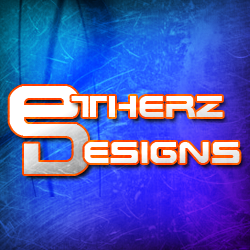
Couple things...
It's quite cool, just a couple things come to mind:
1. How does it look in black and white? I try to make every logo work in solid black and whites along with color.
2. Did you make that typeface yourself? The letters in the first word are interesting, but none of the letters in "designs" feature that crossed out section that seems to be the trademark of that font.
Those are just the things that came to mind.
I'd like to see how it looks on a plain white or black background, as well. There will probably be many times when you won't want to have a blue box around your logo.
Like they say... need to show a version in just B&W.
The blue box and the red outline around the type don't do a thing for me.
Look at the letter forms without that extra decoration and then see where it goes.
The blue box and the red outline around the type don't do a thing for me.
Look at the letter forms without that extra decoration and then see where it goes.
Like they say... need to show a version in just B&W
Yep. One thing to keep in mind about a logo is that, sooner or later, someone is going to put it through a fax machine. Gotta look good in B&W!
Cheers
Jim
perhaps the "N" in DESIGNS should be the "Z" rotated 1/4 turn counter clockwise... That way you have that same feel to the second word... And perhaps the first letter should be in uppercase just like the other "E's"
one other thing... you may rethink your "T"... if you go to www.tentec.com that is similar to their logo...
perhaps the "N" in DESIGNS should be the "Z" rotated 1/4 turn counter clockwise... That way you have that same feel to the second word... And perhaps the first letter should be in uppercase just like the other "E's"
That's a good point. The "T", the "H", the "R" and the "Z" are all broken by horizontal or vertical lines in "Etherz", whereas none of the letters are treated the same way in the "Designs".
That's a good point. The "T", the "H", the "R" and the "Z" are all broken by horizontal or vertical lines in "Etherz", whereas none of the letters are treated the same way in the "Designs".
Ya.. that.
Way Better
Much much better! I tend to find that simplicity is key.
One thing though—adjust the spacing between the 'e' and the 't' so that the spacing matches the space between the 't' and the following 'h'. Same for the 'd' and the 'e' in 'designs'.
I like it otherwise :3
Much much better! I tend to find that simplicity is key.
One thing though—adjust the spacing between the 'e' and the 't' so that the spacing matches the space between the 't' and the following 'h'. Same for the 'd' and the 'e' in 'designs'.
I like it otherwise :3
Thank you for creating the black and white version.
But I can't give it my seal of approval aesthetics-wise.
It feels like a throw-back to a 1970's style that was best left forgotten in the past.
As I've said to my fellow designers at work, "There's good cheese... and there's bad cheese."
I'm afraid this isn't very good cheese (IMHO).
But I can't give it my seal of approval aesthetics-wise.
It feels like a throw-back to a 1970's style that was best left forgotten in the past.
As I've said to my fellow designers at work, "There's good cheese... and there's bad cheese."
I'm afraid this isn't very good cheese (IMHO).
I wanted to explain my previous post a bit...
Recently I'd given an enthusiastic thumbs up on the funk band logo which also borrowed heavily from a style that was best left in the 1970's. So why does one work and one not?
It's all about application. A band that plays 1970's funk should borrow a design style from that era. But you are a designer, not funk band. Unless you want to specialize in retro-techno design, you shouldn't pigeon-hole yourself with that brand identity.
Most designers need to take on a wide variety of clients and solve design problems in a wide variety of ways. Your brand therefore should convey professionalism to your clients yet be distinctive enough to reflect your unique aesthetic talent.
As it is, your logo is all uniqueness and little professionalism. Somehow, you need to find a way to bring more of that into your brand.
Nice Logo. I have not seen this kind of background of any logo but its superb looking background. The 1st reply of your post about black and red combination, i have tried that by myself but your combination is much more better than that. The merging of 1st characters is also appreciable.
The 1st reply of your post about black and red combination, i have tried that by myself but your combination is much more better than that.
When did anybody say anything about a black and red combination? That would be terrible.
In fact, he did almost exactly what I hoped he would, though some of the letters are uncomfortably close to each other at the moment.
I would recommend that you explore simpler and more contemporary design concepts.
Personally, I think it's a big mistake to design a fussy logo for a design business, unless the logo design is absolutely flawless.
K.I.S.S.
Personally, I think it's a big mistake to design a fussy logo for a design business, unless the logo design is absolutely flawless.
K.I.S.S.
Register on MacRumors! This sidebar will go away, and you'll see fewer ads.